
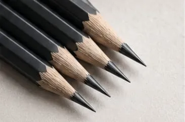
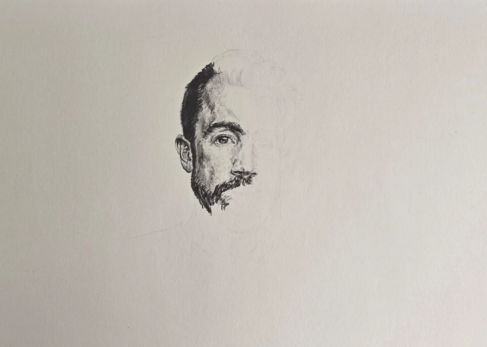
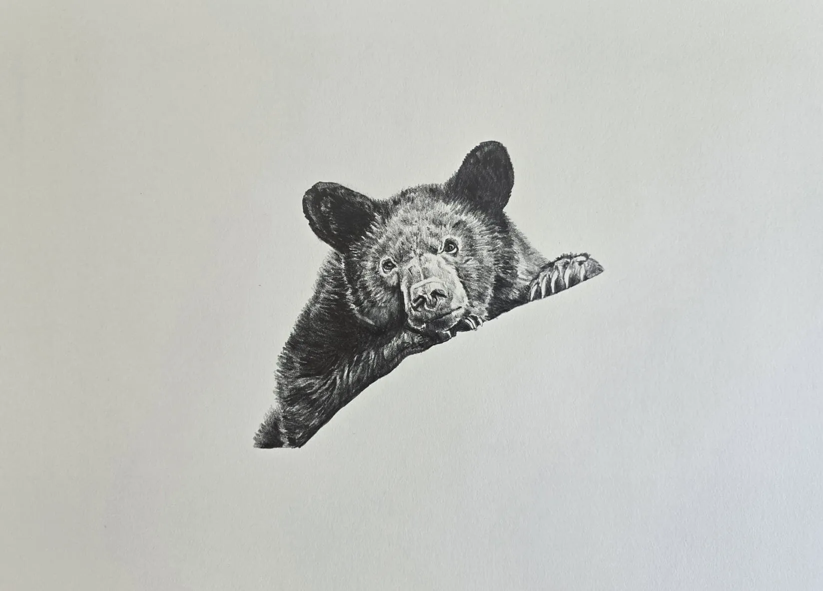
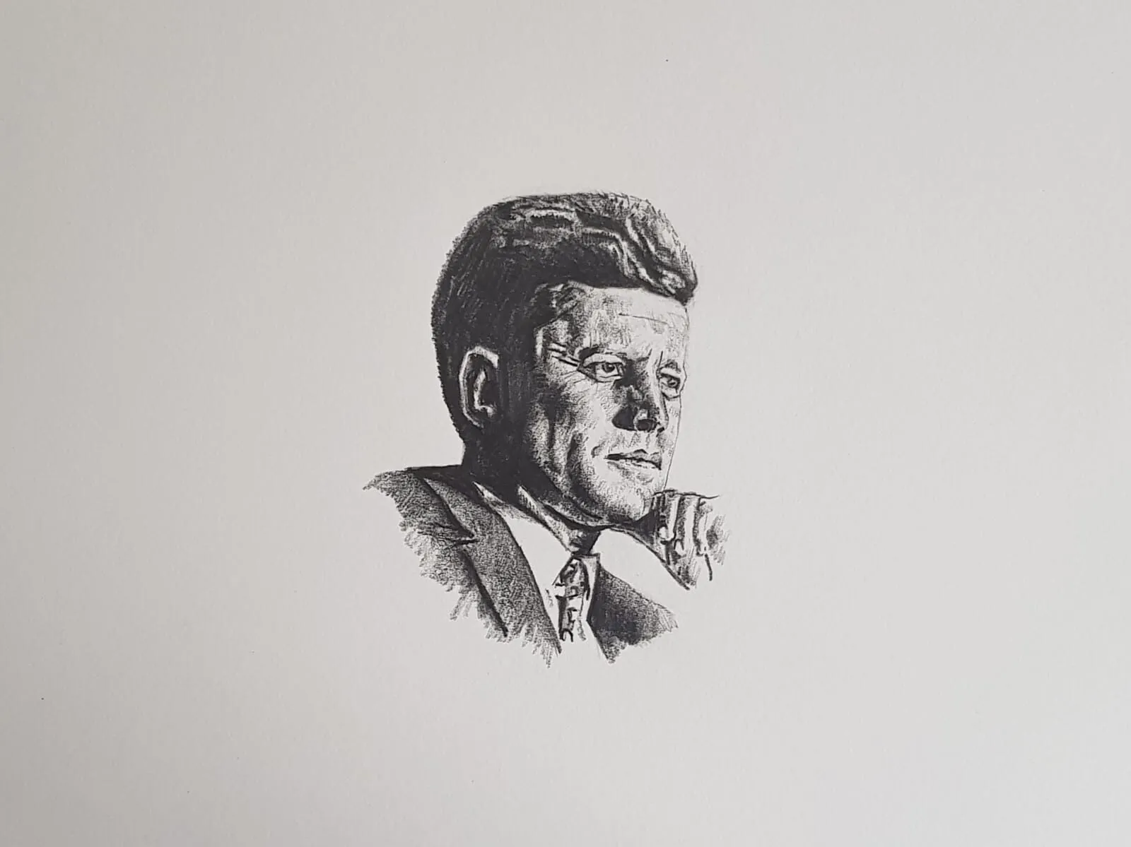
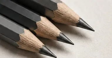
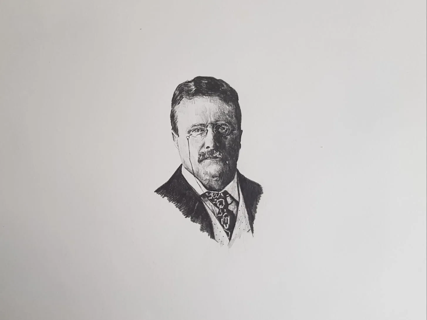

Graphite looks simple: a pencil, a sheet of paper, a grey line. Yet the same pencil can produce a hairline construction mark, a soft velvety shadow and a near-black that gleams in the light. The difficulty is not owning the right kit, it is knowing which grade to pick up, how hard to press, how to move tone across the page and when to stop touching it. Add charcoal to the picture and the choices multiply.
This guide is the map for the whole subject. It covers materials, grades, paper, the three core techniques, what to draw, the mistakes that hold people back and a starter kit. Each section points to a focused guide when you want more depth, and there is a suggested learning order near the end so you are not trying to learn everything at once.
What graphite and charcoal actually are
Graphite is a crystalline form of carbon that leaves a silvery-grey mark by shedding thin flakes as you drag it across paper. Drawing pencils mix graphite with clay. More clay makes a harder pencil that leaves a paler line and holds a sharper point. Less clay gives a softer, darker, smoother pencil that wears down faster. That single trade-off explains the entire grading system.
Charcoal is made from burnt wood or, in its compressed form, from charcoal powder bound into sticks. It is matte, very dark and dusty, and it lifts easily. Where graphite has a slight metallic sheen in heavy layers, charcoal absorbs light and delivers a deeper, flatter black. It suits big, atmospheric marks; graphite suits accuracy and fine finish.
Neither is better. They are two ends of a spectrum, and many artists move between them depending on the subject. Our direct comparison, graphite versus charcoal, sets out where each one wins.
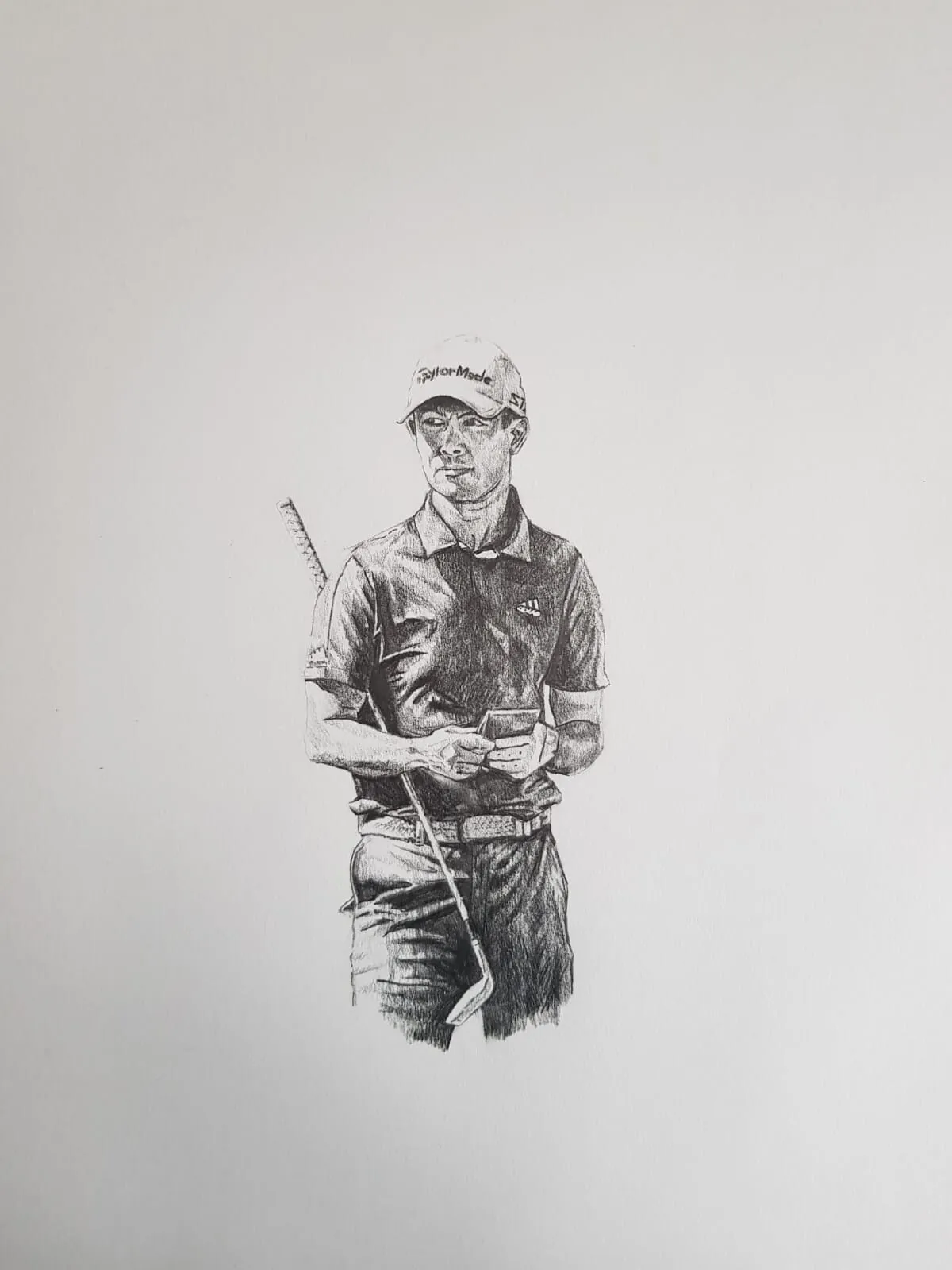
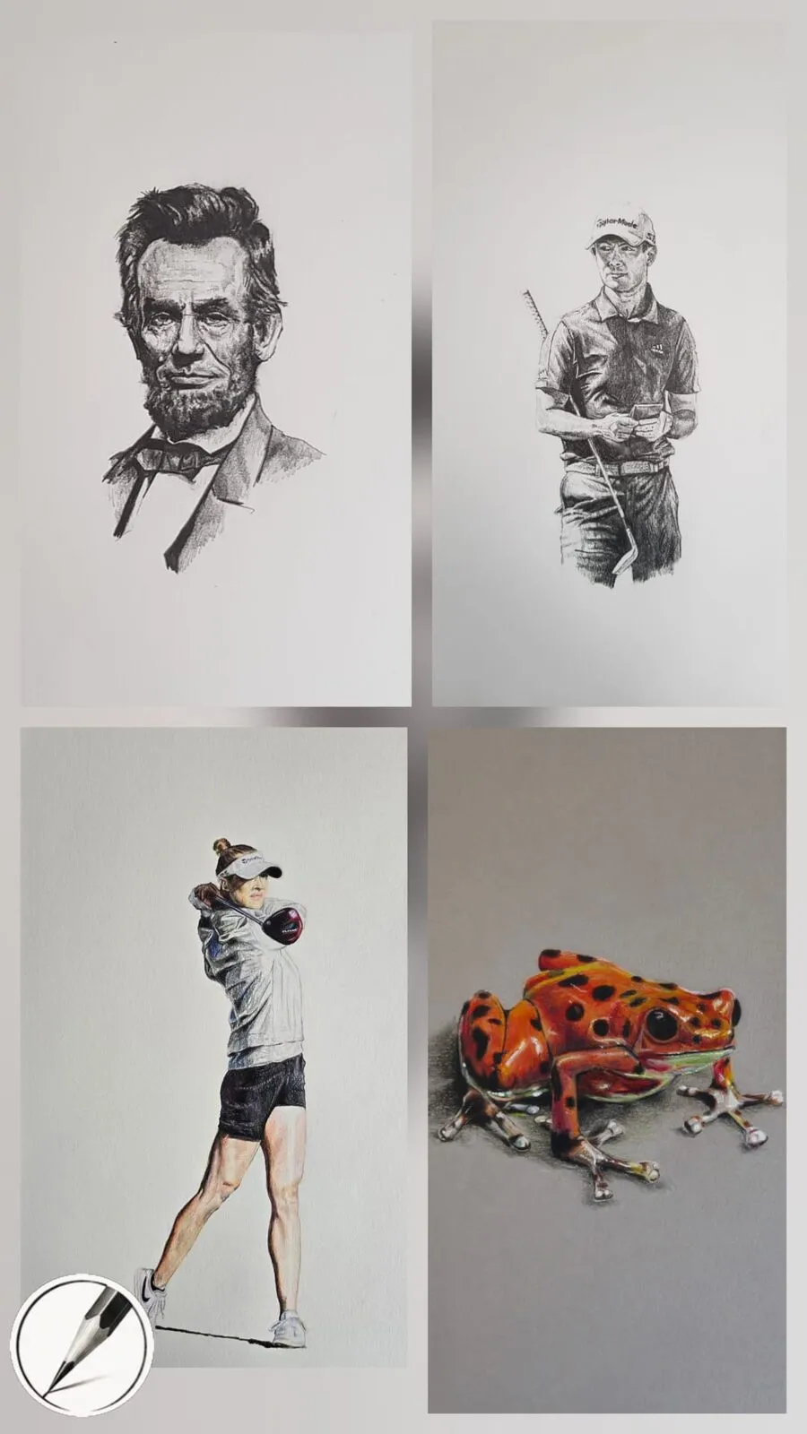
A graphite drawing of a golfer holding a club. Drawing by Michael Brace.
Pencil grades in one minute
Graphite pencils are labelled on the H to B scale. H stands for hard, B for black, and F for fine point. HB sits in the centre. Working outward from HB toward the soft end you get B, 2B, 3B and so on up to 9B in a full range; toward the hard end you get H, 2H and so on up to 9H. In the United States the same pencils are often sold by number, where number 2 is roughly HB, though the exact tone varies between makers.
Do not buy the whole range. Most drawings use only a handful of grades, and a set of five or six well-chosen pencils covers almost everything. Hard grades (H to 4H) suit light layout, architectural lines and very pale tone. The middle (F to 2B) is where most general drawing happens. Soft grades (3B to 9B) give rich darks quickly. Our full breakdown in graphite pencil grades explained includes US equivalents and how grades behave on different paper, and the pencil grade chart tool lets you compare them side by side.
Choosing pencils
Quality matters more in graphite than beginners expect. Cheap pencils can have gritty cores that scratch the paper, uneven density that makes tone patchy, and grades that are printed on the barrel but do not match each other. A good set gives consistent grades, smooth cores and a point that lasts.
Wooden pencils are the classic choice, mechanical pencils suit steady fine detail, woodless graphite gives broad coverage, and graphite sticks and powder cover big areas. Charcoal comes as vine sticks, compressed sticks, pencils and powder. Our guides to the best graphite pencils for drawing and the best charcoal for drawing explain what to look for in each category and which kits suit which subject.
Derwent’s Sketching pencils are one of the ranges worth a look for a first purchase, as a graphite range sold in sets. Check the manufacturer for the current grades in each set.
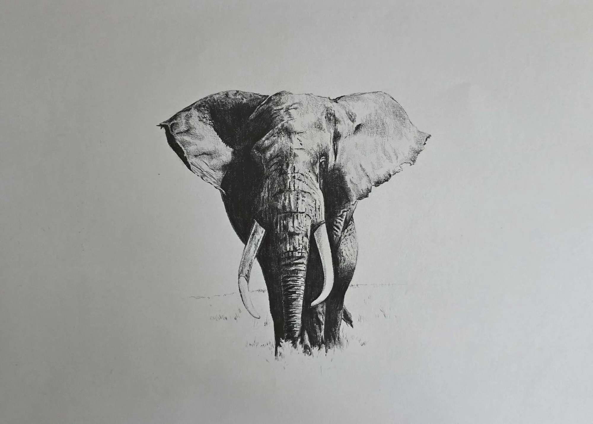
An elephant walking forward drawn in graphite pencil. Drawing by Michael Brace.
Paper: the quiet variable
The same pencil behaves very differently on different surfaces. Smooth paper gives fine detail and smooth blending, but it fills quickly and struggles to hold deep darks. Paper with more tooth grips graphite, lets you build rich shadows and shows hatching clearly, at the cost of some fine detail.
Michael’s preference for graphite is Arches Cold Press and Winsor and Newton cartridge paper: both have the tooth needed for rich shadows and crosshatching. Cartridge paper sits in a mid weight and is friendly and affordable, but softer papers dent more easily and forgive erasing less. Cold press watercolour paper is heavier, stands up to repeated erasing and layering, and its texture becomes part of the drawing.
For a deeper treatment, including what weights and surfaces to look for, read the best paper for graphite drawing and smooth versus textured paper. If you are choosing between finishes, our guide to hot press versus cold press paper is worth reading first.
Core technique 1: shading
Shading is control of pressure, angle and direction. Your goal is smooth, even tone that you can darken gradually without sudden jumps. Hold the pencil further back from the point, use the side of the lead for broad areas, and build tone in many light layers rather than one heavy pass. Layer from light to dark, and change the direction of your strokes slightly with each pass so no single direction of marks dominates.
Start with a value scale, a strip of boxes from white to nearly black, and a smooth gradient. Then shade simple forms: a sphere, a cylinder, a cube. These forms teach you how tone follows light, and they transfer directly to eyes, cheeks, animal bodies and everything else. Our step-by-step guide to how to shade with pencil has a practice sequence you can follow over a week.
Core technique 2: hatching and cross-hatching
Hatching builds tone from lines. Parallel lines placed closely make a darker area; spread them apart and the area is lighter. Cross-hatching adds a second layer at an angle for more depth. Contour hatching bends the lines to follow a form, which quietly describes the surface shape as well as the tone. Stippling and scribble tone are related methods using dots and loose scribbles.
Hatching is especially good on textured paper, for animals, for drapery and for anywhere you want visible energy in the marks. It is also a good discipline: because you cannot smooth everything away, you learn to judge tone by spacing and density. See hatching and cross-hatching for exercises and how to keep the lines consistent on curved forms.
Core technique 3: blending
Blending softens marks into smooth tone. The usual tools are blending stumps and tortillons (tightly rolled paper), tissue, chamois, soft brushes and, with caution, fingers. Each leaves a slightly different result. Stumps give control in small areas, tissue covers large ones, and chamois lifts and smooths at once.
Two points prevent muddy drawings. First, blending spreads graphite rather than adding it, so darks can turn grey and dull if you over-work them; re-darken after blending. Second, fingers carry skin oils that can leave patches that resist further graphite, so use them sparingly. Read how to blend graphite for the full tool guide and how to keep a drawing crisp while still being smooth.
Textures and subjects
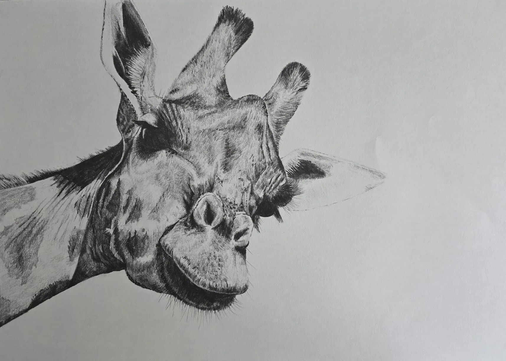
The three core techniques become realism when you apply them to real surfaces. Skin is smooth and needs subtle gradation. Fur and hide are directional. Wrinkled skin, as on an elephant, needs strong value contrast between deep creases and lit ridges. Scales, cloth, metal and wood each have a signature: a pattern of light, edge and direction you can learn to reproduce.
Our guide to drawing realistic textures in graphite works through each material, using graphite animals as examples. For subject-specific study, books on texture, animals and portraits are covered in our best books to improve your drawing.
Erasing, lifting and highlights
In graphite the eraser is a drawing tool, not just a corrector. A kneaded eraser can be shaped to a point and pressed to lift highlights; a vinyl eraser removes cleanly; an electric or pencil-style eraser gives precise, narrow highlights such as whiskers or the glint in an eye. Erasing removes tone; lifting takes a little off, keeping the drawing soft.
Choosing the wrong eraser can burnish the paper or leave residue, and erasing too vigorously can damage cartridge paper. Our guide to the best erasers for graphite explains each type and when to reach for it.
Keeping the drawing clean
Graphite smudges because it is a loose layer of flakes sitting on the paper’s surface. The hand you draw with is the main culprit, followed by careless storage and packing. A slip sheet under your hand, a sensible working order and a cautious approach to fixative solve most problems. Our guide to how to avoid smudging pencil drawings covers hand position for left and right-handed artists, framing and storage.
Common mistakes
- Pressing hard too early. Heavy pressure flattens the paper’s tooth and leaves shiny, hard-to-erase marks. Start light and darken gradually.
- Using one grade for everything. A single HB cannot produce both delicate highlights and deep shadows without excess pressure. Use several grades.
- Ignoring the lights. Beginners often leave everything mid-grey. Keep your lightest tones genuinely light and plan them from the start.
- Outlining everything. A hard line around a form flattens it. Let edges come from changes in tone, and vary between crisp and soft.
- Smearing as you draw. Work on a slip sheet and avoid dragging the side of your hand through finished areas.
- Skipping value checks. Squint, or use the value study tool, to see whether the drawing has a full range from light to dark.
A starter kit
You need less than most kits contain. A sensible, inexpensive starter set is:
- Five or six pencils: 2H, HB, 2B, 4B and 6B cover most needs.
- A pad or sheets of cartridge paper, plus one or two sheets of cold press paper to compare.
- A kneaded eraser and a vinyl eraser.
- A blending stump or two, and a piece of tissue.
- A sharpener or craft knife and a sanding block or fine sandpaper for shaping points.
- A clean sheet of scrap paper to use as a slip sheet.
Add charcoal only when you want bolder work: a few vine sticks and a compressed charcoal pencil are plenty to begin. If you plan to work from a photograph, the grid drawing tool helps you place proportions accurately before you begin shading.
Where to start: a learning path
- Grades and paper. Read pencil grades explained, swatch your pencils and note how they behave.
- Shading. Spend a week on value scales, gradients and simple forms with how to shade with pencil.
- Hatching. Learn to build tone from lines with hatching and cross-hatching.
- Blending. Add smooth transitions with how to blend graphite.
- Cleanliness and correction. Pick up smudge control and erasers.
- Textures. Apply everything to real surfaces with realistic textures in graphite.
- Charcoal. Explore the best charcoal for drawing once graphite feels comfortable.
Every guide in this section
- Graphite pencil grades explained - decode 9H to 9B and pick the grades that matter.
- Best graphite pencils for drawing - what to look for and which kit suits your subject.
- How to shade with pencil - pressure, grip and a practice sequence.
- Hatching and cross-hatching - build tone from lines, including on curved forms.
- How to blend graphite - stumps, tissue, chamois and keeping darks clean.
- Graphite vs charcoal - a table-led comparison to help you choose.
- Best charcoal for drawing - vine, compressed, pencils and dust safety.
- How to draw realistic textures in graphite - hide, scales, fabric, metal and wood.
- Best erasers for graphite - lift, erase and create highlights.
- How to avoid smudging pencil drawings - protect a drawing while you work and afterwards.
Related pillars
Graphite artists often benefit from the tonal thinking in value in drawing, and those who also work in colour can explore the coloured pencil pillar, paper guides and drawing techniques. For a wider reading list, start with the learn section.
If you are just starting out, read our guide to the best drawing pencils for beginners, then practise tone with the basic forms and shading lesson and the shadows and light lesson. The full how to draw hub puts these skills to work on real subjects.
The short version
Learn the grades, choose paper with some tooth, and treat shading, hatching and blending as three separate skills. Keep your lightest lights, keep your hand off the drawing, and add charcoal when you want deeper, softer darks. Start small, practise regularly and let each technique earn its place in a finished drawing.