
Two artists can own identical pencils and produce very different drawings, and the reason is often the sheet underneath. Paper controls how much pigment a surface will hold, how smooth a blend can get, whether you can lift a highlight back out and whether the whole thing survives a fortieth layer. A mismatch shows up as pilling, patchy colour or a shine that never quite arrives.
This guide is the map for everything paper-related on the site. It explains the properties that matter, introduces the four papers Michael Brace works with and when to reach for each, compares white, grey and toned options, and finishes with a decision guide by subject and a set of buying tips. Every section links to a deeper guide when you want the detail. Everything here applies to coloured pencils, known as colored pencils in the US, as well as graphite.
New to drawing? Start with our best drawing paper for beginners, see how drawing on black paper differs, and compare notebooks in the best sketchbooks for drawing. If you are choosing a sheet size, the paper sizes hub lists the standard formats.
How paper shapes the result
Five properties do most of the work. Learn these and any paper label becomes readable.
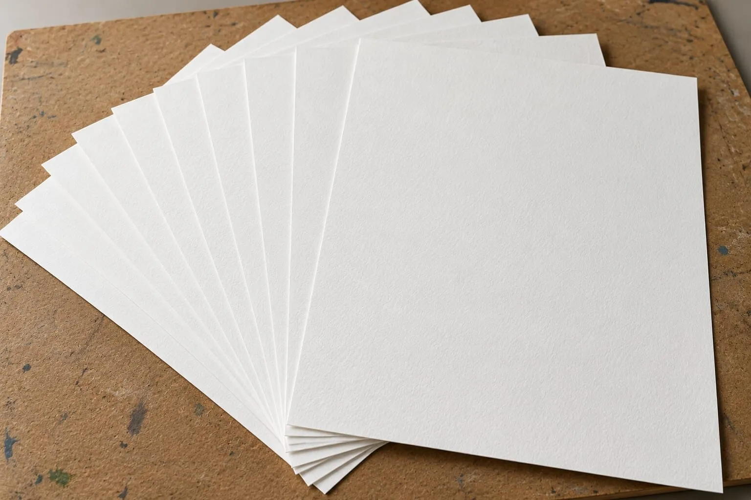
Weight is how thick and sturdy the sheet is, measured in gsm (grams per square metre). Lighter papers, roughly 120 to 180 gsm, are flexible and good for sketching, but they can buckle or wear under heavy coloured pencil. Heavier papers feel more like card: they stay flat, resist damage and allow dozens of layers. Our guide to paper weight in gsm explained covers the numbers, and the paper size converter helps when a shop lists sizes or weights in units you do not use.
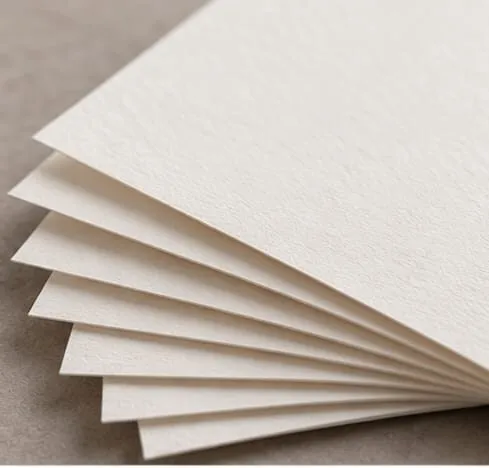
Tooth is the texture: the tiny hills and valleys that catch pigment. High tooth grips layer after layer and makes colour punchy, but the texture shows in the finish. Low tooth gives a smooth, almost creamy result but fills up sooner, so you need gentle pressure and patience. See smooth versus textured paper for how this plays out.
Surface is the manufacturing finish. Hot press is smooth, cold press is lightly textured, and rough is strongly textured. Our hot press versus cold press guide explains which suits which medium.
Colour changes the whole drawing. White gives you the full value range downward from the paper itself. Grey and toned papers start in the middle, so you build both lights and darks.
Archival quality decides whether the work will last. Acid-free, museum-grade papers resist yellowing for decades; cheaper papers may not. If you intend to sell, read archival paper for selling your drawings.
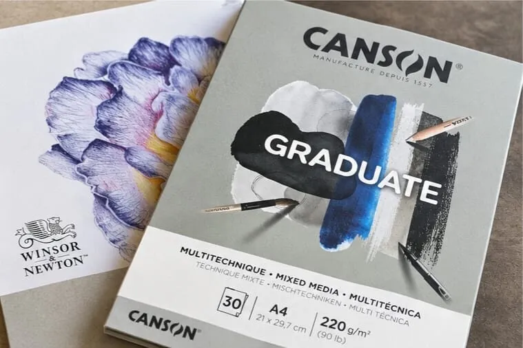
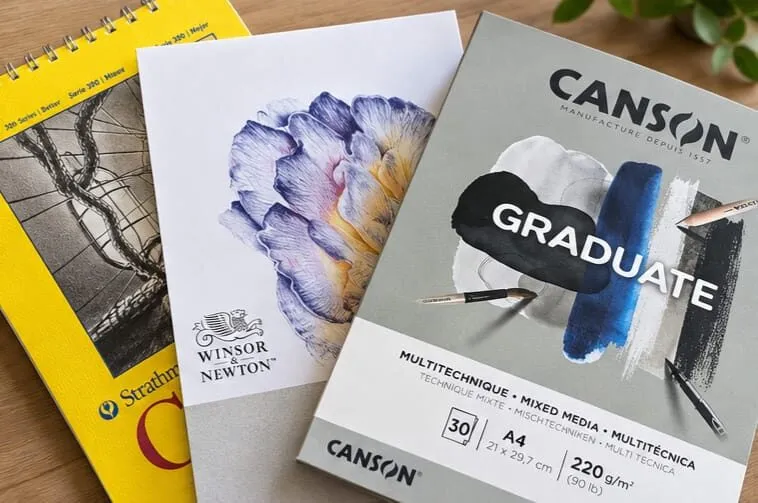
A grey mixed media paper pad beside a sheet with a purple flower drawing.
The four papers Michael works with
Michael’s approach is to know a small number of papers very well rather than to keep switching. These four cover his still life, portraits and atmospheric work. The detailed head-to-head is in Canson vs Arches vs Stonehenge vs Clairefontaine; here is the working summary.
Canson Mixed Media grey
The bold one. It is textured, grainy and robust, with strong tooth that grips pigment and lets you layer again and again while colour stays vivid. Because it is a mid-tone paper, you build light and dark rather than starting from zero. It is Michael’s first choice for reflective and glossy subjects: metal, icing, glaze, glass. Michael works on paper of around 300 gsm for this kind of work. It is durable rather than always fully archival, so it is superb for still life, studies and practice, and worth checking before you sell.
Arches Hot Press
The elegant one. A premium watercolour paper with a smooth, consistent surface that coloured pencil artists favour for portraits, because it allows subtle transitions and delicate shading. It is strong enough for heavy layering yet smooth enough for fine detail. Pigment sinks into the smooth surface, so it is harder to lift from and rewards planning. It is fully archival and handles burnishing and solvents well. Check the current weight on the label; Michael describes it as around 300 gsm.
Stonehenge White
The soft one. Velvety and forgiving, it allows deep layering without feeling scratchy, and colour sinks into the fibres with a natural, painterly softness. Michael reaches for it for skin, fur, feathers and botanical work, and it lifts gently and burnishes without streaking. Michael describes it as roughly 250 gsm, so gentle layering suits it best.
Clairefontaine Paint’On Gris
The dramatic one. It is darker and atmospheric, slightly smoother than Canson, with a subtle drag under the pencil that feels almost like paint. Michael uses it for moody still life and expressive portraits where the paper should contribute to the overall tone. It sits in the midweight range, around 250 gsm, so it blends well but is a little less resilient under repeated erasing.
| Paper | Colour | Tooth | Best for | Watch out for |
|---|---|---|---|---|
| Canson Mixed Media | Grey | Heavy | Glossy, reflective still life | Not always fully archival |
| Arches Hot Press | White | Minimal | Portraits, botanical, fine detail | Hard to lift; needs planning |
| Stonehenge White | White | Soft | Skin, fur, feathers, soft realism | Lighter weight; gentle layering |
| Clairefontaine Paint’On Gris | Dark grey | Fine | Moody still life, expressive portraits | Slight staining with heavy pigment |
White, grey or toned?
This is the choice that changes a drawing most.
On white paper every mark is darker than the surface, so your lightest tone is the paper itself. That is natural for soft, warm subjects, but bright highlights must be protected as untouched paper for the whole drawing.
On a mid-tone grey the paper sits in the middle of your range. Darker pencils build shadows, light pencils and white build highlights, and both are additions. A crisp white mark on grey looks brighter than bare white paper can, because your eye compares it with the tone around it. That is why glossy and reflective subjects come alive there. Our full guide, why use grey paper for coloured pencil, goes through choosing light, mid and dark greys, and colour theory on grey paper shows how colours shift over a toned ground.
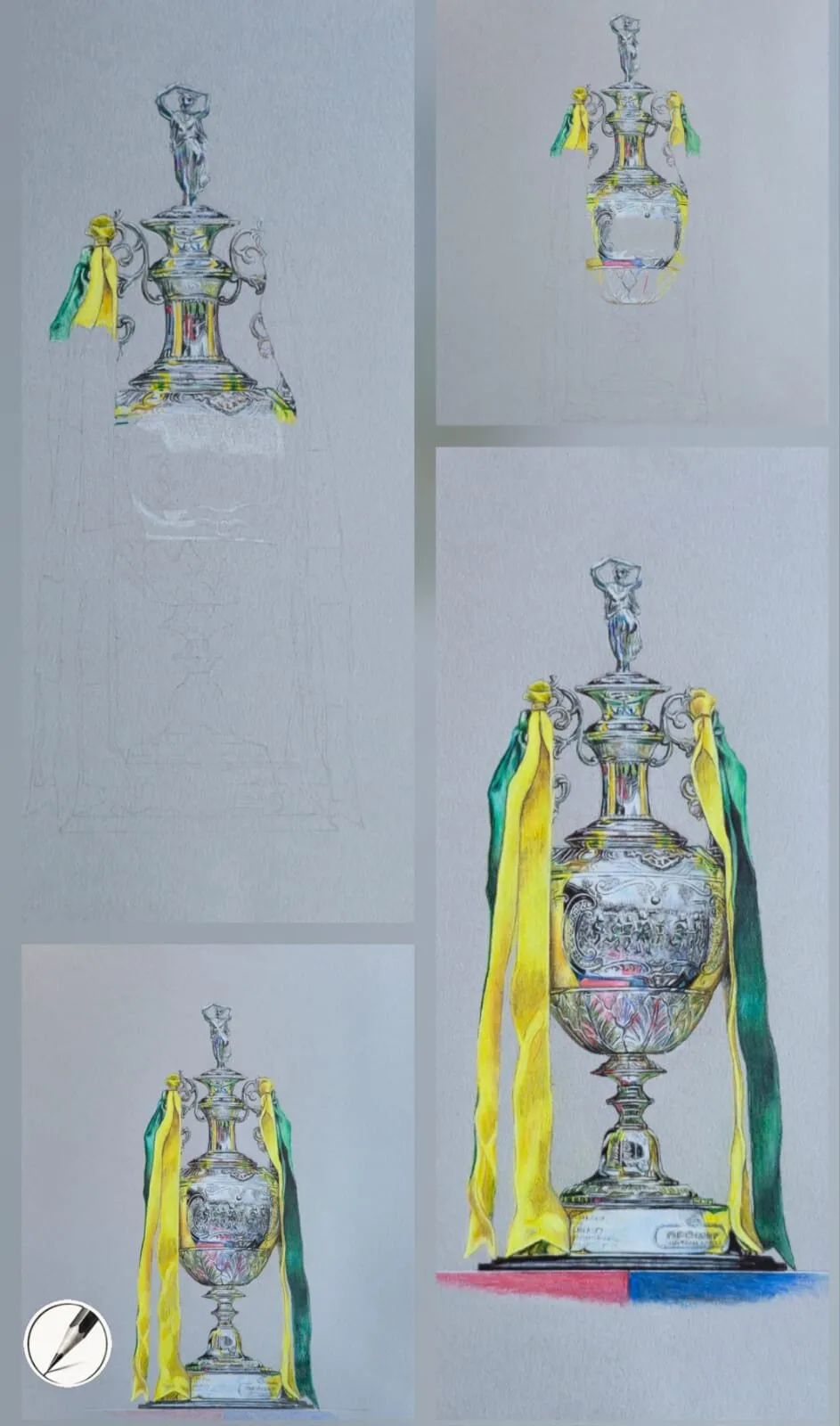
Silver built in stages on grey paper: darks and mid-tones first, then crisp highlights last.
White cartridge paper, cream and warm sheets suit animals, figures, athletes, musicians and full-frame compositions that resemble film stills. Cartridge absorbs pencil differently, giving deeper tones and softer blends, which is ideal for chiaroscuro and blurred effects but less suited to high-gloss finishes. See when to use cartridge paper for the detail.
Graphite versus coloured pencil needs
The two media want different things from a sheet.
Coloured pencil stacks pigment, often in many thin layers, so the paper must resist pilling and keep accepting pigment. Michael uses Arches Hot Press and Stonehenge White for the smooth, creamy, almost oil-paint depth they allow, and heavier weights of around 250 to 300 gsm give the strength for multiple layers.
Graphite is about tonal range, rich shadows and crosshatching, so it likes a little more tooth. Michael points to Arches Cold Press and Winsor & Newton cartridge paper for graphite, since their tooth builds dark shadows cleanly. Our best paper for graphite drawing guide compares these, and the pencil grade chart helps you match grades to a surface. For the wider medium, see the graphite and charcoal hub.
Which paper for which subject
Use this as a starting point, then adjust to your own taste.
| Subject | Start with | Why |
|---|---|---|
| Metal, chrome, trophies | Canson Mixed Media grey | Tooth and grey ground make highlights glow |
| Glazes, icing, glossy food | Canson Mixed Media grey | Crisp highlights over smooth mid-tones |
| Moody or dramatic still life | Clairefontaine Paint’On Gris | Dark ground adds atmosphere |
| Skin and portraits | Arches Hot Press | Subtle transitions, fine detail |
| Fur, feathers, botanical | Stonehenge White | Velvety layering, gentle lifting |
| Animals, athletes, full-frame scenes | White cartridge or Stonehenge | Warm, soft blending |
| Graphite portraits and animals | Arches Cold Press or W&N cartridge | Tooth for rich shadows |
| Studies and travel | A good sketchbook | Portability and low cost |
If your work is heavily layered realism whatever the subject, best paper for realistic drawing explains why surface has to outlast the number of layers you plan.
Where to start: a path through this cluster
If you are new to choosing paper, follow this order.
- Read the best paper for coloured pencils for the four main recommendations and who each suits.
- Open Canson vs Arches vs Stonehenge vs Clairefontaine for the side-by-side comparison.
- Learn the vocabulary with paper weight explained, smooth versus textured paper and hot press versus cold press.
- Decide on colour: why use grey paper or when to use cartridge paper.
- Pick for your medium and goal: best paper for realistic drawing, best paper for graphite drawing, best sketchbooks for coloured pencil and archival paper for selling your drawings.
Every guide in this cluster
- Best paper for coloured pencils - the four picks, who they suit and a quick-reference table.
- Canson vs Arches vs Stonehenge vs Clairefontaine - a point-by-point comparison with a verdict.
- Best paper for realistic drawing - surviving dozens of layers and avoiding pilling.
- Why use grey paper for coloured pencil - when a mid-tone beats white.
- When to use cartridge paper - warm subjects, soft blends and its limits.
- Paper weight in gsm explained - what the numbers mean in practice.
- Smooth versus textured paper - how tooth changes layering and finish.
- Hot press versus cold press paper - which surface suits your medium.
- Best paper for graphite drawing - tooth for rich shadow and crosshatching.
- Best sketchbooks for coloured pencil - portable options for studies.
- Archival paper for selling your drawings - protecting work that leaves your studio.
Paper is one leg of a three-part decision. Once you know the sheet, choose pencils in the coloured pencils hub, then learn to use them well in techniques, where how to layer coloured pencils and how to burnish coloured pencils depend directly on the surface you have chosen. The learn hub collects books and courses, and the art world hub covers framing, pricing and selling once the drawing is done.
Buying tips
- Buy one sheet or a small pad first. Papers behave differently under your pencils, and testing is essential before you commit to a large pack.
- Test before a finished piece. Swatch your pencils, layer six or seven times, then try lifting and erasing. Note whether the surface begins to pill.
- Match weight to ambition. For detailed, many-layered work, choose heavier paper. Save lighter sheets for sketches and studies.
- Check the label, not the memory. Weight, surface and archival status can differ between lines from the same brand.
- Think about the end use. If a drawing may be sold or exhibited, use acid-free, archival paper from the first mark.
- Consider the frame. Standard sizes make framing cheaper; the paper size converter and the frame and mount calculator help you plan ahead.
- Keep a paper log. A quick note of paper, pencils and what worked turns every drawing into a reference for the next.
The short version
Choose Canson Mixed Media grey for glossy, reflective still life, Arches Hot Press for portraits and fine detail, Stonehenge White for soft realism, and Clairefontaine Paint’On Gris for atmosphere. Pick grey when the subject is shiny or dramatic and white or cream when it is soft and warm. Buy heavier paper, test it first, and use archival stock for anything you plan to sell. From here, the best paper for coloured pencils is the natural next step.