Paper & Surfaces
Clairefontaine Paint'On Gris Review for Coloured Pencil
A Clairefontaine Paint'On Gris review for coloured pencil (colored pencil): darker tone, slight drag like paint, lifting and staining, and moody still life.
This guide contains affiliate links. If you buy through them we may earn a small commission at no cost to you. How this works.
Jump to recommended products
Key takeaways
- ◆Clairefontaine Paint'On Gris is darker, atmospheric and slightly smoother than Canson, with a subtle drag under the pencil that feels almost like paint.
- ◆Its fine tooth gives enough grip for layering but smooth enough for painterly effects and broader areas of contrast.
- ◆Michael places it in the midweight range at about 250 gsm, so it is flexible but a little less resilient if you erase repeatedly.
- ◆It lifts well but can stain slightly with heavy pigment, and archival status varies by line, so check the maker's current spec.
- ◆It suits moody still life and expressive portraits; choose Canson for maximum lifting and Arches or Stonehenge for archival certainty.
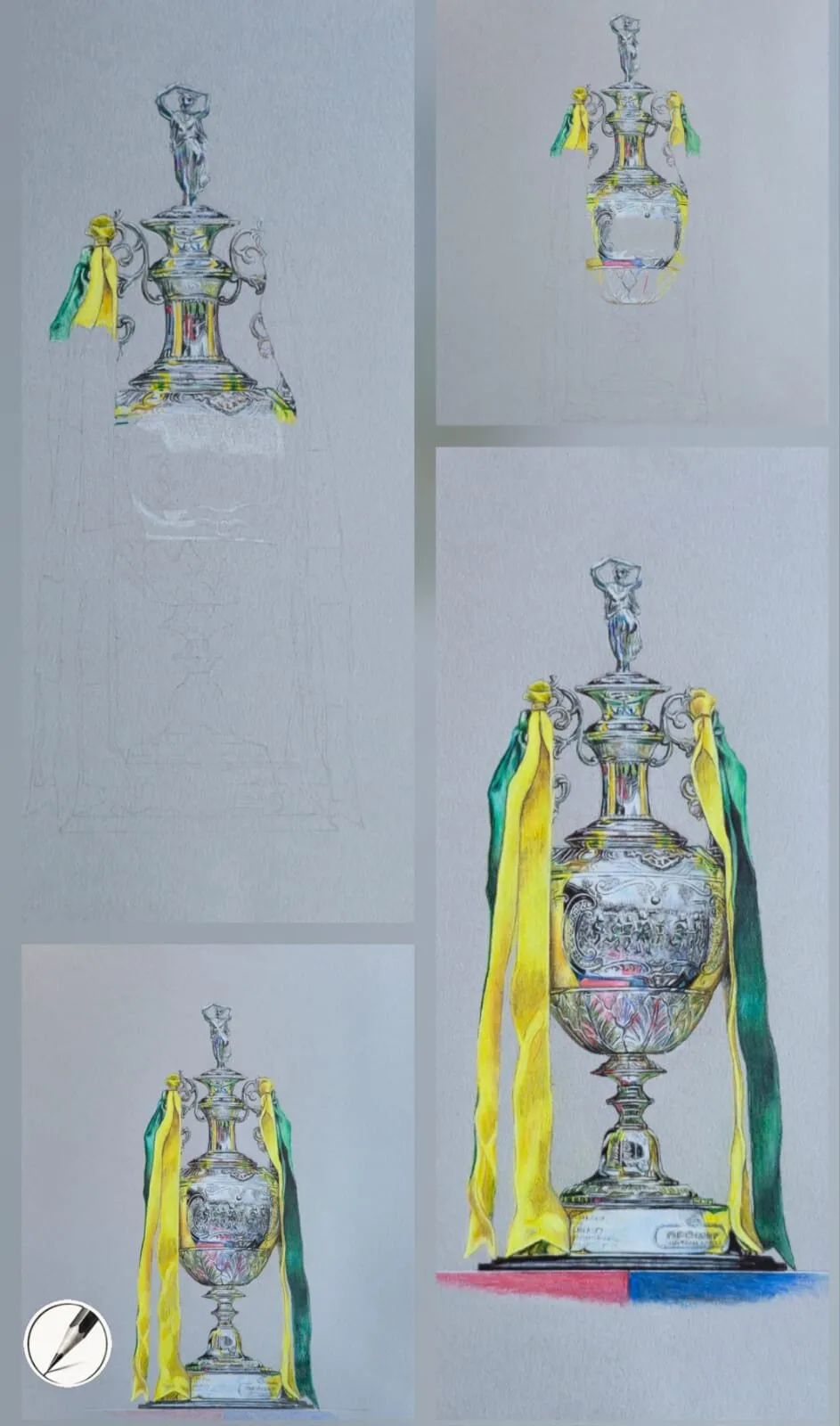
Clairefontaine Paint’On Gris is the dramatic one. It is darker than most grey papers, it lets the ground contribute to the overall tone, and under the pencil it has a slight drag that Michael compares to paint. It suits artists who want mood and contrast more than clinical precision.
This review covers the feel, tooth, weight, layering, lifting, burnishing and archival questions, plus who should choose it and who should not. Coloured pencils, called colored pencils in the US, behave the same on it whichever spelling you use. For the wider view, see the paper guide and the Canson vs Arches vs Stonehenge vs Clairefontaine comparison.
What it is
In Michael’s comparison, Clairefontaine is darker, atmospheric and slightly smoother than Canson. It is perfect for moody still life, expressive portraits and drawings where you want the paper to contribute to the overall tone. The paper is a grey midtone, and the darker tone means more of the drawing is built by adding light rather than darks.
The reasoning behind toned grounds is covered in why use grey paper for coloured pencil, and the darker end of the range is explored further in drawing on black paper.
Drawing materials on a table: sheets of paper, pencils, a wooden mannequin, an eraser and a sharpener.
Feel and tooth
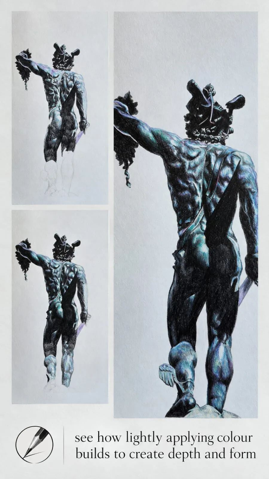
Clairefontaine has fine tooth, which is enough grip for layering but smooth enough for painterly effects. The surface is smooth with a slight drag: the pencil does not glide as freely as on Arches Hot Press, nor bite as aggressively as on Canson. The result is a finish that blends into the surface, with colours that settle painterly rather than sitting on a grain.
Paint’On Gris is a smooth, slightly textured sheet, so you can work broader areas of contrast without the grain dominating. See the paper tooth guide for how this compares with other surfaces.
Weight
Michael places it in the midweight range, around 250 gsm, alongside Art Gecko grey sketchbooks at roughly 200 to 250 gsm. That makes it slightly more flexible and easier to blend on, but also a little less resilient if you erase repeatedly. It is good for mixed media too. Product specifications differ between lines and change over time, so check the maker’s current spec. For background, read paper weight explained.
A collection of white and brown paper rolls.
Layering
Michael calls the layering painterly: colours blend into the surface beautifully. A sensible approach:
- Light pressure first. The fine tooth fills sooner than a heavy grain.
- Sketch the darkest shapes quietly, then bring up mid-tones and lights.
- Use the paper as a mid-dark value. Because the ground is darker, light pencils do more work for you.
- Keep white and pale pencils for last so the highlights stay bright.
The method in how to layer coloured pencils applies, and underpainting in coloured pencil shows how muted colours can set mood before final colour goes on.
Lifting and staining
Clairefontaine lifts well, but Michael notes it may stain slightly with heavy pigment. So very saturated or dark layers can leave a faint trace where you erase, and corrections on heavily worked passages may never disappear completely.
Burnishing
Michael says Clairefontaine burnishes with a paint-like finish. Burnishing is pressing hard, usually with a light pencil, to smooth and polish an area, flattening the tooth. It is best done last, as it leaves little room for extra colour. See how to burnish coloured pencils.
Archival quality
Michael’s source says Clairefontaine is generally archival but varies by line. That means you should check the maker’s current specification for the exact product rather than assume. If you sell or exhibit, see archival paper for selling your drawings.
Best subjects
- Moody still life. Dramatic lighting and expressive shadows benefit from the darker ground.
- Expressive portraits. The painterly drag supports looser, more atmospheric handling.
- Atmospheric scenes, where the paper tone should carry part of the composition.
How it compares
| Quality | Clairefontaine Paint’On Gris | Canson Mixed Media grey | Arches Hot Press |
|---|---|---|---|
| Tone | Darker grey | Mid grey | White |
| Tooth | Fine | Heavy | Minimal |
| Lifting | Good, may stain | Excellent | Hardest |
| Weight (Michael) | About 250 gsm | About 300 gsm | About 300 gsm |
| Best for | Atmosphere | Glossy still life | Portraits |
If you want the strongest grain and lifting for glossy subjects, try the Canson Mixed Media grey review. For smooth, archival portrait work, see Arches Hot Press. The best paper for coloured pencils list shows all four together.
Working on a darker ground
A darker paper changes how you plan a drawing. On white you start at the lightest value and add darks; on a mid-dark grey you are adding both, and the paper itself becomes your deep mid-tone. That has a few practical effects.
- Lights carry the drawing. Pale and white pencils do most of the work in highlights, so keep them sharp and save them until the darker structure is established.
- Shadows can be quiet. Because the paper is already dark, you may need fewer layers in shadow areas, which is where the paper contributes to the overall tone.
- Edges matter. Crisp transitions between light and ground read strongly, so plan your contrasts rather than filling everything evenly.
If you are new to toned paper, the colour theory on grey paper guide explains how colours shift against a grey ground, and the value study tool helps you check your light and dark pattern before you start.
A sensible first project
If you have not used the paper before, start with a small still life of two or three objects under a single strong light. A simple subject lets you see how the ground behaves without a complicated drawing hiding the lessons.
- Swatch first. Lay down your main pencils in light, medium and heavy pressure on a corner, then try lifting each one.
- Block in the shapes lightly, using the whole drawing rather than finishing one corner.
- Establish the darkest darks with thin layers, checking them against the ground.
- Bring up the mid-tones and lights with light, layered strokes, changing direction between layers.
- Add the brightest highlights last, sparingly, so they sit clearly against the toned paper.
Keeping notes on what each pencil did on this surface saves time on later drawings, and it tells you whether the slight drag suits your way of working.
Common problems and fixes
- Faint staining after erasing. Plan highlights early, use lighter pressure in areas you may need to lift, and test your eraser on a corner swatch.
- The surface feels slick. The fine tooth fills sooner than a heavy grain, so keep pressure light and stop layering when the pencil no longer deposits colour.
- Colours look muted. A dark ground can dull pale colours; build them in thin layers and finish with a brighter top layer.
- Paper marks from repeated erasing. The midweight sheet is less resilient than heavier papers, so avoid repeated heavy erasing in one place.
Who should skip it
If you want the strongest grain, the best lifting and the most forgiving surface for learning, Canson is the friendlier choice. If you need certain archival status for every sheet, check the line you are buying or pick Arches or Stonehenge. And if your subject is delicate skin with very pale tones, a white or lighter ground will be easier to manage.
Buying advice
- Check the current spec. Weight, colour and finish differ across lines.
- Start small and swatch your pencils before committing.
- Plan size using the paper size converter and A3 dimensions.
- Pick pencils that suit dark grounds, and try the pencil set quiz.
The short version
Clairefontaine Paint’On Gris is a darker, atmospheric, midweight paper with a fine tooth and a slight drag like paint. It is excellent for moody still life and expressive portraits, lifts well but may stain, and its archival status varies by line. Choose it for mood. Choose something heavier or more clearly archival when the job demands it.
Where to buy
Recommended products
Affiliate links. We may earn a small commission if you buy, at no extra cost to you. Why?
Paper · Clairefontaine
Clairefontaine Paint On Gris
A darker grey paper with a painterly drag - atmospheric for dramatic lighting.
Buy on AmazonAffiliate link · opens Amazon
Quick answers
Frequently asked questions
Is Clairefontaine Paint'On Gris good for coloured pencil?+
Yes, particularly for moody still life and expressive portraits. It is a darker grey with a fine tooth and a subtle drag that feels almost like paint. It gives enough grip for layering while staying smooth enough for painterly effects, and the darker ground adds atmosphere to the whole drawing.
How heavy is Clairefontaine Paint'On Gris?+
Michael describes it as midweight, around 250 gsm, which makes it flexible and expressive but less tolerant of repeated erasing than heavier sheets. Products differ and change, so check the maker's current specification on the pad or label before you buy.
Does Clairefontaine Paint'On Gris stain when you lift colour?+
It lifts well, but Michael notes it may stain slightly with heavy pigment. That means very dark or saturated layers may leave a faint trace after erasing, so plan highlights and corrections early, and test lifting on a corner swatch with your own pencils.
Is Clairefontaine Paint'On Gris archival?+
Michael's source says Clairefontaine is generally archival but varies by line. Because of that variation, check the maker's current specification for the exact product before using it for work you intend to sell or exhibit.
Are colored pencils and coloured pencils the same?+
Yes. Coloured pencils is the UK spelling and colored pencils is the US spelling, and they are the same pencils. This review applies to either.