Graphite & Charcoal
How to Make a Value Scale for Drawing
Make a 5, 7 or 9 step value scale in graphite, choose the right pencil grades, control pressure, check your drawings with it and adapt it for coloured pencil.
Key takeaways
- ◆A value scale is a strip of steps from white to near black; five steps is enough to start, nine gives finer control.
- ◆Aim for evenly spaced steps that look equally different from their neighbours, not equal amounts of graphite.
- ◆Use several grades, such as 2H, HB, 2B, 4B and 6B, and build each step in light layers instead of pressing.
- ◆Use the scale to check a drawing: squint, compare areas to the steps and look for a missing light or dark.
- ◆For coloured pencil, make a separate scale in each colour, because every hue has its own darkest and lightest value.
A value scale is the smallest, most useful exercise in drawing. It is a strip of boxes that steps from white through greys to black, and it trains your eye and hand to work with a full range of tone. It is also a tool you keep using: drawing is judging value, and a scale is a ruler for that judgement.
This guide shows how to make a value scale with five, seven or nine steps, how to pick pencil grades and control pressure, how to check the evenness of the steps, how to use the scale to assess a drawing and how to adapt it to coloured pencil (colored pencil in the US). If you are still learning to shade, read how to shade with pencil alongside this guide, and see value in drawing for why value matters.
What a value scale is
Value is the lightness or darkness of a tone, separate from its colour. A value scale arranges values in order, from the lightest (the white of the paper) to the darkest you can achieve with your medium. It is most often drawn as a row of adjacent squares, each a single flat tone.
The aim is for each step to look equally different from the next. That is a perceptual goal rather than a measurable one: the steps should feel evenly spaced to the eye. It is tougher than it sounds, because our eyes judge relative contrast and a dark square next to a lighter one can fool us.
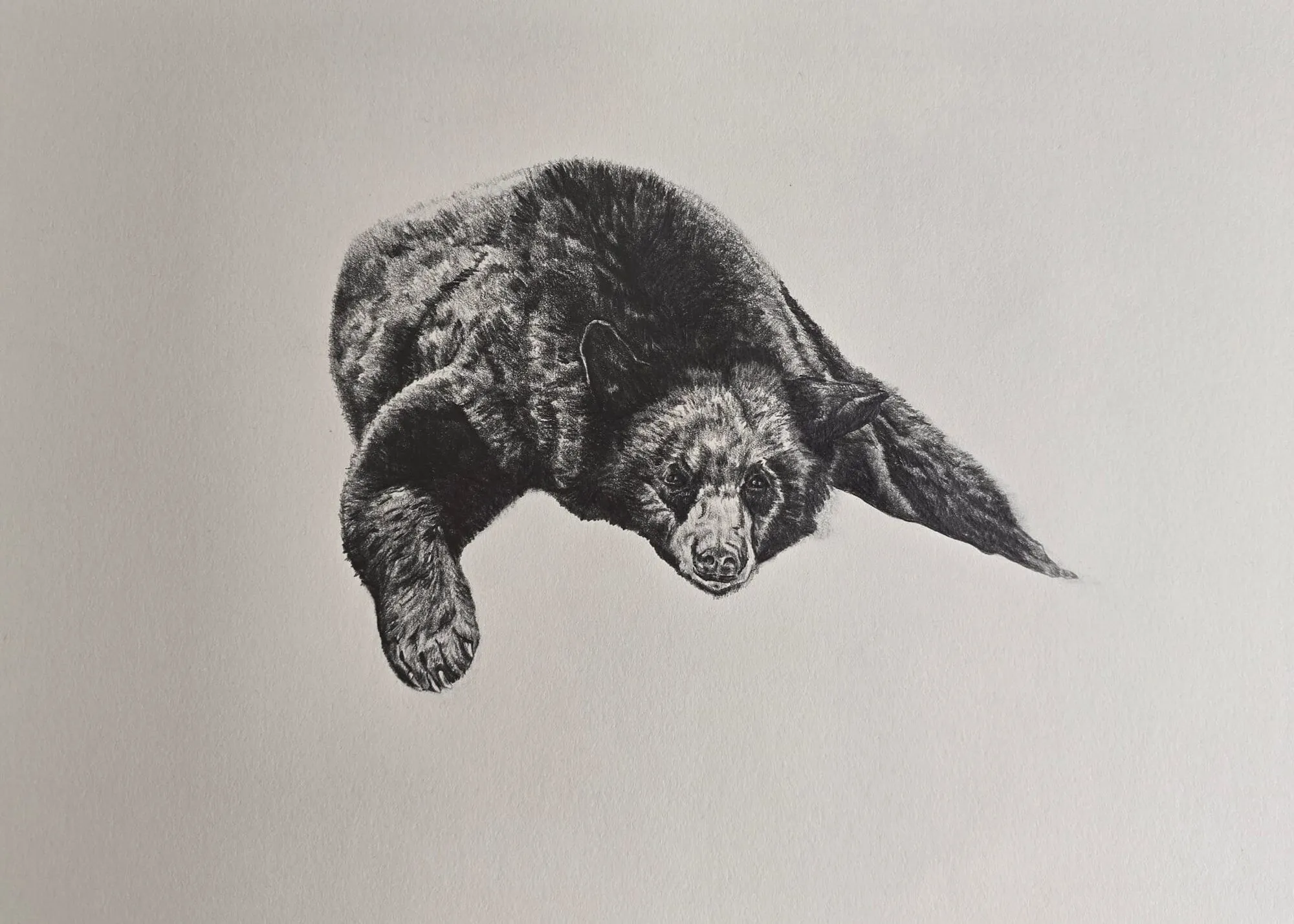
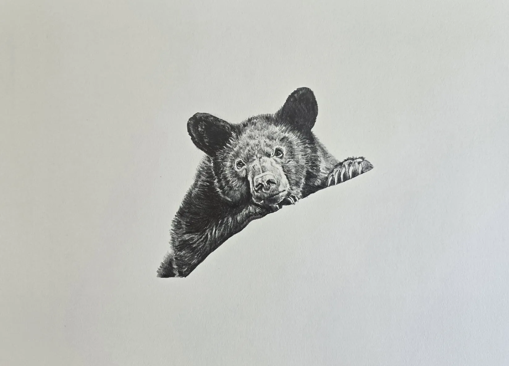
A bear lying down drawn in graphite pencil. Drawing by Michael Brace.
Five, seven or nine steps
| Steps | Good for | Notes |
|---|---|---|
| 5 | Beginners, quick planning | White, light, mid, dark, black |
| 7 | General drawing | Finer steps in the middle |
| 9 | Realistic work, portraits | Fine control; harder to keep distinct |
Nine is the classic scale for realistic drawing, but five is easier and often enough for planning a composition. Start with five, then seven and then nine as your control improves. Many artists make a nine-step scale and use it as a reference strip.
What you need
- Paper of the type you will draw on, as the same pencil looks different on different surfaces.
- A range of graphite pencils: 2H, HB, 2B, 4B and 6B cover most of the scale. See graphite pencil grades explained and the pencil grade chart for the spread of tones each grade gives.
- A ruler, a sharp pencil and a kneaded eraser.
- A scrap sheet to protect finished boxes from smudging.
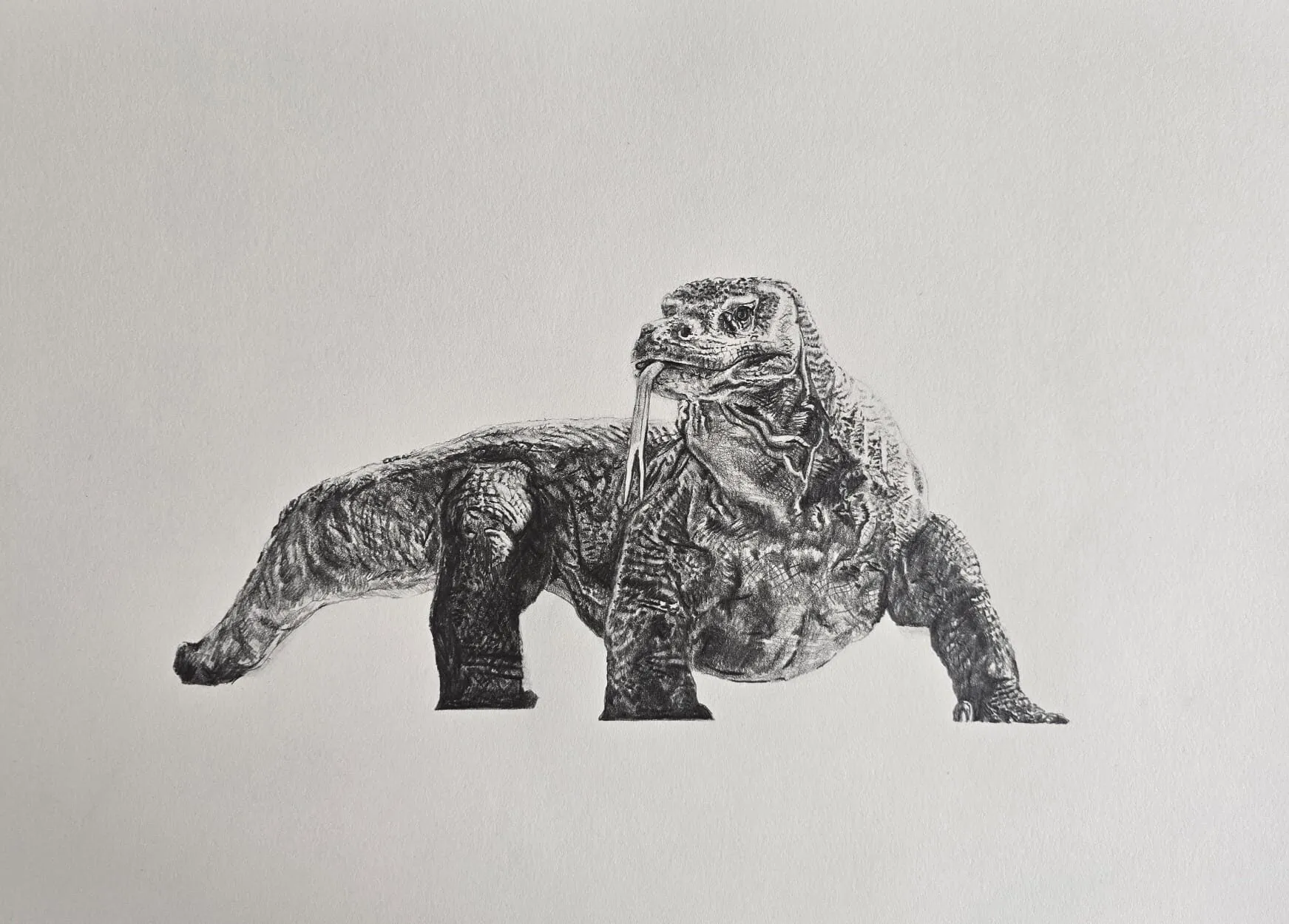
A lizard drawn in graphite pencil. Drawing by Michael Brace.
How to make a value scale, step by step
- Draw the strip. Use a ruler to draw a row of five, seven or nine boxes, each about 2 to 3 cm wide and 3 to 4 cm tall, touching one another. Keep the lines very light.
- Leave the first box white. This is the paper itself, your lightest light.
- Shade the last box. Use your softest pencil in several layers to reach the darkest tone you can without pressing hard. This fixes the top of your range.
- Mark the middle. Shade the centre box to a mid-grey. Now your scale has three anchors: light, mid and dark.
- Fill the gaps. Halve each remaining gap. On a five-step scale this finishes the job; on seven or nine, fill the other boxes between the anchors.
- Compare neighbours. Step back and squint. If two neighbours look the same, darken the darker one. If one jump is larger than the rest, add a layer to the lighter side.
- Adjust both directions. Do not only darken. If the scale ends up too dark overall, lift tone with a kneaded eraser.
Working from the ends to the middle is easier than starting at one end and counting steps, because you know where your range begins and ends.
Choosing grades
Graphite alone cannot always give a very dark tone on smooth paper, so use a range of pencils. A workable approach:
| Steps (9) | Suggested grade |
|---|---|
| 1 | Paper white |
| 2 | 2H, very light |
| 3 | HB, light |
| 4 | HB or 2B, light |
| 5 | 2B, mid |
| 6 | 2B or 4B, mid-dark |
| 7 | 4B |
| 8 | 4B or 6B |
| 9 | 6B or softer, in layers |
These are starting points, not rules, since grades differ between brands and respond differently to paper. Swatch your own pencils on your own paper, and adjust. If you want to see how grades compare, the best graphite pencils for drawing guide is a good reference.
Controlling pressure
Pressure control is the hidden skill behind a good scale. Graphite darkens mainly with the number of layers, and pressing hard early makes the surface shiny and resistant.
- Use light, even layers. Two or three light layers with a harder pencil, then a softer pencil for the darkest steps.
- Overlap strokes. Keep your strokes close and slightly overlapping for an even, flat tone within each box.
- Change direction between layers. This avoids streaks.
- Use the side of the lead for flat tone and a sharp point only for the box edges.
- Practise a pressure ladder. Shade a row of boxes from barely touching to firm pressure with one pencil and see how many distinct tones one grade can produce.
Checking that the steps are even
Your eye can be fooled by adjacent tones, so use some checks:
- Squint. Blurring your vision merges detail and shows whether steps are distinct.
- Step back. Look from a few feet away, or view the scale in a mirror.
- Photograph it in black and white. Put the image into the value study tool, which reduces a picture to a limited range of values, and see whether each step separates clearly.
- Cover neighbours. Hide the other boxes with paper and compare two steps at a time.
Using a value scale to check a drawing
Once you have a scale, use it on your work.
- Squint at your subject and find the lightest light and darkest dark.
- Match the areas to steps on the scale. Is the shadow on the cheek a step 7 or a step 5?
- Compare your drawing. Hold the scale next to your drawing and see whether the values match the ones you saw.
- Look for gaps. Drawings commonly lack a true dark or a true light. If nothing in the picture reaches the darkest two steps, it will look flat.
- Limit the range. A strong composition often uses three or four main values, so group tones into light, mid and dark shapes before refining.
This checking habit is useful at every stage: in the first tonal sketch, at the half-way point and before calling a drawing finished. Comparing tones across the whole drawing, rather than finishing one area at a time, works well with a scale beside you, and how to blend graphite shows how to soften the transitions once the values are right.
Colour value scales
Coloured pencil has a value scale of its own, and it is a good way to learn a pencil range.
- Grey scale first. Make a graphite scale as above. It is your reference for value.
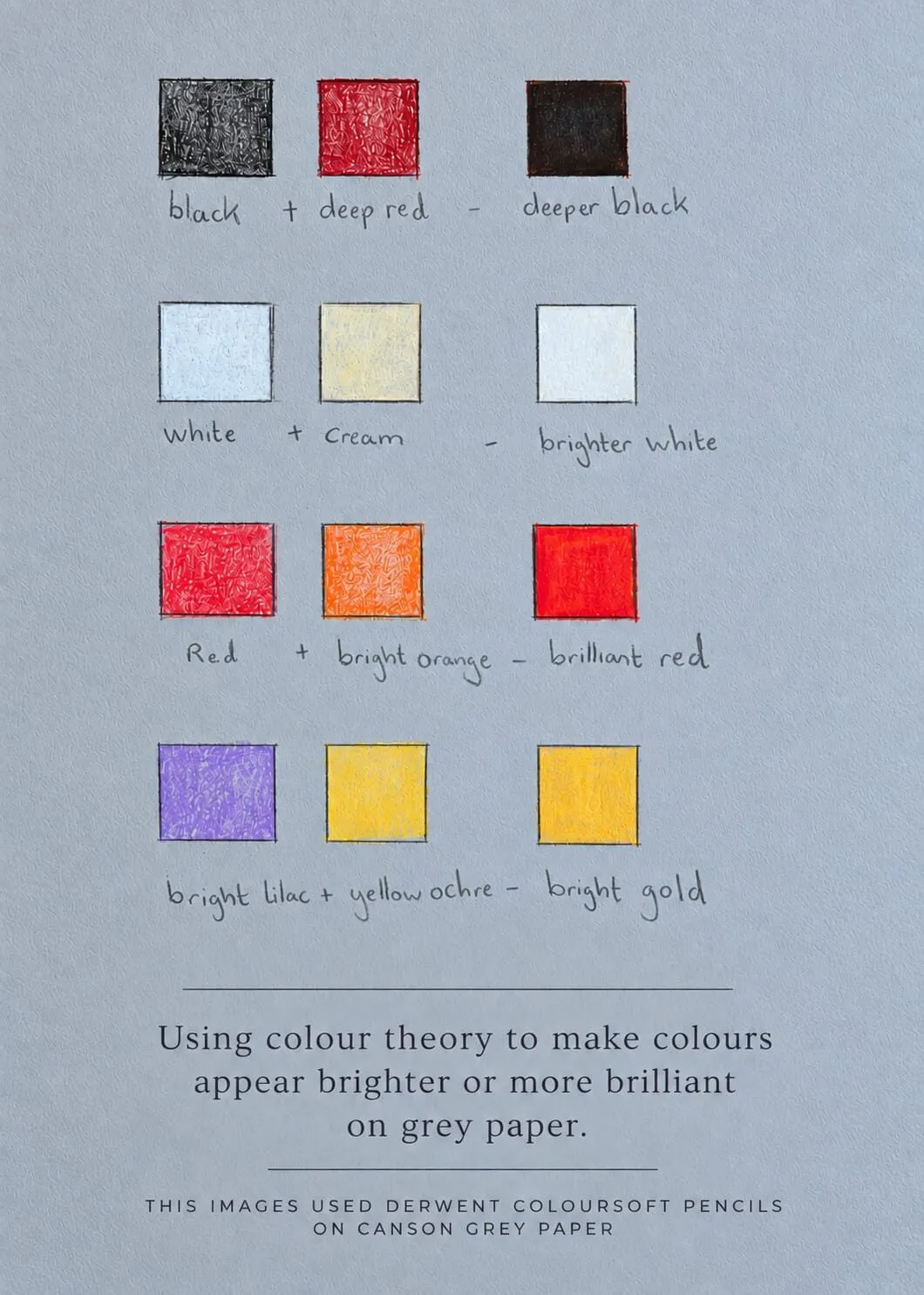
- Colour scale. For each colour, make a strip from the lightest tint, using light pressure, to the darkest layered shade, using several layers. Note that some colours cannot go very dark alone: a yellow will not reach the depth of a deep blue.
- Compare with the grey scale. Place a colour strip next to your grey scale, or photograph both in greyscale, to see what value each step matches.
- Use it for planning. Knowing that your yellow tops out at a mid-value tells you when to darken with a complementary or another hue.
This is the same idea taught in value in drawing. On grey or toned paper the paper itself becomes the middle value, so see why use grey paper for coloured pencil for how this changes your scale. For a comparison of coloured pencil ranges, see the best coloured pencils guide.
Common mistakes
- A weak dark end. If the darkest box is not dark enough, every other step compresses. Use a soft pencil and layers.
- Pressing for darkness. It flattens the paper and makes uneven tone. Build layers instead.
- Steps that are equal in graphite, not in appearance. What matters is how the steps look, not how much pencil you used.
- Ignoring the paper. The same pencils give a different scale on smooth and toothy paper.
- Making the scale once and forgetting it. Redo it on new papers and with new pencils.
Practice routine
Ten minutes a day for a week is enough to make a real difference.
| Day | Exercise |
|---|---|
| 1 | Five-step scale, one pencil |
| 2 | Five-step scale, three grades |
| 3 | Seven-step scale |
| 4 | Nine-step scale |
| 5 | Nine-step scale in a different medium, such as charcoal |
| 6 | Match a photo: pick five areas and find their steps |
| 7 | Redo day 4 and compare |
Combine it with the exercises in pencil drawing for beginners and the 30 day drawing challenge.
The short version
Draw a strip of five, seven or nine touching boxes, leave the first white, make the last as dark as you can reach and fill the middle in even steps. Use a range of grades, build tone in light layers, and check the result by squinting, stepping back or viewing a black-and-white photo. Then use the scale to judge your drawings, looking especially for a missing dark or light.
Quick answers
Frequently asked questions
How many steps should a value scale have?+
Five steps is enough for beginners: white, light grey, mid-grey, dark grey and near black. Seven adds finer control, and nine is the classic scale for detailed realistic work. More steps are harder to keep distinct. Start with five and move up when you can make each step clearly different from its neighbours.
What pencils should I use for a value scale?+
Use a spread of grades so you can reach both pale and dark tones without pressing hard: for example 2H for the lightest greys, HB and 2B for the middle and 4B or 6B for the darkest steps. Compare the result with a pencil grade chart, and make the scale on the same paper you will draw on.
Why is my value scale uneven?+
Uneven scales usually come from inconsistent pressure, tone that is too similar between neighbours or a darkest step that is not dark enough. Squint at the scale or photograph it in black and white to see where steps merge. Darken the steps that look alike and lighten any that jump too far.
Does a value scale work for coloured pencil?+
Yes. Make a scale in each colour, from the lightest tint to the darkest layered shade, and compare them with a grey scale. Every colour has a different natural value, so a yellow will not reach the depth of a blue. A scale helps you judge value separately from hue.