Graphite & Charcoal
Hatching and Cross-Hatching: Pencil Techniques
How to use hatching, cross-hatching, contour hatching, stippling and scribble tone in graphite, with spacing, density, curved forms and practice exercises.
Key takeaways
- ◆Hatching builds tone from parallel lines; closer or heavier lines read darker, wider spacing reads lighter.
- ◆Cross-hatching adds layers at different angles for deeper, more solid tone.
- ◆Contour hatching curves the lines around a form, so the marks describe shape as well as tone.
- ◆Consistent spacing and pressure matter more than speed; even lines look controlled and deliberate.
- ◆Combine hatching with light blending only when you want a softer result, keeping the line quality where it helps.
Shading with smooth tone is only one way to describe a form. The other is to build it out of lines. Hatching and its relatives are among the oldest drawing techniques, used in engraving, pen and ink and graphite alike, and they give a drawing structure and energy that smooth blending cannot. They also teach you to think about tone in terms of density: how many marks, how close, how heavy.
This guide covers straight hatching, cross-hatching, contour hatching, stippling and scribble tone, and explains how to control spacing and density, how to use these methods on curved forms and how to practise them. If you have not yet read our guide to how to shade with pencil, it is worth starting there, since the pressure and grip habits carry straight over.
Hatching
Hatching is a set of parallel or near-parallel lines that together create tone. Each line is a stroke, and the closer together the strokes, or the heavier the pressure, the darker the area reads.
To hatch well:
- Keep the lines parallel and evenly spaced within each area. Slight variation is natural, but wobbling spacing looks accidental.
- Use a consistent angle. A common angle for right-handed artists is around 45 degrees, sloping from lower left to upper right, because the wrist moves naturally that way. Left-handed artists often find the mirror angle more comfortable.
- Lift the pencil at the end of each stroke. This gives tapered ends that blend into the next line, avoiding hard stops.
- Keep your pencil sharp. A dull point makes thick lines that leave fewer gaps and reduce the range of tone.
Hatching on its own gives relatively light to middle tone. It is well suited to background areas, light shadows and any place where you want the paper to stay partly visible.
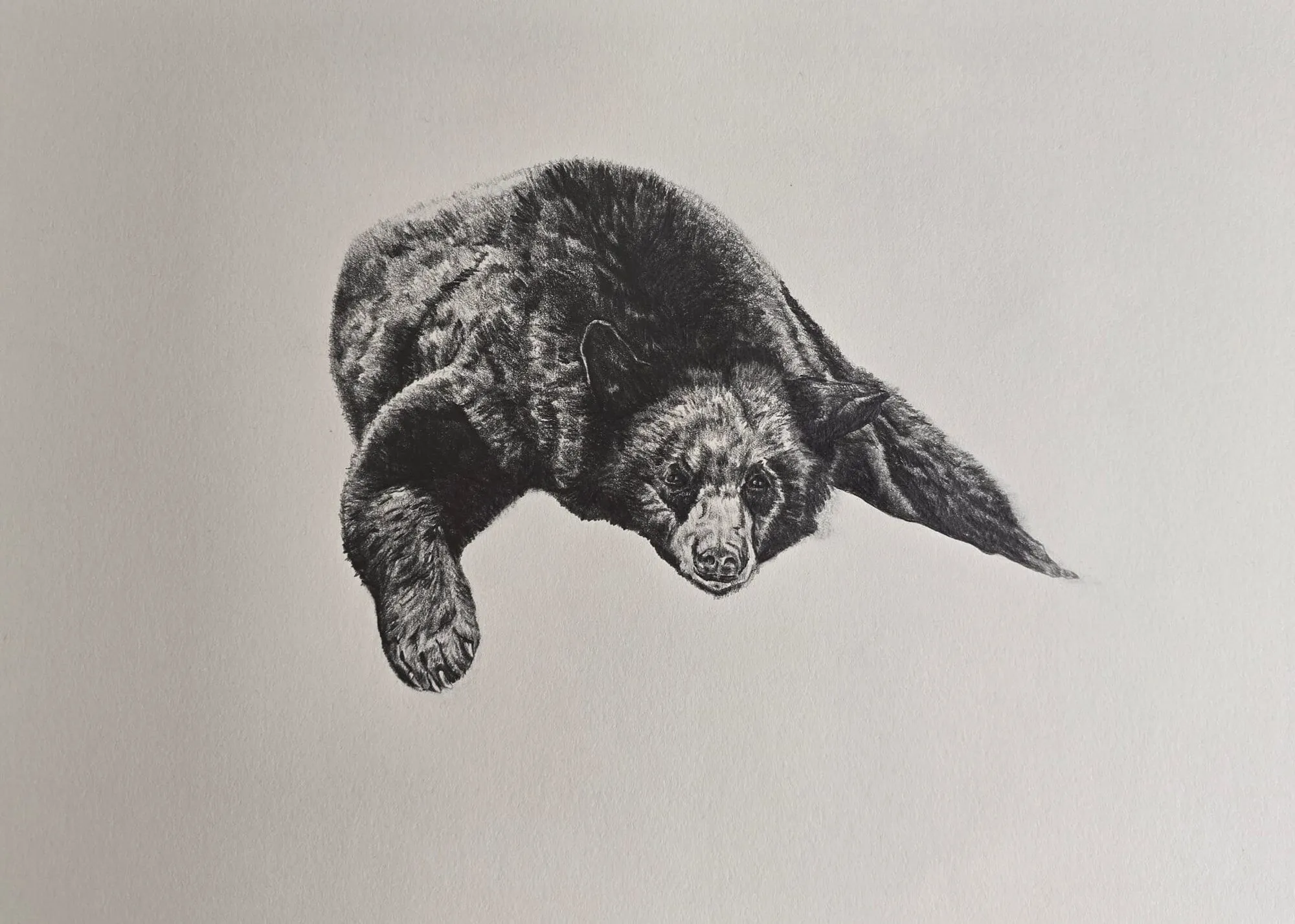
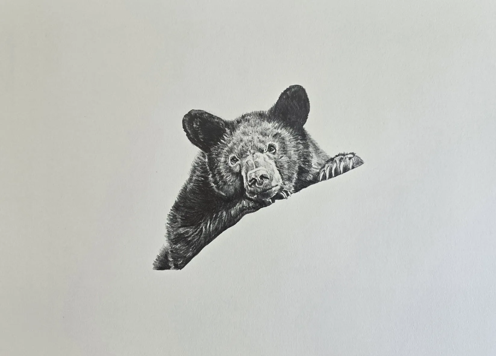
A bear lying down drawn in graphite pencil. Drawing by Michael Brace.
Cross-hatching
Cross-hatching lays a second set of lines across the first, usually at an angle between 30 and 90 degrees. A third or fourth layer at different angles gives deeper, more solid tone.
The principle is straightforward: each layer covers more of the paper, so tone darkens. The more layers, the darker the area, and the paper’s white gets progressively covered. Lines in each layer should also be lightly applied; heavy pressure in the first layer leaves you nowhere to go.
A practical layering plan:
- First layer: light hatching in the general direction of the form.
- Second layer: cross at roughly 45 to 60 degrees, same spacing.
- Third layer: only in the darker areas, at a different angle.
- Fourth layer: only for the deepest shadows, perhaps with a softer pencil.
Change the angle in a considered way. Layers at nearly the same angle can merge into a texture that looks heavy; layers at close to 90 degrees produce a visible grid, which can be a deliberate style but reads as mechanical if not intended. An angle of 30 to 60 degrees between layers is a good starting point.
Contour hatching
Contour hatching curves the lines to follow the surface of the form. On a sphere, the lines wrap around it like latitude lines; on a cheek, they follow the roundness of the bone; on an arm, they run across the cylinder of the muscle.
The benefit is that the direction of the lines describes the form, so even without tone the marks suggest volume. It is especially effective on:
- Rounded forms such as fruit, heads and animal bodies.
- Draped cloth, where the lines follow the folds.
- Skin and hide with a directional grain.
Start by drawing a few light guide lines that show how the surface curves, then hatch along those guides. As the surface turns away from you, the lines curve and often compress, which reinforces the sense of turning form.
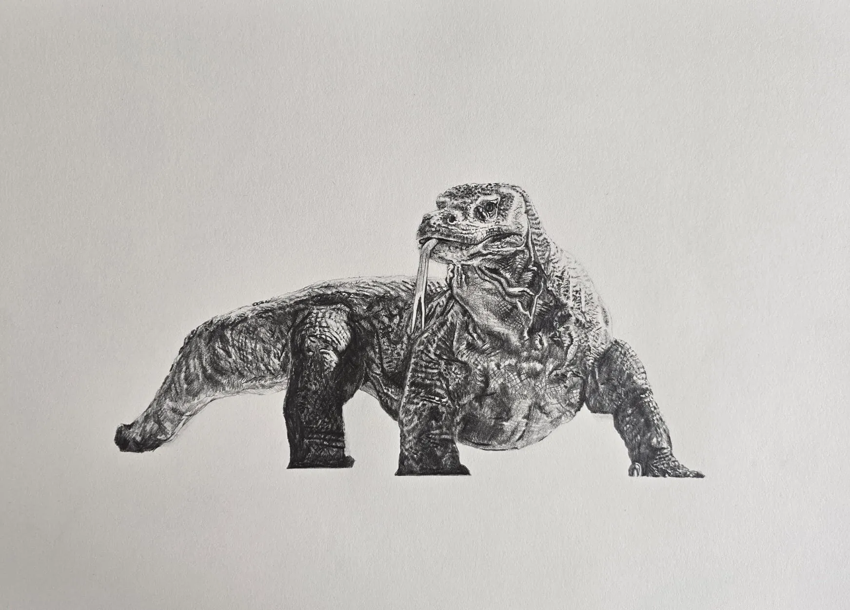
A lizard drawn in graphite pencil. Drawing by Michael Brace.
Stippling
Stippling builds tone from dots. The closer the dots, the darker the tone. It is slow, but it gives very smooth transitions and a distinctive granular look, and it is well suited to small, precise drawings.
Use a very sharp pencil, hold it upright and tap rather than drag. Keep a consistent dot size, and vary the density rather than the dot size to change tone. Stippling works best on smooth to medium tooth paper, since very rough paper breaks up the dots.
Scribble tone
Scribble tone, also called random hatching or scumbling, is loose, overlapping scribbles that build tone quickly. It is more expressive than hatching and can be used for foliage, fur, rough textures and backgrounds. Because the direction is not fixed, scribble tone blends into a smooth surface faster than parallel lines do.
Keep it controlled: use a consistent stroke size and a consistent speed, and overlap so that no gaps are left in the areas that should be dark. Vary the scribble density to change tone. A drawing built entirely from scribbles can look busy, so consider combining it with more controlled hatching in the focal area.
| Technique | Mark | Speed | Best for |
|---|---|---|---|
| Hatching | Parallel lines | Medium | Light to mid tone, backgrounds |
| Cross-hatching | Crossing layers | Slow | Deep shadow, structure |
| Contour hatching | Curved lines | Slow | Rounded forms, cloth |
| Stippling | Dots | Very slow | Smooth, fine tone |
| Scribble tone | Loose scribbles | Fast | Texture, foliage, fur |
Density and spacing
Tone in hatching is controlled by three things:
- Spacing: the gap between lines. Wider gaps look lighter.
- Pressure: heavier lines look darker, but keep it modest.
- Number of layers: more layers give darker tone.
Change tone gradually by shifting spacing or the number of layers across the area. To move smoothly from light to dark, you can start with widely spaced single hatching, then gradually add cross layers as you head toward the shadow. Avoid sudden jumps in spacing, which look like stripes.
A practical test is to step back or squint at the drawing. If the tone looks patchy or lines stand out individually, spacing needs to be more consistent or the layers need more overlap. The value study tool gives another way to check the result: it shows whether your hatched areas read as distinct values when the detail is stripped away.
Controlling tone with grade
Line quality is influenced by the pencil grade. Hard pencils, such as 2H, keep a fine point and give crisp, thin lines, making them useful for pale areas and precision. Softer pencils, such as 2B or 4B, give darker lines with less pressure but wear faster. A typical approach uses a harder pencil for the first layers of hatching and a softer one for the deepest cross-hatched shadows. Our guide to graphite pencil grades explained shows what to expect at each step, and the pencil grade chart tool compares them.
Hatching on curved forms
Curved forms are where hatching often goes wrong. Straight parallel lines across a sphere read as flat stripes, because the lines do not respond to the surface. Three fixes:
- Curve the lines to follow the form, as in contour hatching.
- Change spacing as the surface turns. Lines tighten near the shadow edge and open up toward the light.
- Change direction between layers so the shape is built up in stages.
On a cylinder such as an arm or a bottle, use lines that run either along the length or around the circumference, and let the density change across the width, dark on the shadow side, lighter on the light side. On a sphere, use curved lines that wrap the form, becoming denser toward the core shadow.
Practice exercises
Spend ten to twenty minutes on each.
- Even hatching squares. Draw four squares. Fill each with hatching at a different spacing, from wide to very tight. Aim for the lines being visually equal in spacing within each square.
- Tone ladder. Draw a strip of five boxes. Use hatching and cross-hatching to make an even value scale from white to dark, changing only spacing and layers.
- Gradient by hatching. Draw a rectangle and make a smooth gradient from light to dark using only hatching, letting spacing and layers change gradually.
- Sphere in contour hatching. Draw a circle and shade it with curved lines that wrap the form.
- Cylinder and cloth. Draw a cylinder and a piece of folded cloth and use contour hatching for both.
- Stipple and scribble comparison. Shade the same simple shape with stippling, scribble and hatching, and compare how each reads.
Once these feel easy, apply them to real subjects. Textures such as fur, hide and fabric respond especially well to hatching, and our guide to how to draw realistic textures in graphite shows how.
Combining with blending
Hatching and blending can work together. A smooth, blended base can carry hatched detail on top, or hatched tone can be softened with a stump to reduce visible lines. The key is to decide which you want the viewer to notice. Heavy blending removes line character; light blending keeps a hint of it. If you want a visible line drawing, avoid blending. If you want a smooth image with crisp accents, blend first, then hatch or cross-hatch the shadows and edges for definition. See how to blend graphite for the tools and methods.
Common mistakes
- Uneven spacing. Makes tone look patchy. Slow down and keep the gaps regular.
- Lines that start and stop heavily. Blunt starts and stops create blobs. Lift the pencil smoothly.
- Using one direction everywhere. Lines that ignore the form flatten it.
- Layers at the same angle. Adding another layer at the same angle just thickens the line.
- Pressing hard in early layers. You lose the ability to darken later.
- Dull pencils. A blunt point widens lines and fills the gaps you need.
Try hatching on the basic forms and shading lesson or when drawing a tree, where directional marks suit bark and foliage.
The short version
Hatching builds tone from parallel lines, cross-hatching adds layered angles for depth, contour hatching wraps the lines around the form, and stippling and scribble offer dots and loose texture. Control tone through spacing, pressure and layers, keep lines even, and curve them on round forms. Practise tone ladders and simple forms, then move to real textures. For the wider picture, return to the graphite and charcoal guide.
Quick answers
Frequently asked questions
What is the difference between hatching and cross-hatching?+
Hatching uses a single set of parallel lines to build tone. Cross-hatching layers a second set of lines at an angle over the first, and sometimes a third or fourth, to make tone darker and denser. Hatching gives lighter, more open tone; cross-hatching gives deeper, more solid shadow.
How close should hatching lines be?+
Close enough that the tone reads as intended from a normal viewing distance. Tightly spaced lines read dark, wider spacing reads light. Aim for even spacing within each area and change the spacing gradually between areas. Judge by squinting, not by inspecting individual lines up close.
Can I use hatching with blending?+
Yes. Some artists hatch first, then soften the lines with a stump or tissue for a smoother finish, and reinforce shadows with another layer of hatching. The trade-off is that blending reduces visible line quality, so decide whether you want a linear or a smooth look before you start.
What paper is best for cross-hatching?+
Paper with moderate tooth, such as cold press watercolour paper or a good cartridge, grips graphite so lines look crisp and layers build without slipping. Very smooth paper works for fine hatching but fills up faster, while very rough paper breaks up thin lines.