Drawing Techniques
How to Plan a Coloured Pencil Drawing
Plan a coloured pencil (colored pencil) drawing before you start: choose a reference, sketch thumbnails, map values and colour, pick paper and sequence your layers.
Key takeaways
- ◆A plan costs minutes and saves hours: choose a strong reference, test the composition in small thumbnails and decide your values and colours before you touch the final paper.
- ◆Work in stages: layout first, base colours across the whole image, then final detail last, as Michael's staged figures show.
- ◆Plan values in greyscale first, because a drawing with strong light and dark reads well even when the colours are imperfect.
- ◆Choose paper and size early, since weight, tooth and colour affect how many layers you can build and how the drawing finishes.
- ◆Plan your layer sequence and your time so you never rush the final details or over-burnish an unfinished drawing.
Most coloured pencil drawings that go wrong were already in trouble before the first colour went down. The composition was awkward, the values were unplanned or the paper could not take the layers the drawing needed. A short planning stage fixes most of that, and unlike erasing, it costs almost nothing.
This guide walks through a practical planning sequence: reference, thumbnails, value plan, colour plan, paper and size, layout transfer, layer sequence and time. It uses Michael’s staged figures as process examples. Coloured pencils, called colored pencils in the US, are the medium throughout. If you want the whole process in one view, read how a realistic drawing comes together alongside this guide.
1. Choose a reference that can carry the drawing
A reference is a photograph, study or set-up you draw from. A good one gives you:
- Clear light. One dominant light direction produces readable shadows and highlights.
- A strong value range, with real darks and real lights, not a flat, evenly lit image.
- Sharp detail where it matters. If you will draw fine detail, you need a reference that shows it.
- An interesting shape. Think about the silhouette and the main masses before you think about detail.
Be wary of references that are very dark or blown out, because the information you need may simply be missing. If you use someone else’s photograph, check you have permission to use it. For shiny subjects such as metal and icing, look for distinct highlights and clear reflections; the glossy surfaces guide explains why.
2. Test the composition with thumbnails
Thumbnails are tiny, quick sketches, often only a few centimetres across. Their job is to answer big questions cheaply.
- Draw three or four small rectangles in the proportion of your paper.
- Sketch the main shapes in each, trying different crops and positions.
- Check where the eye enters, where it rests and whether the edges feel crowded or empty.
- Choose one and note any changes.
Crop decisions are far easier to make at thumbnail size than after two hours on the final sheet. Keep the main subject away from awkward tangents, such as a highlight sitting exactly on an edge.
3. Make a value plan
Value means how light or dark something is, regardless of colour. A drawing with a strong value structure reads well even if the colours are imperfect, and a drawing with weak values looks flat however good the colour.
- Convert your reference to greyscale, or sketch it in a few simple grey tones.
- Decide where your lightest light and darkest dark will be, and keep them for the focal point.
- Simplify into three to five value groups: light, light mid, dark mid, dark, plus the highlight.
Our value study tool helps you see those groups quickly, and value in drawing explains the principles. Michael’s guidance on glossy subjects is a useful planning rule: the base tones must be fully built first, from deep shadows to gentle midtones, before any highlight is added, because highlights only look bright when everything around them is darker.
4. Make a colour plan
A colour plan decides which pencils you will use, and roughly where.
- Look for undertones, not single colours. Skin is not peach; it is layers of ochre, rose, grey and brown. Objects are dozens of colours, not one.
- Sample the key colours from the reference: the main light, the main shadow and two or three accents.
- Limit the palette. A smaller set of pencils gives a more harmonious result. See limited palette drawing.
- Swatch on your paper. Test combinations on an offcut of the actual paper, since colour changes against a grey ground.
The palette from photo tool can pull starting colours from your reference, and the colour harmony guide helps if you are designing the scheme from scratch. How to match and mix colours with pencils covers turning a chosen colour into a layered mix.
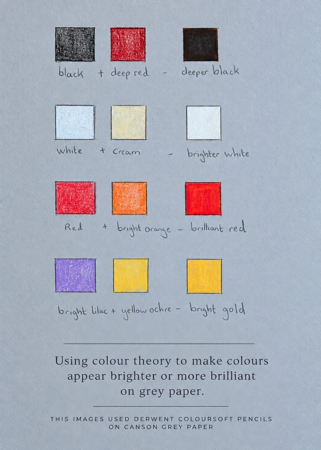
Michael’s hand-drawn swatch card on grey paper: testing colour combinations before using them in a drawing.
5. Choose paper and size
Paper is part of the plan, because it decides how many layers you can build and how the drawing finishes.
- Weight. Heavier papers, around 250 to 300 gsm, tolerate many layers, erasing and reworking. See paper weight explained.
- Tooth. Strong tooth suits layered, high-contrast work; smoother paper suits soft blends. See paper tooth and smooth versus textured paper.
- Colour. Grey starts you in the middle and suits glossy or dramatic subjects; white suits warm, soft subjects. See why use grey paper for coloured pencil and the best paper for coloured pencils list.
- Size. Bigger is not better. A larger drawing takes more layers and more time. A4 suits studies and small pieces, while A3 gives room for more detail, and you should leave a margin for mounting and framing. The paper size converter helps with formats.
If you may sell or exhibit the piece, choose archival paper at this stage, not afterwards.
6. Transfer a light layout
Layout is the framework of the drawing: proportions, placement and main shapes. Accuracy here saves a great deal of correction later, especially on papers that do not tolerate heavy erasing.
- Use a grid if proportions are tricky. The grid drawing tool divides your reference for you so you can transfer each square accurately.
- Draw lightly with a sharp pencil, and keep lines faint enough to disappear under colour.
- Check the whole shape before you commit: compare angles, distances and the overall silhouette.
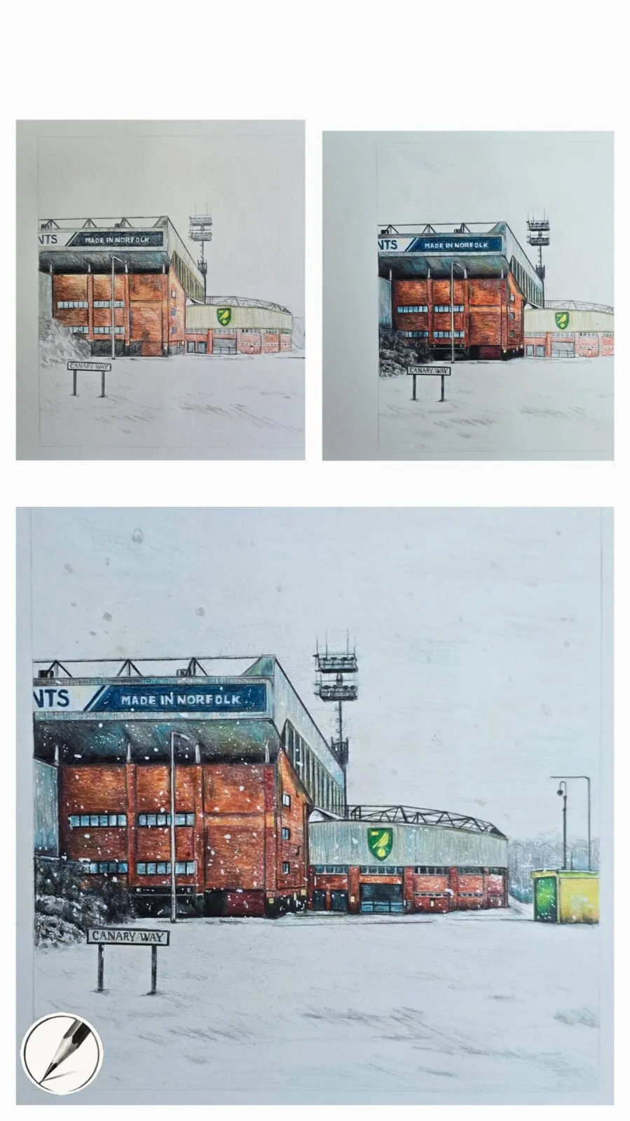
Michael’s stadium figure shows the idea clearly. It is a football stadium in snow drawn in stages: the layout comes first, then base colours, then final detail. The sequence is the same for almost any subject.
7. Plan the layer sequence
Layering is the backbone of coloured pencil realism. A plan for the sequence prevents you from working in corners and keeps the whole image moving together.
- Layout in light line.
- Base colours across the whole image. Bring every area up together in light, thin layers, rather than finishing one part.
- Mid-tones and form. Build shadows and mid-tones gradually, working general to specific.
- Deepen darks and refine edges.
- Final detail and highlights last. Crisp highlights and small accents go on when everything around them is established.
- Burnish or glaze only if needed, once layers are complete.
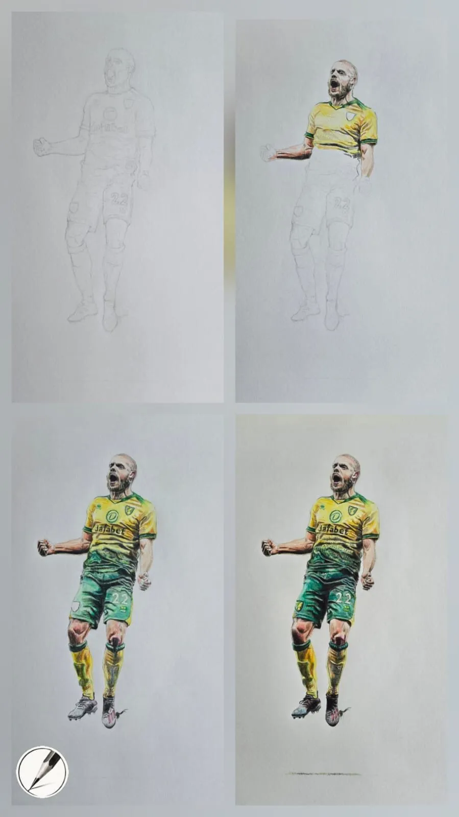
Michael’s progression figures show exactly this order. In one, four stages of a figure drawing work top down and build colour gradually. In another, a footballer goes from pencil layout to completion in four stages, and shadow and grass add movement to a dynamic pose. They are process examples of the sequence, not recipes for your subject. Use light pressure through steps two to four, following how to layer coloured pencils.
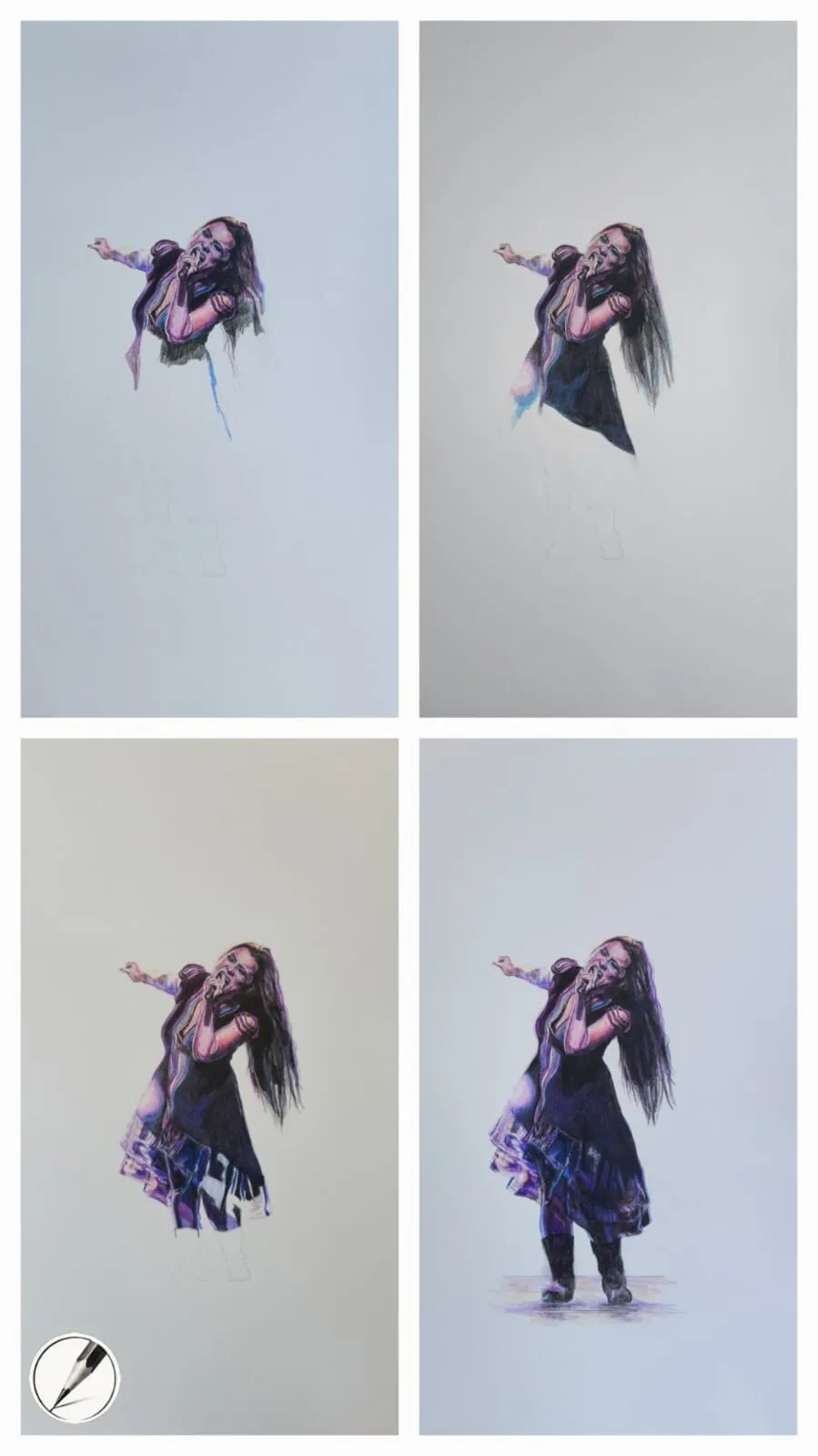
Michael’s progression: the whole image comes up together, with detail saved for the end.
8. Plan your time
A drawing rarely fails because you ran out of talent. It fails because you ran out of patience at the wrong stage.
- Split the work into sessions, each with a clear goal: layout, base, mid-tones, detail.
- Stop at a natural point, not halfway through a difficult edge.
- Leave time for the end. Detail and highlights are where drawings come to life, so do not spend your energy earlier.
- Step away and look with fresh eyes. Problems in value and proportion show up after a break.
- Build in a check at each stage: squint, compare to your value plan and correct before adding colour.
Time estimates depend on subject and size, so track your own sessions rather than relying on a rule.
A planning checklist
| Stage | Question to answer |
|---|---|
| Reference | Does it show clear light and real darks? |
| Thumbnails | Which crop and composition work best? |
| Values | Where are my lightest light and darkest dark? |
| Colour | Which pencils, and do they work on my paper? |
| Paper and size | Is it heavy enough, archival if needed, and a sensible size? |
| Layout | Are proportions checked and lines faint? |
| Sequence | Which stage am I in, and what comes next? |
| Time | Have I left room for final detail? |
The short version
Plan in this order: reference, thumbnails, values, colour, paper and size, layout, layer sequence and time. Build the whole image in stages, with layout first, base colours across everything and detail last. The upfront effort is small, and it is what makes the long middle part of a drawing feel controlled. For the mistakes planning helps avoid, see common coloured pencil mistakes.
Quick answers
Frequently asked questions
How do you plan a coloured pencil drawing?+
Choose a strong reference, sketch small thumbnails to test the composition, map your values in greyscale, decide a colour plan, pick paper and size, then transfer a light layout. Build base colours across the whole image before final detail. A clear plan reduces erasing and stops you overworking one area.
Should I sketch before drawing in coloured pencil?+
Yes. Start with small thumbnails to test composition and cropping, then a light layout on the final paper. Keep construction lines faint because heavy graphite and heavy erasing can damage paper and show through layers. Accuracy at the layout stage matters, especially on papers that are less forgiving of erasing.
How do I plan colours for a coloured pencil drawing?+
Sample the main colours from your reference, choose a limited set of pencils and swatch them on your chosen paper. Think in undertones rather than single colours, for example ochre, rose, grey and brown in skin. A palette from a photo tool can suggest starting points.
How long does it take to plan a coloured pencil drawing?+
It depends on the subject, but planning usually takes a small fraction of the whole drawing time. A few thumbnails, a value study and a swatch test can take under an hour for a small piece, and it often saves far more time than it costs.
Are colored pencils and coloured pencils the same?+
Yes. Coloured pencils is the UK spelling and colored pencils is the US spelling, and they are the same pencils. The planning advice applies whichever name you use.