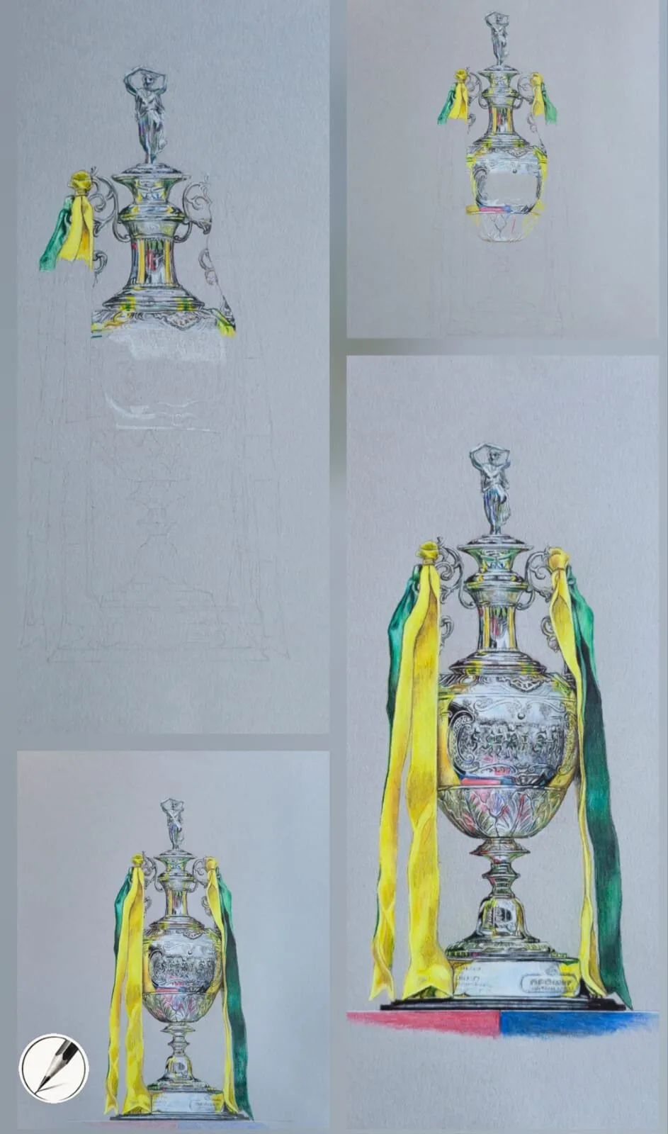
Drawing Techniques
How to Draw Glossy Surfaces: Icing, Glaze and Shine
A convincing shine comes from a few sharp highlights on smooth mid-tones. A coloured pencil (colored pencil) method for icing, glaze, sauce and glazed ceramics.
This guide contains affiliate links. If you buy through them we may earn a small commission at no cost to you. How this works.
Jump to recommended products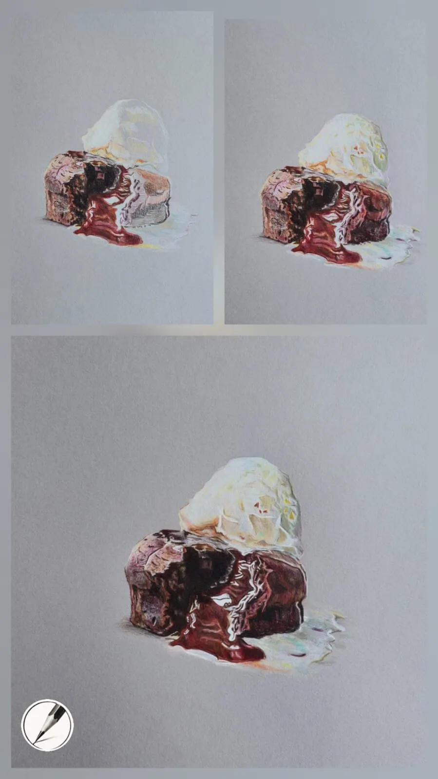
Key takeaways
- ◆The secret to shine is restraint: a few sharp, high-contrast highlights sitting on smooth, simple mid-tones.
- ◆Build the base tones first, from deep shadow to gentle mid-tone, and add highlights last.
- ◆Hard, crisp highlights suit glassy surfaces, while softer transitions suit icing and glaze.
- ◆Highlights pick up surrounding colour, so a warm glaze often has a hint of orange or pink rather than pure white.
- ◆Grey paper makes glossy surfaces easier because white pencil sits brightly on top of the mid-tone.
Glossy surfaces are deceptively tricky. Icing, glaze, sauce and glazed ceramics all look wet and bright in life, yet the moment you try to copy them most drawings come out flat or plasticky. The problem is rarely a lack of skill with the pencil. It is usually too much white, in the wrong places, at the wrong time.
This guide sets out a method that works for anything shiny and smooth: tone first, highlights last, and very few of them. It draws on Michael’s approach to desserts and glazed subjects, with a worked example built around his dessert drawings. If you are choosing your surface, read why use grey paper for coloured pencil alongside this guide, because paper makes a real difference here.
What makes a surface look glossy
A glossy surface reflects light instead of scattering it. That has a few visible consequences, and every one of them is something you can draw:
- Sharp contrast. The brightest light sits right beside deep shadow or a rich mid-tone. Gloss is really a contrast effect.
- Smooth transitions. Between light and dark, the tone moves cleanly across a curve without visible grain or streaks.
- Few, defined highlights. Shine appears as one or two crisp marks that follow the form, not a scatter of bright spots.
- Borrowed colour. The reflection takes on the colour of the light and the objects around it.
Hold those four in mind and most of the technique follows. The rest is order of work.
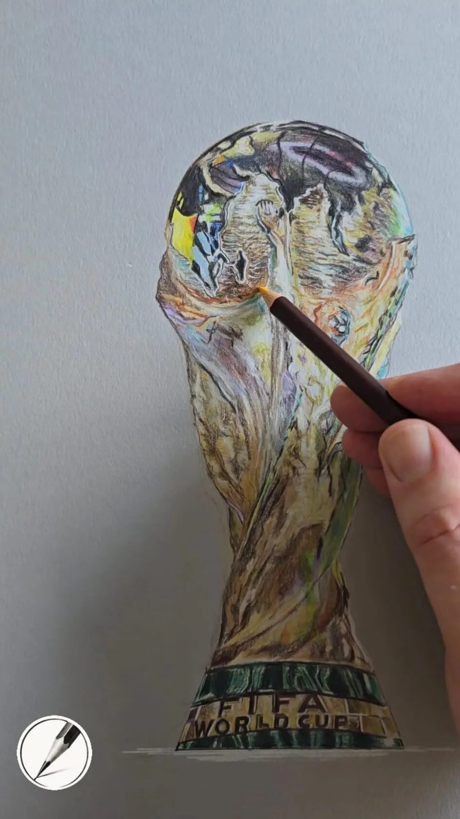
A hand drawing a gold trophy in coloured pencil on grey paper. Drawing by Michael Brace.
The principle: restraint
A convincing shine comes from a few sharp, high-contrast highlights sitting on top of smooth, simple mid-tones. It does not come from adding more and more white. Add too many highlights and the surface starts to look busy or plasticky rather than wet.
That runs against instinct. When a shiny area is not working, the natural response is to add another bright mark. Usually the fix is the opposite: check the mid-tones and darks around the highlight, make them smoother and deeper, and remove a highlight rather than adding one. Highlights only look bright when everything around them is darker.
Step-by-step method
- Lay out the shapes accurately. Draw the outline and the main shadow shapes lightly. Mark where the highlights will sit, but do not draw them yet. Our guide to how a realistic drawing comes together explains why finishing the layout first saves trouble later.
- Establish the deepest shadows. Use a dark, cool or warm dark that suits the subject rather than black. A chocolate sauce needs deep brown, not grey. These darks give the highlights something to beat.
- Build the mid-tones smoothly. Work in thin, even layers with light pressure and a sharp point, moving from shadow into mid-tone. Avoid visible strokes. The transition should look poured, not scribbled. For layering technique, see how to layer coloured pencils.
- Check the tonal range. Squint or look at your drawing in greyscale. If the mid-tones and darks are not clearly separated, deepen the darks now. The value study tool is a quick way to check.
- Tint the highlight zones. Before any white, lay a very light tint of the surrounding colour where the highlights will go. This is what stops them looking pasted on.
- Place the highlights last. Add a few crisp marks at the brightest points, following the curve of the surface. Vary their size. Make the brightest one clearly the brightest.
- Adjust the edges. Sharpen edges that should be glassy. Soften those that should melt into the surface, with a gentler layer or a light touch of colour over the edge.
- Step back and remove. Look for any highlight that competes with the main one and lift or tone it down. Our guide to lifting and erasing coloured pencil covers this.
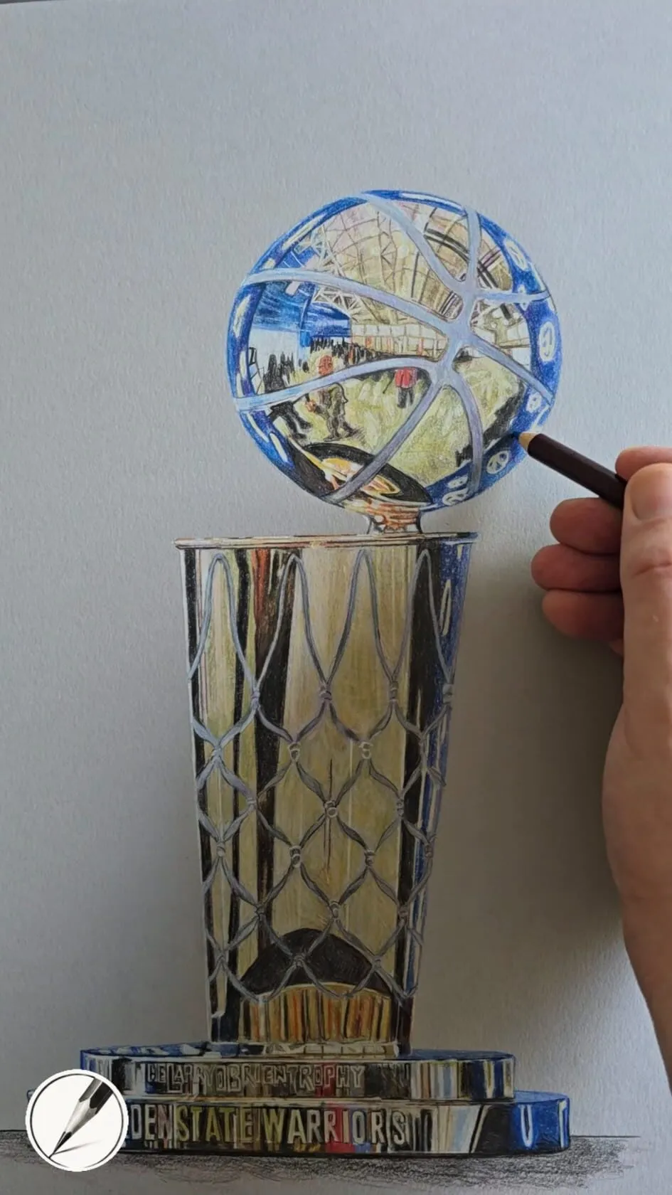
A hand adding detail to a trophy drawing in coloured pencil on grey paper. Drawing by Michael Brace.
Hard highlights versus soft highlights
Not every shiny surface reflects light the same way, and getting the edge quality right is what separates glass from glaze.
Hard, crisp highlights suit glassy surfaces. Glass, glazed ceramics, polished fruit skin and hard sugar shells all give small, sharp, well-defined lights with a clean edge against the tone next to them.
Softer transitions suit icing and glaze. Soft icing, sticky glaze and thick sauce scatter light slightly, so the highlight has a gentler edge that fades into the mid-tone. Use a softer tip, a lighter touch and a small blend at the edge.
A single drawing often needs both. A cherry on top of iced bun has a crisp point of light on its skin, while the icing beneath it has broader, softer highlights.
Give the highlight some colour
Highlights pick up surrounding colour. A warm glaze often has a hint of orange or pink in the highlight, not pure white. A white highlight on a golden-brown pastry looks cold and detached, while a highlight that leans warm looks like reflected light on that surface.
Some practical pairings:
| Surface | Highlight tint to try |
|---|---|
| Golden glaze on pastry | Cream with a touch of orange or pink |
| Chocolate sauce | Pale warm grey or a cool light brown |
| White icing | Very pale grey or blue, with warm reflections from nearby |
| Red berry or cherry | Pale pink, with a small white point on top |
| Glazed ceramic | The colour of the glaze, lightened, and the cool colour of the room |
For choosing colours that sit well together, the colour scheme generator can help, and the colour theory on grey paper guide shows how to make tints look brighter on a toned surface.
Why grey paper makes this easier
Grey paper makes glossy surfaces easier because white pencil can sit brightly on top of the mid-tone, giving a wider value range than white paper allows. On white paper, your lightest light is the paper itself, so you have to protect it and work around it for the whole drawing. On grey, the highlight is a positive mark you can add at the very end, and you can move it if it lands in the wrong place.
A textured mixed media grey such as Canson Mixed Media grey also holds many layers and lifts well, which suits this method. Firm, oil-based pencils such as Faber-Castell Polychromos keep the edges of highlights crisp, while creamier wax pencils help build the smooth mid-tones.
Worked example: a glazed dessert
Take the glossy sauce on a chocolate dessert. Michael’s progress figure shows the same drawing at three stages, and three things change as the layers build.
- The sauce is resolved early. Even in the first stage the sauce already reads as wet, because its bright highlights sit right beside deep, saturated red-brown. Meanwhile the cake and the ice cream are still pale and unfinished.
- The surroundings catch up. In the middle stage the cake body and the scoop of ice cream gain colour and form. As they deepen, the sauce looks brighter by comparison, even though it has barely changed.
- Contrast does the rest. In the final stage the darks are richer and the value range is at its widest. The highlights stay sharp and few, and the whole surface looks convincingly glossy.
The lesson is that shine is a relationship. A highlight only looks bright when the tones around it are dark enough, so building depth around the glossy areas matters as much as the highlights themselves.
The same logic holds across his other dessert drawings. The pastry swirl and the fondant are both built from deep, simple tones with a few bright accents on top.
Subjects that use this method
- Icing and glaze: soft edges, warm-tinted highlights.
- Doughnuts and pastries: sugar glaze plus jam or filling, with a mix of soft and sharp highlights.
- Sauces and syrups: deep darks, one or two curved highlights following the pour.
- Glazed ceramics: crisp highlights, strong reflected colour at the edges.
- Wet fruit and berries: small sharp highlights plus soft coloured reflections.
- Glass and water droplets: hard highlights beside dark edges.
Common mistakes
If you keep making the same error, check your surface too. Very smooth paper can make it hard to correct a misplaced highlight, so plan on hot press paper rather than rescue. On grey paper you have more room to adjust.
The same thinking helps with other subjects, such as drawing food realistically and placing shadows and light. Grey paper suits shine, so see the best white pencils for drawing on grey paper. Coloured pencils are called colored pencils in the US, and everything in this guide applies to both.
The short version
Build the base tones first, from deep shadow to smooth mid-tone. Add a few sharp, tinted highlights last, hard for glass and softer for icing and glaze. Choose grey paper if you can, and remove highlights rather than adding more. For the same principles applied to hard, reflective surfaces, continue with how to draw shiny metal and reflections.
Where to buy
Recommended products
Affiliate links. We may earn a small commission if you buy, at no extra cost to you. Why?
Pencils · Faber-Castell
Faber-Castell Polychromos
Firm, oil-based artist pencils that hold a point - a benchmark for detail and clean layering.
Paper · Canson
Canson Mixed Media Grey Paper
A toothy mid-tone grey paper that grips pigment and makes highlights glow.
Quick answers
Frequently asked questions
How do you draw a shiny surface with coloured pencil?+
Build smooth, simple mid-tones and deep shadows first, then place a small number of crisp, high-contrast highlights on top. Keep the edges of the highlights sharper for glassy surfaces and softer for icing. Working on grey paper makes it easier because white pencil stands out against the mid-tone.
Why does my glaze look plastic instead of wet?+
Usually there are too many highlights, or they are pure white and identical in size. Wet surfaces have a few well-placed lights that take on the surrounding colour and vary in sharpness. Remove some highlights, tint the rest, and check that the darks around them are deep enough.
What colour should highlights be on a glaze?+
Rarely pure white. A highlight reflects the light source and the surrounding colour, so on a warm glaze it often carries a hint of orange, pink or cream. Layer that tint first, then add a small touch of white only at the brightest point.
Is grey paper better for glossy subjects?+
It makes them easier. Grey supplies a mid-tone, so you can build shadows with darker pencils and highlights with lighter ones and white. Glossy surfaces on white paper are possible, but you have to preserve the white paper for the brightest lights throughout the drawing.
Does this glossy method work with colored pencils in the US?+
Yes. Colored pencils and coloured pencils are the same, so the method of smooth mid-tones and a few sharp, tinted highlights applies whichever spelling you use.