Drawing Techniques
How to Draw Shiny Metal and Reflections in Coloured Pencil
Metal is all about contrast: hard edges, borrowed colour and gradients on curves. A coloured pencil (colored pencil) method for silver, chrome and trophies.
This guide contains affiliate links. If you buy through them we may earn a small commission at no cost to you. How this works.
Jump to recommended products
Key takeaways
- ◆Metal reads as metal through high contrast, with sharp edges between its lights and darks.
- ◆Reflected colours from the surroundings matter more than the colour of the metal itself.
- ◆Curved forms need smooth gradients, while flat faces need clean-edged bands of tone.
- ◆Place the brightest highlights last, and use far less white than you think you need.
- ◆Grey paper gives you a mid-tone to build both the darks and the lights of a silver surface.
Silver, chrome and polished gold seem to be the hardest thing you can draw with a coloured pencil. There is no single colour to match, the surface is mostly made of reflections, and a small mistake makes the object look like grey plastic. In fact, metal follows clear rules, and once you know them it becomes one of the most satisfying subjects to draw.
This guide gives you those rules and a step-by-step method built around Michael’s silver trophy and board-game token drawings. It pairs naturally with how to draw glossy surfaces, because metal is glossiness at its most extreme: more contrast, harder edges, and more borrowed colour.
What metal actually looks like
Polished metal has almost no colour of its own. What you see is a distorted picture of its surroundings, bent around the shape of the object. That produces four visual signatures you can rely on:
- High contrast. Near-black darks sit right beside near-white lights.
- Sharp edges between tones. Where one reflection ends and another starts, the boundary is crisp, not blended.
- Reflected environment colour. The sky, the table, a nearby wall and even your own room appear on the surface.
- Gradients on curves. Round forms such as cups and rims move smoothly from light to dark, while flat faces show flat bands of tone.
Draw these four things and the object reads as metal even if the colours are approximate.
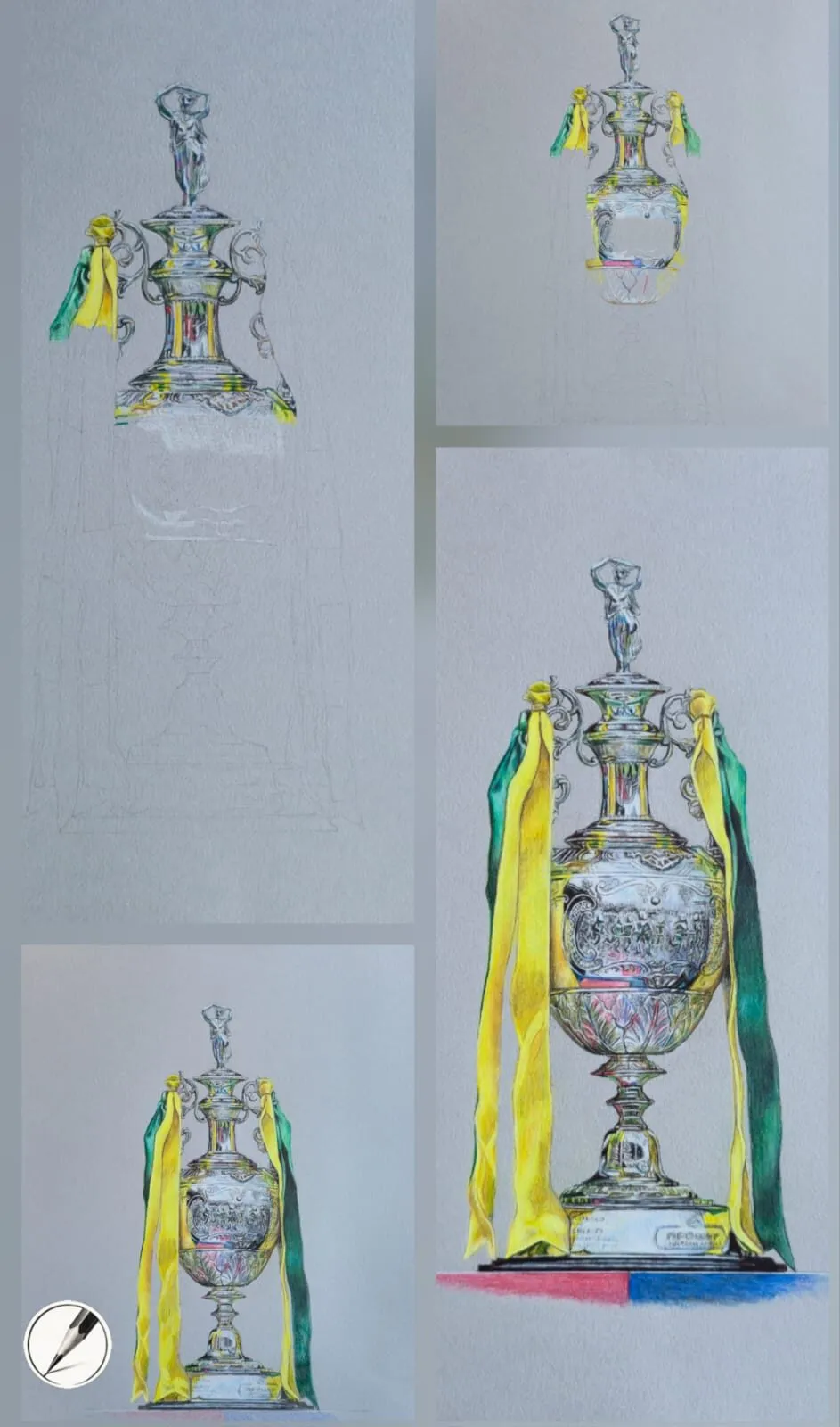
A silver trophy with yellow and green ribbons drawn in coloured pencil on grey paper, shown in four stages. Drawing by Michael Brace.
Set up: paper and pencils
Grey paper is a natural fit. Michael uses it for reflective subjects because the mid-tone gives him a foundation: dark pencils make the shadows, and white and pale pencils make the highlights, all as additions. Our guide on why use grey paper for coloured pencil explains that in more detail.
A textured, heavy paper such as Canson Mixed Media grey has enough tooth to hold many layers and to lift a highlight cleanly. Firm, oil-based pencils such as Faber-Castell Polychromos keep the edges sharp, and you will need a good white plus a range of cool greys, a warm brown or two, and a deep blue-black. A sharp point matters more than usual, so keep a sharpener close.
Step-by-step method
- Draw an accurate outline. Metal exposes wobbly shapes, so use a grid or careful measuring for the layout. Mark the edges between large reflection shapes as well as the outline.
- Map the light and dark shapes. Squint and identify three or four big value zones: darkest, mid, lightest. Lightly outline each. This is the plan for the whole drawing.
- Lay in the darks first. Fill the darkest reflections with layered blue-black, deep brown or dark grey. Keep the boundaries crisp. These darks are what make the lights look bright.
- Add the mid-tones. Build the mid greys and coloured reflections over the top in thin layers. Follow the curve of the object with your strokes so the surface feels rounded.
- Smooth the gradients on curved areas. Blend gradually from dark to light along a rim or a cylinder, with no visible strokes. Keep the edges between separate reflections hard.
- Introduce reflected colour. Add warm or cool notes from the surroundings, such as a warm brown from the tabletop along the lower edge, and a cool blue near the top. Keep them subtle but present.
- Place the brightest highlights last. Add small, sharp highlights with white or very pale grey where light hits an edge or a curve directly. Then step back.
- Correct and refine. Sharpen any edge that has softened, deepen any dark that has weakened, and lift a glint if a highlight has clogged. See lifting and erasing coloured pencil for methods.
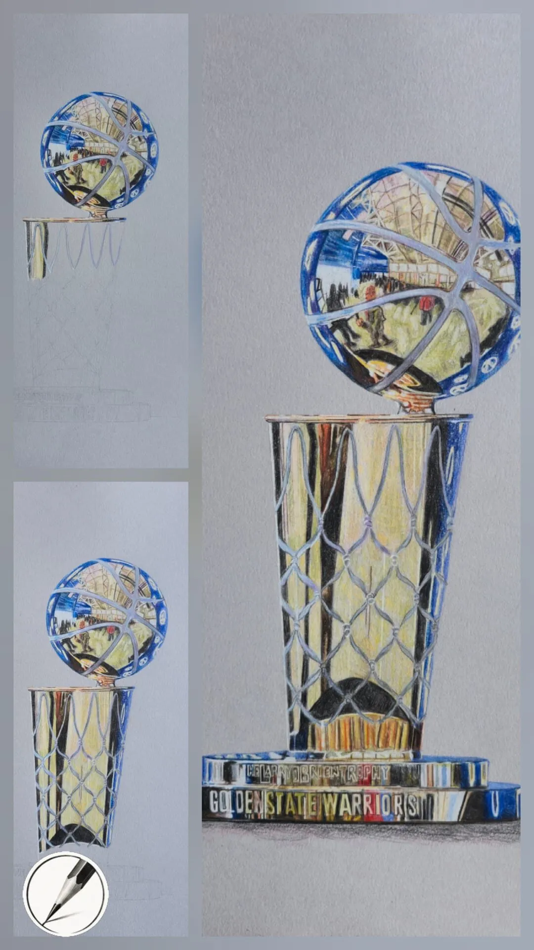
A silver and gold basketball trophy drawn in coloured pencil, shown in three stages. Drawing by Michael Brace.
Worked example: the silver trophy
Michael’s trophy drawing on grey paper is shown in four stages. It is built section by section from the top down: in the earliest stage the upper part of the cup is already fully rendered, with its dark reflections, mid-greys and bright accents, while the lower part is still only faint construction lines. In the later stages the rest of the cup is completed to the same standard, then the ribbons and base are added, until the whole trophy looks polished. Throughout, the grey of the paper acts as the middle value between the darks and the lights.
The takeaway is to finish each area properly before moving on, keeping your darks and lights consistent from section to section. Highlights only look bright when there are real darks beside them.
The taller drawings show how the same principles play out on other metals.
Colour for different metals
| Metal | Darks | Mids | Reflections and lights |
|---|---|---|---|
| Silver and chrome | Blue-black, cool dark grey | Cool and neutral greys | Blues, warm browns, near-white |
| Gold | Deep brown, dark olive | Ochre, warm yellow | Orange, cream, pale yellow |
| Bronze and copper | Dark brown, deep red-brown | Burnt orange, mid-brown | Warm cream, pinkish highlights |
| Pewter and brushed steel | Dark warm grey | Soft mid greys | Gentle, wider highlights |
For help mixing and matching those colours, see how to match and mix colours with pencils. The Perseus statue shows how dark bronze is built with light layers of colour.
Reflections: simplify and distort
A reflection is not a mirror image. It is a stretched, curved and simplified version of what surrounds the object. Keep these principles in mind:
- Look for big shapes. A window becomes a bright rectangle that curves around the object. A dark cupboard becomes a dark band.
- Follow the surface. On a cylinder, reflected shapes stretch vertically. On a sphere, they curve and squeeze towards the edges.
- Keep edges crisp and detail low. A few clear shapes read better than lots of tiny ones.
- Take the colour from the scene. Even a small hint of the tabletop or the background colour ties the object into its setting.
Common mistakes
The first two matter most. If metal looks dull, deepen the darks and sharpen the edges before you reach for more white.
Edges, lost and found
Hard edges make metal look metallic, but not every edge should be equally sharp. Where a reflection meets a much darker shape, keep the boundary crisp. Where a highlight rolls around a curve and fades, let the edge soften a little. Having a range from very hard to very soft gives the surface depth and stops it looking cut out.
Watch the outer contour too. A dark edge against a light background and a light edge against a dark background both help the object stand forward. Where a metal rim catches light, a thin, bright line along the edge is often all it takes to make the form read. Lifting is an excellent way to make that line, because it stays clean and thin.
Paper and surface notes
Textured paper is more forgiving on metal, because you can lift or rework a highlight if it lands in the wrong place. Smooth paper gives fine, polished gradients but demands careful planning. If you are unsure which to try, our comparison of Canson, Arches, Stonehenge and Clairefontaine explains how each behaves.
Practice plan
Start with a single shiny object with a simple form, such as a spoon, a coin or a small cup. Do a quick value sketch, then follow the eight steps above. Repeat with a different metal. When you can make silver look convincing, move to a complex object such as a trophy. For a related approach to glossy food and glaze, see how to draw glossy surfaces. To see how all the stages fit together in one finished drawing, read how a realistic drawing comes together.
Metal is a lesson in light, so also read our guide to drawing shadows and light and try the basic forms and shading lesson. White pencils shine on grey paper, see the best white pencils for drawing on grey paper. Coloured pencils are called colored pencils in the US, and everything in this guide applies to both.
The short version
Metal is contrast. Lay in deep darks, build crisp-edged mid-tones, smooth the gradients on curves, add reflected colour from the surroundings, and place a few sharp highlights last. Work on grey paper if you can, keep your white in reserve, and if the surface looks dull, fix the darks and the edges before adding anything bright.
Where to buy
Recommended products
Affiliate links. We may earn a small commission if you buy, at no extra cost to you. Why?
Paper · Canson
Canson Mixed Media Grey Paper
A toothy mid-tone grey paper that grips pigment and makes highlights glow.
Pencils · Faber-Castell
Faber-Castell Polychromos
Firm, oil-based artist pencils that hold a point - a benchmark for detail and clean layering.
Quick answers
Frequently asked questions
How do you draw metal with coloured pencil?+
Use strong contrast with crisp edges between light and dark, and include colours reflected from the surroundings. Build smooth gradients on curves and clean-edged bands on flat faces. Work from dark to mid-tone, then add the brightest highlights last. Grey paper makes the process easier.
What colours do you use for silver?+
Silver is not grey. Use a range of cool greys, blue-greys and near-blacks for the darks, mid-greys in between, and warm or coloured reflections from nearby objects. Finish with a small amount of white or very pale grey at the brightest points.
Why does my metal look dull or flat?+
There is usually not enough contrast, or the edges between tones are soft. Metal needs deep darks next to bright lights, with a clear boundary between them. Deepen your darkest tones and sharpen the edges where reflections meet.
How do you draw reflections in metal?+
Treat a reflection as a distorted, simplified copy of what surrounds the object. Look for large shapes of colour and value rather than detail, follow the curve of the surface when you draw them, and keep the edges crisp. Fewer, clearer shapes read better than many small ones.
Can I use colored pencils for metal, or only coloured pencils?+
They are the same thing. Colored pencils is the US spelling, so the method of hard edges, borrowed colour and sharp highlights works with any brand sold under either name.