Drawing Techniques
How to Match and Mix Colours with Coloured Pencils
Colour matching (color matching in the US) is the art of seeing undertones. Swatch, layer and compare to build accurate colours from several coloured pencils.
This guide contains affiliate links. If you buy through them we may earn a small commission at no cost to you. How this works.
Jump to recommended products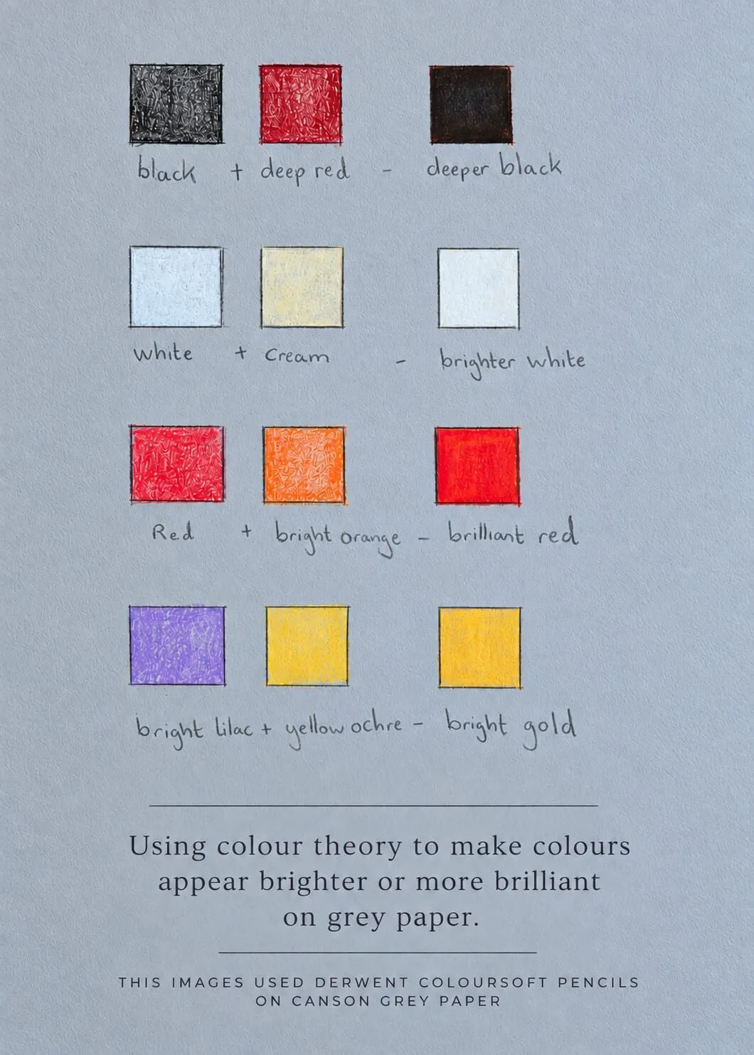
Key takeaways
- ◆Colour matching is the art of seeing undertones, not picking the one pencil that looks nearest.
- ◆Skin is not peach: it is layers of ochre, rose, grey and brown, and most objects hold dozens of colours.
- ◆Build colours by mixing two or three pencils in light layers, and check the result against your reference.
- ◆Swatch on the same paper you will draw on, because grey and white paper change how every pencil looks.
- ◆Layered pairs can make colours look deeper, brighter or more brilliant, especially on grey paper.
Pick up a pencil labelled “skin” or “sky blue” and try to match a photograph: the result rarely looks right. The reason is that no real subject is one colour. A cheek holds ochre, rose, grey and brown; a red apple carries orange, purple and the reflected colours of everything around it. Accurate colour comes from mixing, not from finding the perfect pencil in the tin.
This guide teaches the skill in a practical way: how to see undertones, how to swatch, layer and compare, and how to use Michael’s hand-drawn swatch card as a model for building brighter colour on grey paper. It sits inside our complete guide to coloured pencil techniques, and it relies on the light layering covered in how to layer coloured pencils.
Colour matching is seeing undertones
Beginners tend to name the colour of an object and then select the pencil with that name. Experienced artists look for what is underneath the obvious colour. That is what “seeing undertones” means: noticing the warm, cool, dull or bright colours that make up the overall effect.
Two examples show it clearly:
- Skin. It is not peach. It is layers of ochre, rose, grey and brown, and it shifts across the face with light and form. See how to mix skin tones with coloured pencils for more.
- Objects. A white cup is a range of greys, creams, blues and warm reflections. A red apple includes greens and purples. Objects are dozens of colours.
The more you observe, the more accurate your matches become. Squint at the subject to reduce detail and see broad colour areas, and compare neighbouring colours to each other rather than in isolation. A colour that looks green beside red may look yellow beside blue.
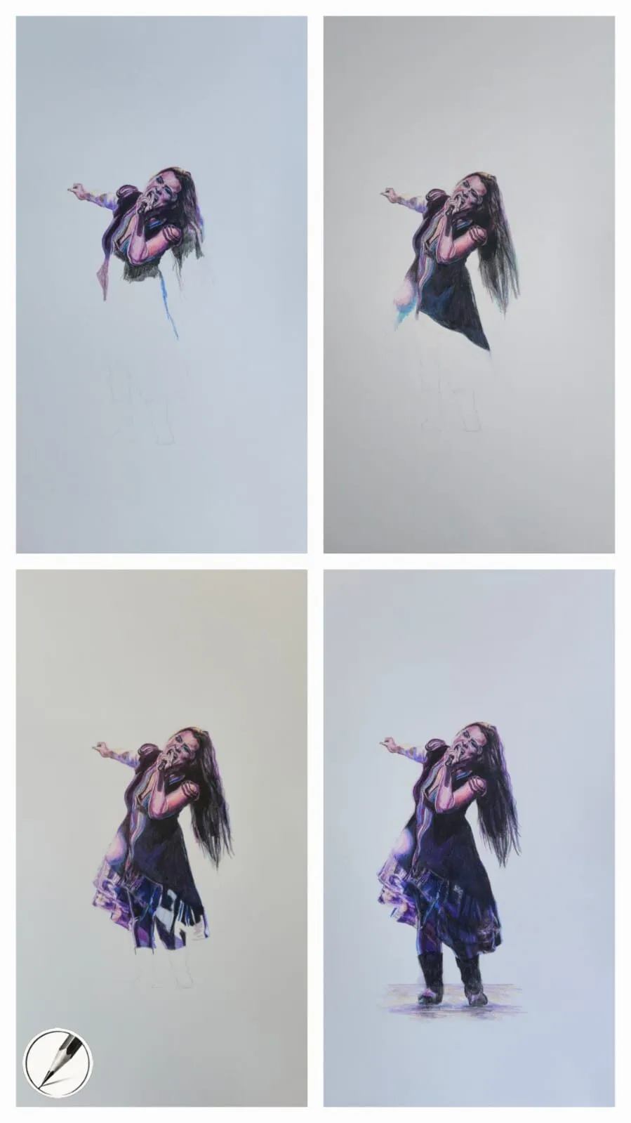
A figure drawing built up in four stages of coloured pencil. Drawing by Michael Brace.
Mix by layering, not choosing
Coloured pencil colour mixes optically. When you layer one colour lightly over another, light passes through and reflects off the paper, so the eye combines them. The order and pressure change the result: a light layer of blue over yellow is different from yellow over blue.
That gives you three practical rules:
- Use light pressure. Heavy pressure covers the layer beneath instead of mixing with it. See the pressure principles in how to layer coloured pencils.
- Use two or three pencils. One for the main colour, one for warmth or coolness, one to dull or deepen.
- Vary the order. Try both directions on a swatch and choose whichever looks closer.
For an explanation of why some colours dull or brighten each other, see complementary colours in drawing and saturation and muted colours.
A practical method: swatch, layer, compare
This method works for any colour and any subject.
- Cut a scrap of your actual paper. Grey, white and cream paper each change how pencils look, so swatch on the paper you will use.
- Choose a small area of the reference. Pick one patch, such as a shadow on the cheek or the side of a cup.
- Name its temperature and value. Is it warm or cool? Light, mid or dark? This narrows the choice of pencils before you begin.
- Lay down a first swatch with one pencil, lightly.
- Layer a second pencil over it, also lightly, then a third if needed.
- Hold the swatch beside the reference and compare. Do not compare it to your memory.
- Adjust. Too bright? Add a light layer of the complement or a grey. Too dull? Add a saturated colour. Too cold? Add ochre or a warm red.
- Label the swatch with the pencils and order. Keep it as a reference for the same drawing.
Michael’s hand-drawn swatch card
The swatch card below is a hand-drawn reference by Michael, made with Derwent Coloursoft on Canson grey paper. It shows how pairs of layered pencils change what a colour does on grey. Its caption reads: “Using colour theory to make colours appear brighter or more brilliant on grey paper.”
The card above is Michael’s hand-drawn swatch card on grey paper, made with Derwent Coloursoft on Canson grey.
The pairs on the card are:
| Layered pair | Result |
|---|---|
| Black + deep red | A deeper black |
| White + cream | A brighter white |
| Red + bright orange | A brilliant red |
| Bright lilac + yellow ochre | A bright gold |
The idea behind them is that a single pencil often looks flat, especially on grey, while two related pencils layered together look richer. Red plus orange gives more vibrancy than either alone; white plus cream gives a warm, believable highlight. The same approach works in any palette, and our guide to colour theory on grey paper explains why grey paper changes colour.
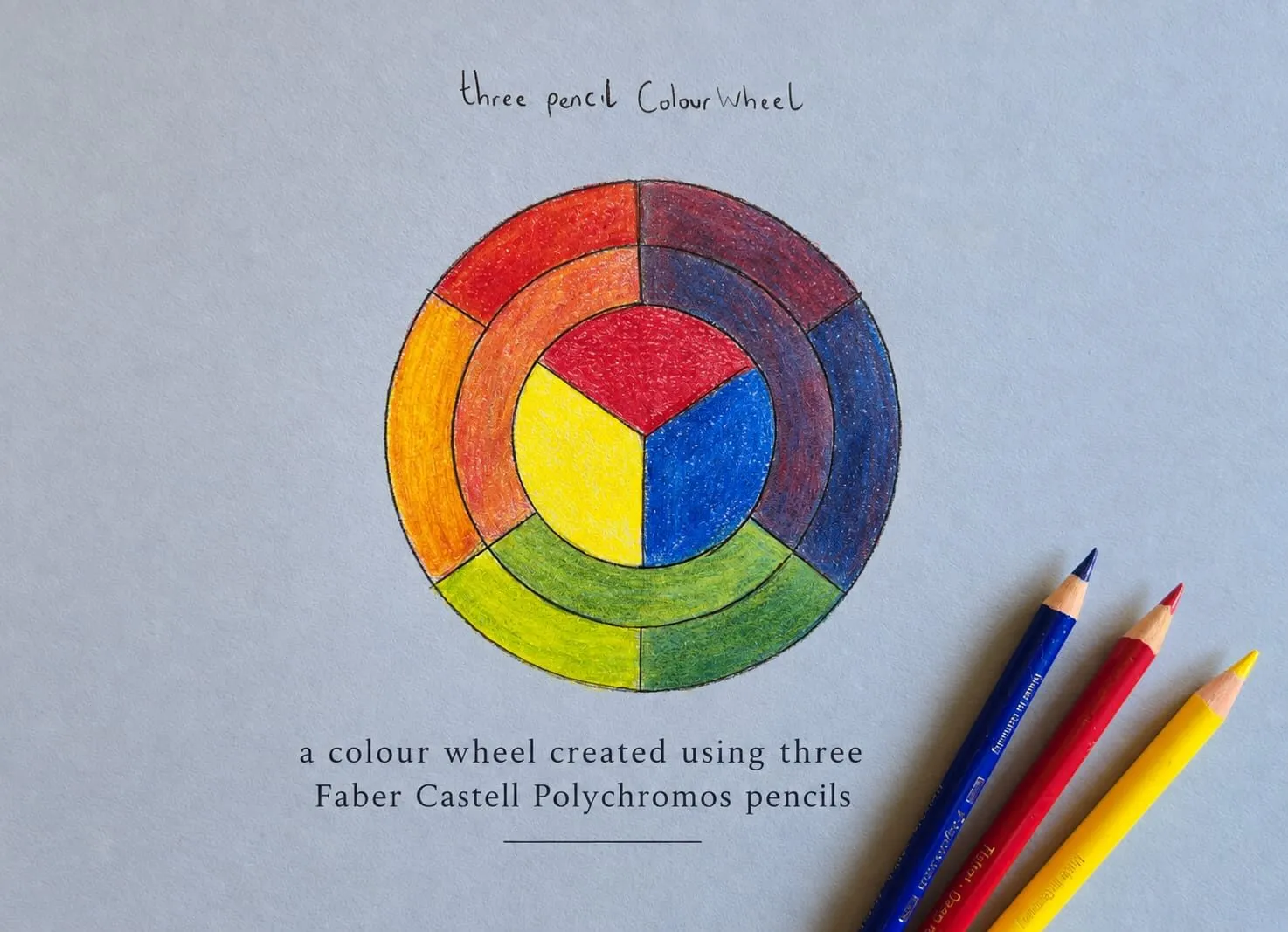
A hand-drawn colour wheel made with just three Faber-Castell Polychromos pencils on blue-grey paper: mixing, not choosing.
Colour on grey versus white paper
On white paper, colours are as light as the pigment allows and darkness comes only from adding more. On grey paper, the paper acts as a mid-tone, so pale pencils may barely show and colours appear a little muted. That is why an opaque white and a light cream matter, and why layering pairs, as on the swatch card, can brighten a colour.
This is one reason to test on the actual paper. If you are choosing between them, see why use grey paper for coloured pencil and the best paper for coloured pencils.
Matching colour to value
Colour without the right value looks wrong even when the hue is correct. A pale yellow that should be a mid-tone gold will look weak; a saturated red that should be dark needs a deeper base. Check values as you match. The value study tool converts a reference to tone so you can see whether the colour sits at the right lightness, and our guide to value in drawing covers the principle.
Planning a palette
For complex drawings, plan a limited set of pencils before you begin. Choose the main hues, a warm and a cool version of each, and neutrals to dull them. The colour scheme generator is helpful for testing harmonious combinations before you commit to paper, and our overview of colour harmony schemes explains the standard approaches. A limited palette also makes the drawing feel unified. See limited palette drawing for how to work with fewer pencils.
Exercises to build your eye
- Grey scale swatches. Make a strip of five greys by layering, then push each warm or cool.
- One object, twenty colours. Draw a small square for every distinct colour you can see in an ordinary object.
- Copy a swatch. Photograph or print a small colour sample and match it with pencils on your chosen paper.
- Pairs. Make a card like Michael’s, layering two pencils in different orders and noting the result.
- Reflected colour. Place a white object on a coloured surface and record the tint it picks up.
Common colour matching mistakes
- Choosing one pencil. It gives a flat, single-note result. Mix at least two.
- Comparing to memory. Compare directly with the reference.
- Swatching on the wrong paper. Colours shift on grey and white.
- Pressing hard. It buries the underlayer instead of mixing with it.
- Ignoring value. Correct hue at the wrong lightness still looks wrong.
- Using black for shadows. It flattens colour. Deepen with saturated darks or complements instead.
To pull a palette from a reference image, try the palette from photo tool. Pencil choice matters too, so take the which pencil set quiz. Coloured pencils are called colored pencils in the US, and everything in this guide applies to both.
The short version
Look for undertones, mix two or three pencils in light layers, and swatch on your actual paper before committing to a drawing. Compare against the reference, adjust, and keep a labelled swatch card. Layered pairs make colours richer, particularly on grey. For the full workflow, return to coloured pencil techniques.
Where to buy
Recommended products
Affiliate links. We may earn a small commission if you buy, at no extra cost to you. Why?
Pencils · Derwent
Derwent Coloursoft Pencils
Soft, velvety and richly pigmented - excellent for painterly blending and bold colour.
Pencils · Faber-Castell
Faber-Castell Polychromos
Firm, oil-based artist pencils that hold a point - a benchmark for detail and clean layering.
Paper · Canson
Canson Mixed Media Grey Paper
A toothy mid-tone grey paper that grips pigment and makes highlights glow.
Quick answers
Frequently asked questions
How do I match a colour with coloured pencils?+
Make small swatches on scrap paper of the same type as your drawing, layering two or three pencils lightly, then hold them beside the reference. Adjust by adding the undertone that seems missing, such as a touch of ochre for warmth or grey for dullness. Matching is a process of comparison, not a single choice.
Why do my colours look different on grey paper?+
Grey paper shows through every light layer, so colours appear darker, duller or cooler than on white. Pale pencils may barely register, and white becomes a highlight tool. Always swatch on the actual paper you will use, and consider layering pairs to brighten colours.
How many pencils do I need to mix a colour?+
Two or three is usually enough for a convincing mix. Start with the main local colour, add one for warmth or coolness, and one for the shadow. More pencils add complexity rather than accuracy. A larger range helps you find subtle undertones, but skill matters more than set size.
Can I mix coloured pencils like paint?+
Not exactly. Pencils mix optically, by layering one colour over another so the layers combine in the eye, rather than physically blending pigment like wet paint. You can also blend with a lighter pencil or solvent for a smoother result. Order and pressure of layers changes the outcome.
Is colour matching with colored pencils different from coloured pencils?+
No. Colored pencils and coloured pencils are the same, and the swatch, layer and compare method works identically. The only difference is the spelling of colour or color.