
Colour Theory
Colour Harmony Schemes for Drawing
Complementary, split-complementary, analogous, triadic, tetradic and monochromatic schemes explained with drawing examples, and how to choose one.
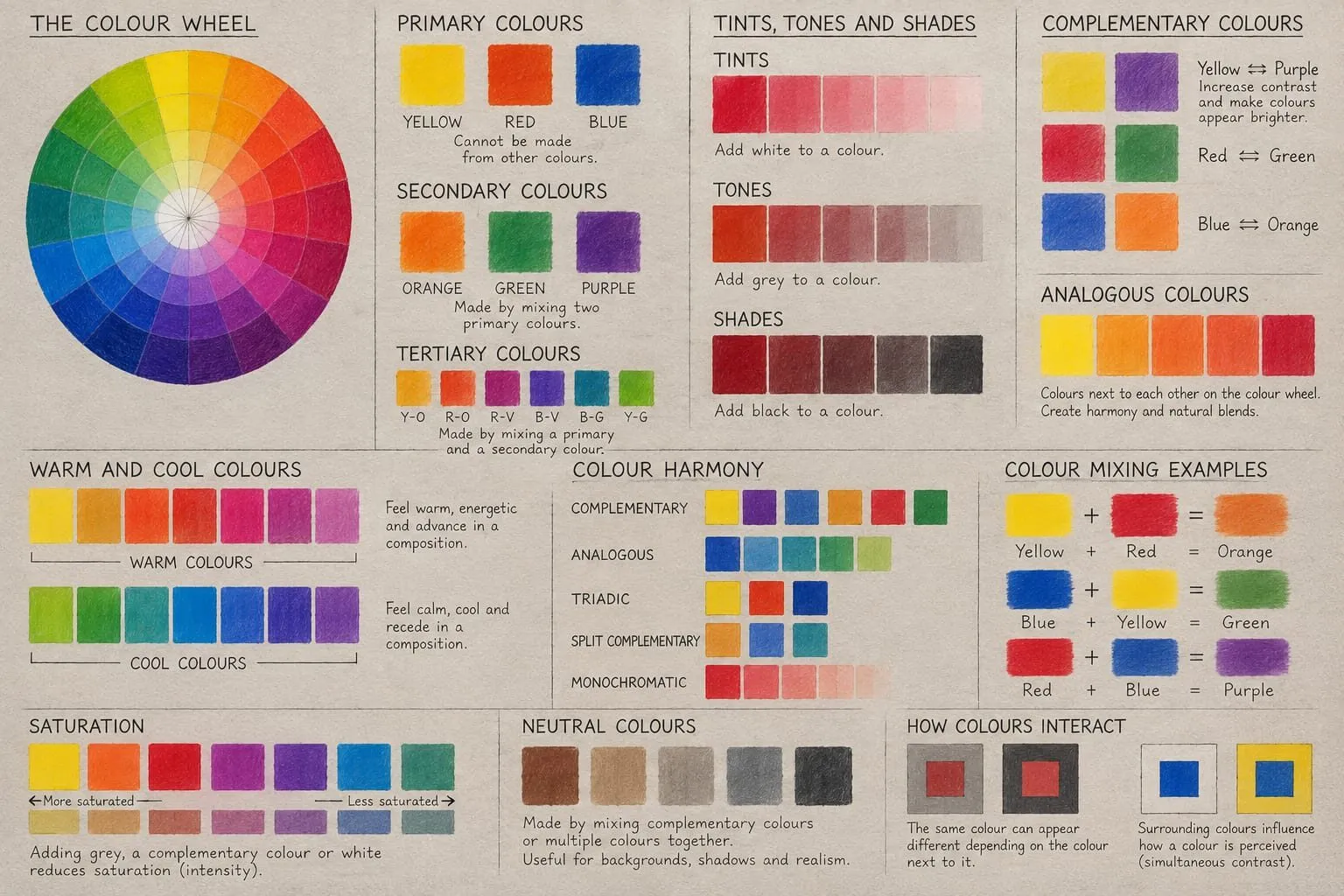
Key takeaways
- ◆A colour harmony scheme is a way of choosing colours that relate to each other. Harmony does not mean everything matches.
- ◆Complementary schemes create drama, analogous schemes create calm, and triadic schemes create balance.
- ◆Split-complementary and tetradic schemes offer more variety while keeping structure; monochromatic schemes explore value and saturation.
- ◆Choose a scheme from the mood you want and the colours your subject already has, then let one colour dominate.
- ◆Schemes are guides, not rules. Once you have a palette, adjust it by eye.
Every drawing has a palette, whether you chose it or not. A harmony scheme is simply a deliberate way of choosing it. Complementary schemes create drama, analogous schemes create calm, and triadic schemes create balance. A harmonious palette does not mean everything matches. It means the colours relate in a way that feels intentional.
This guide covers the six schemes you will meet most, shows how each looks in real pencil drawings, and gives you a way to choose between them. The schemes are helpful guides rather than rules, and we say so plainly, because the most common mistake is treating them as laws. It belongs to the colour theory hub and assumes you know the wheel from the colour wheel explained. The examples use coloured pencils (colored pencils in the US). To try a scheme from a reference, use the palette from photo tool, and see the best coloured pencil sets for pencils that cover a scheme well.
The six schemes at a glance
| Scheme | How it is built | Feel | Good for |
|---|---|---|---|
| Complementary | Two colours opposite each other | Drama, vibrancy | Focal contrast, portraits with a strong accent |
| Split-complementary | One colour plus the two neighbours of its complement | Contrast with less tension | Confident colour without harshness |
| Analogous | Three or four neighbouring colours | Calm, unified | Landscapes, atmospheric pieces, warm still life |
| Triadic | Three colours evenly spaced | Balanced, lively | Playful or varied subjects |
| Tetradic | Two complementary pairs | Rich, complex | Busy, colourful subjects |
| Monochromatic | One hue in many values and saturations | Quiet, moody | Studies, value practice |
Build any of these from a starting colour with the colour scheme generator, which does the wheel geometry for you. Bear in mind it works on the digital RGB wheel, so the results are close to, but not identical to, a traditional red, yellow and blue wheel.
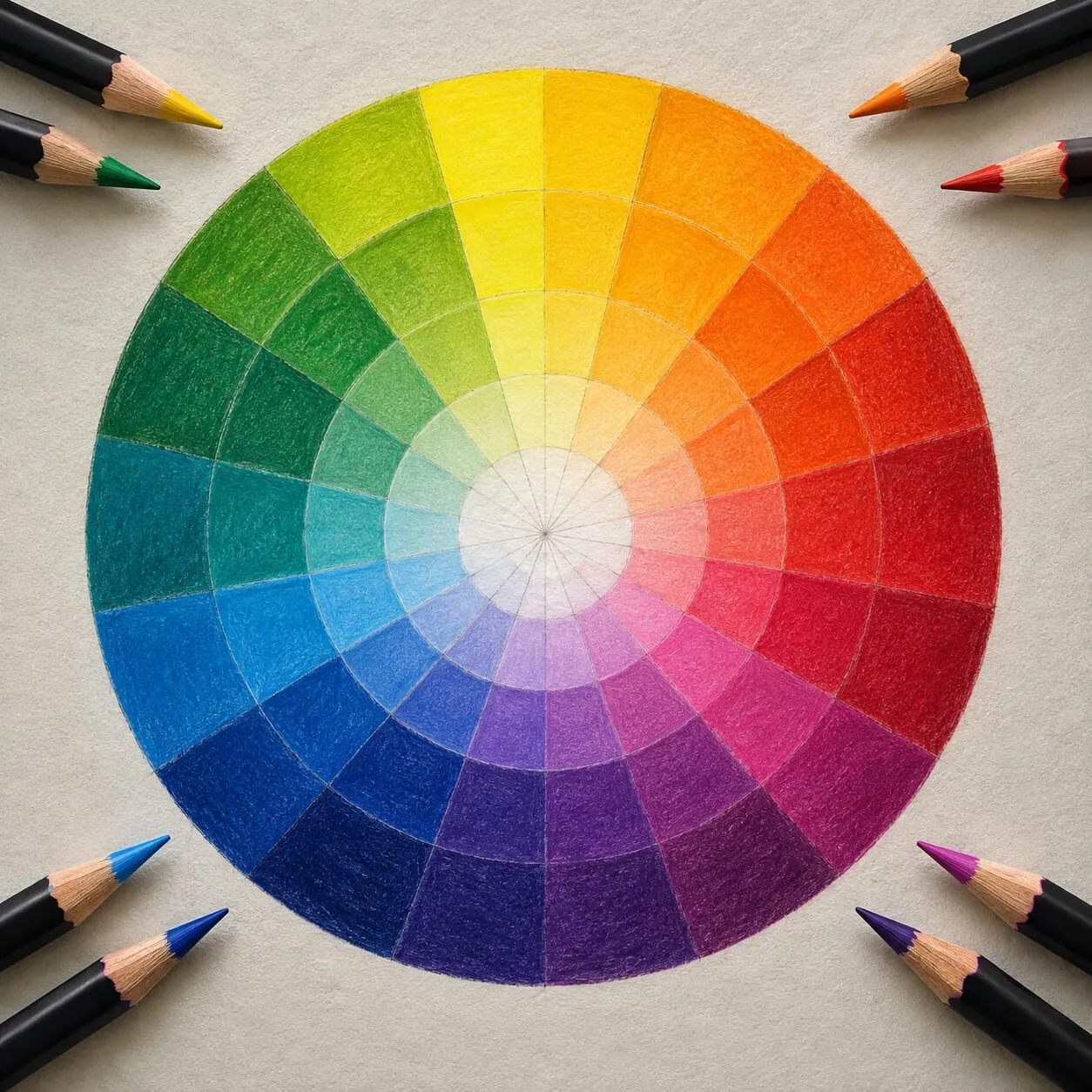
A colour wheel of radiating rings of colour surrounded by sharpened coloured pencils.
Complementary
Two colours opposite each other. It is the highest-contrast scheme, and it works best with one colour dominant and the other as an accent. Detailed methods, including neutralising shadows, are in complementary colours in drawing.
Split-complementary
Take a colour, then use the two colours either side of its complement. Instead of blue with orange, you might use blue with yellow-orange and red-orange. You keep the contrast but get more variety and less of the direct tension of a pure pair. It is a forgiving scheme, and a good next step when a pure complementary drawing feels harsh.
Round swatches of coloured pencil in yellow, orange, red, pink, green, blue, brown and black on cream paper.
Analogous
Colours that sit side by side on the wheel, for instance yellow, yellow-orange and orange. They blend smoothly and create unity, so they suit atmosphere and softness. The risk is monotony, so bring in value contrast and a small accent of the opposite temperature.
Triadic
Three colours evenly spaced around the wheel, such as red, yellow and blue, or orange, green and violet. Triadic schemes feel balanced but lively. They work best when one colour dominates and the other two support it, and when two of them are muted. A full-strength triad tends to look childlike unless value and saturation are managed.
Tetradic
Two complementary pairs, forming a rectangle on the wheel. It gives the most variety and the most risk. Use it for subjects that are already colourful, choose a dominant, and mute the others. A colourful subject can hold this much colour when the values underneath are clearly structured.
Monochromatic
One hue, many values. You explore light and dark, and pale and saturated versions of the same colour. It is superb practice, because with hue removed as a variable you learn how much value does, as explained in value in drawing. Graphite drawings are the natural extreme of this idea, and coloured pencil can do the same in blue, sepia or a warm grey.
How to choose a scheme
Do not start from the wheel. Start from the drawing.
- Name the mood. Calm, dramatic, playful, quiet, warm, cold. Calm points to analogous or monochromatic, drama to complementary, playfulness to triadic.
- List the colours the subject already has. The reference decides most of the palette. Find the scheme that best describes it.
- Pick the dominant. Whichever scheme you choose, one colour should cover most of the area.
- Choose the accent. A small amount of the opposite temperature will make the rest of the drawing look intentional.
- Plan values before colour. A scheme cannot rescue a drawing whose values are all the same. Use the value study tool on your reference.
- Test on a swatch strip. Lay your chosen pencils in the proportions you expect to use them, on the paper you will draw on. Adjust.
If you want a small palette, limited palette drawing shows how to translate a scheme into three to six pencils.
Schemes are guides, not rules
It is tempting to treat these schemes as a checklist. They are better used as a vocabulary. Notice that the following examples of good drawing all bend the rules:
- A portrait that is nearly monochromatic but has a single spot of complementary colour.
- A landscape that is analogous in the sky and complementary in the foreground.
- A still life that is triadic but with two of the three colours heavily muted.
What all of them share is intention. A viewer does not consciously think “this is split-complementary”, but they feel that the colours belong together. The rules are a way of getting there faster. When you know why a scheme works, you know when to break it, and saturation and muted colours explains the most common way of doing so.
Common mistakes
- Using every hue. A drawing with the whole wheel in it usually looks chaotic. Choose a scheme and stick to most of it.
- Equal proportions. Give one colour clear dominance.
- Full saturation everywhere. Even a harmonious scheme looks garish when every colour is at full strength.
- Ignoring temperature. Harmony is also about warm and cool. See colour temperature: warm and cool.
- Forgetting the paper. Toned paper is part of your palette. On grey, every colour is partly seen against grey, as discussed in colour theory on grey paper.
Putting a scheme into pencils: a worked example
Say your reference is a bowl of oranges on a blue cloth. That is already a complementary scheme, so the decision is about proportion and control rather than hue.
- Assign roles. Let the oranges and warm highlights take the dominant role, roughly two thirds of the visual weight, with the blue as the supporting colour.
- Split the blue. Use a cooler blue in the deep folds and a slightly greener or greyer blue where the cloth catches light. This is a small analogous shift inside the complement, and it keeps the cloth from looking flat.
- Mute the background. Bring the wall or table down to a warm or cool grey, so it neither competes with nor repeats the main pair.
- Echo the accent. Add a small touch of the cloth blue as a reflected note in the shadow side of an orange, and a hint of orange in a fold of the cloth. Those repeats are what make the palette feel deliberate.
- Check in greyscale. Confirm the drawing still reads without hue, using the value study tool.
The same reasoning applies to any scheme. Name the dominant, name the accent, mute the rest, and repeat a little of each colour in the other’s territory.
The short version
Choose a scheme from the mood you want and the colours in your subject: complementary for drama, analogous for calm, triadic for balance, split-complementary for confident colour with less tension, tetradic for rich variety, monochromatic for value practice. Let one colour dominate, mute the rest, and use the colour scheme generator to test ideas before you commit pencil to paper.
Quick answers
Frequently asked questions
What is a colour harmony scheme?+
It is a rule of thumb for selecting colours that look good together, based on their positions on the colour wheel. The common schemes are complementary, split-complementary, analogous, triadic, tetradic and monochromatic. They are starting points that make a palette feel deliberate, not laws you must follow.
Which colour scheme is best for beginners?+
Analogous is the easiest, because neighbouring colours blend smoothly and rarely clash. A limited palette with one complementary accent is the next step up. Both give strong results quickly, and both are easy to test with the colour scheme generator.
What is the difference between analogous and monochromatic?+
Analogous uses several neighbouring hues, such as yellow, yellow-orange and orange. Monochromatic uses a single hue in many values and saturations, such as blue from pale to deep. Monochromatic is more restrained, and value carries all the variety.
Do I have to follow a colour scheme?+
No. Schemes help when you are unsure, and many drawings break them successfully. What matters is that the colours relate in a way that feels intentional. Use a scheme to make a decision, then trust what you see on the paper.