Colour Theory
Saturation and Muted Colours in Coloured Pencil
Control saturation in coloured (colored) pencil with layers, pressure, greys and complements. When to use bold colour, how to mute it without mud, and mood.
Key takeaways
- ◆Saturation is how intense or muted a colour is. Bold colours feel immediate, and muted colours feel softer and more subtle.
- ◆In coloured pencil, more layers give richer colour, while lighter pressure or mixing with greys and neutrals softens it.
- ◆A thin layer of a complement mutes a colour more naturally than black or grey.
- ◆Contrast of saturation matters: muted surroundings make one saturated colour look brilliant.
- ◆Saturation shapes emotional tone, so decide the mood before choosing how loud each colour should be.
A single saturated colour in a muted drawing can carry the whole page. A whole page of saturated colour can be exhausting. The difference is not the pencils, it is how you control intensity, and that is what saturation is about.
This guide covers what saturation means, how to raise and lower it with coloured pencil, why complements are the elegant route to muted colour, and how saturation shapes the mood of a piece. It sits in the colour theory cluster next to colour temperature and value. This covers coloured pencils, or colored pencils in the US. See best blending tools for coloured pencil for softening intensity and the palette from photo tool for checking a reference.
What saturation is
Saturation describes how intense or muted a colour is. Highly saturated colours feel bold and immediate. Desaturated colours feel softer and more subtle.
It helps to keep saturation apart from value:
| Saturation | Value | |
|---|---|---|
| Question | Vivid or dull? | Light or dark? |
| Extreme low | Grey or neutral | Black |
| Extreme high | Pure, intense hue | White |
| Example | A vivid red versus a brownish red | A pale pink versus a deep maroon |
A colour can be pale and saturated, or dark and muted. Mixing the two up is the source of a lot of confusion. If you find yourself adding black to make a colour “less bright”, you are changing value, not saturation.
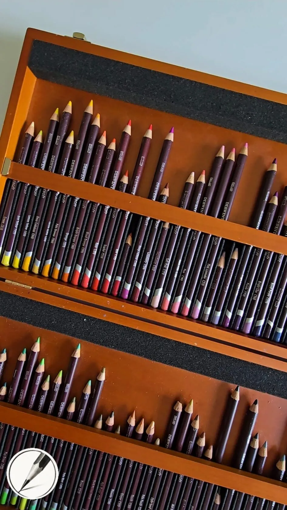
An open wooden box of coloured pencils arranged in tiered trays.
How to control saturation with pencils
In coloured pencil you control saturation through layering. More layers create richer colour. Lighter pressure, or mixing with greys and neutrals, softens it. Four levers do most of the work.
1. Layers
Each layer adds pigment and covers more of the paper’s tooth. A single light layer is muted because the paper shows through. Four or five layers with a sharp point make the colour deep and rich. The method is covered in how to layer coloured pencils.
2. Pressure
Light pressure keeps colour delicate and leaves tooth open for more layers. Heavy pressure fills tooth, increases intensity, and makes further layering difficult. Start light and build.
3. Greys and neutrals
A warm or cool grey layered into a colour softens it. Use a grey that leans toward the temperature you want: a warm grey for a soft, earthy mute, a cool grey for a hazy, atmospheric one.
4. Complements
Layering a small amount of the opposite colour mutes the original while keeping it alive. This is the most beautiful route to muted colour. More on it in the next section.
Muting with complements
Complements neutralise each other when mixed. So to mute a green, add red. To mute an orange, add blue. To mute a violet, add yellow. The result is a rich, natural colour that a flat grey cannot match, because the complement leaves traces of both hues in the mix.
- Lay the colour you want to mute.
- Add a light layer of its complement, with a sharp point and even strokes.
- Judge the result. If it is still too strong, add another light layer.
- Adjust value if the colour has become too dark or too light.
- Repeat across the area so the muting is even, or vary it deliberately to make variety.
This is also how natural shadows are made, as described in complementary colours in drawing.
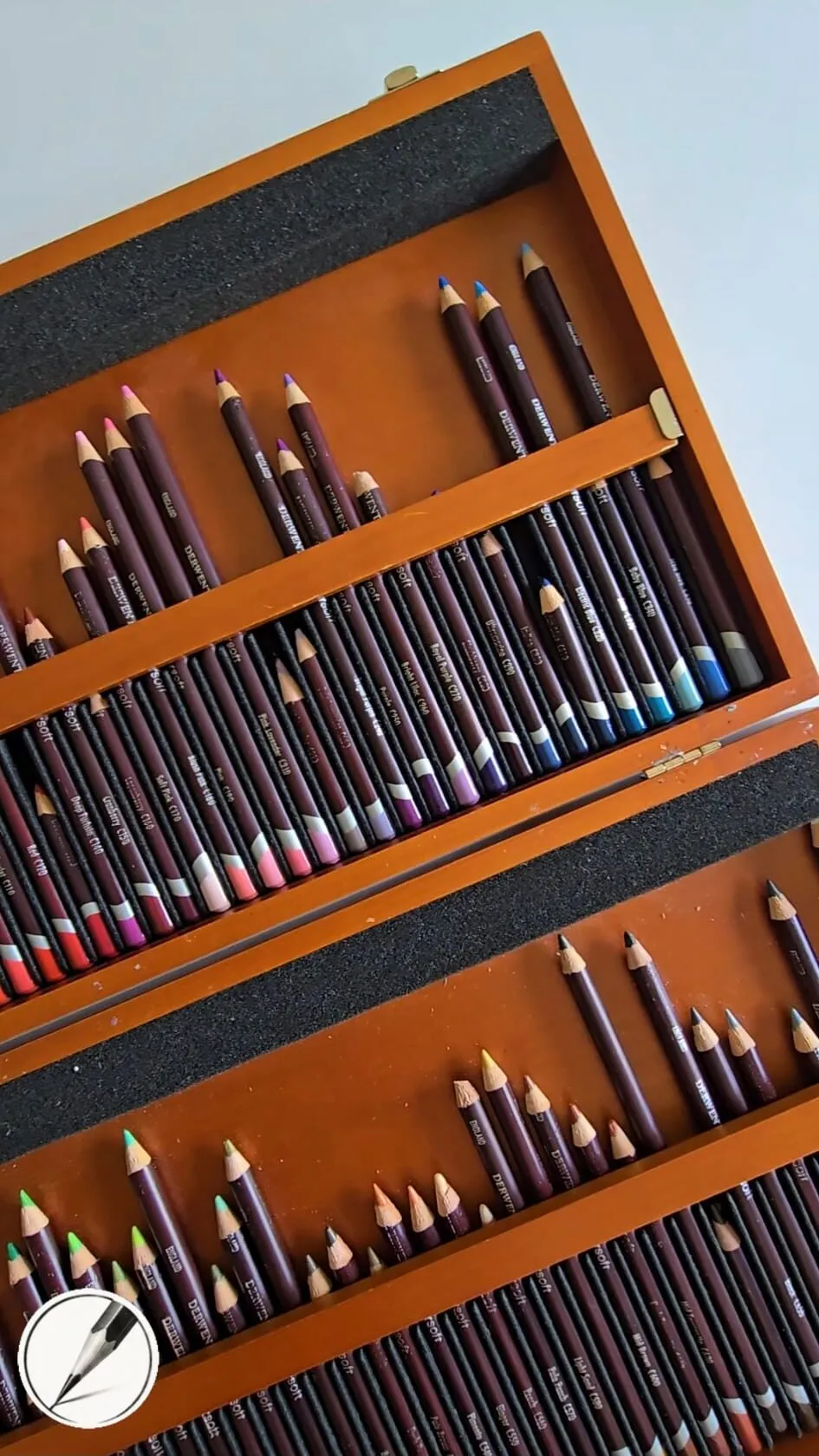
A wooden box of coloured pencils in trays, seen at an angle.
Saturation contrast: why muted makes bright shine
A colour looks as intense as its surroundings allow. A saturated orange on a muted blue-grey ground looks more brilliant than the same orange among other bright colours. So there are two ways to get a vivid colour: make it more saturated, or make everything around it less so.
Most professional drawings use the second. The recipe is:
- Keep the majority muted. Backgrounds, secondary areas and large masses are low or moderate saturation.
- Save the strongest colour for the focal point.
- Repeat it in small amounts elsewhere, so it feels part of the drawing.
That is the same logic as a limited palette. See limited palette drawing to explore it further.
Saturation and emotional tone
Saturation controls the emotional tone of a piece. It is one of the fastest ways to set mood.
| Saturation | Typical mood | Often suits |
|---|---|---|
| High | Energetic, bold, joyful, playful | Birds, fruit, celebration, pop portraits |
| Moderate | Natural, balanced, honest | Most portraits and still life |
| Low | Quiet, calm, nostalgic, sombre | Winter landscapes, elderly portraits, moody scenes |
These are tendencies. A muted palette with one intense accent can feel both calm and dramatic. What matters is choosing on purpose. Before you begin, ask what the drawing should feel like, and set the overall saturation accordingly. Then use the colour scheme generator to test a palette, and lower the saturation of the suggested colours in your pencil mixes.
Saturation on toned paper
Toned paper mutes what you draw on it in the thinnest layers, because the paper colour shows through. Opaque, creamy pencils cover the paper and restore saturation, and an underlayer of a related bright colour can lift the top layer. Michael’s swatch card shows pairings that do this. The full explanation is in colour theory on grey paper, and the paper background is in why use grey paper for coloured pencil.
Common mistakes
- Saturating everything. If every colour is at full strength, nothing stands out. Choose.
- Muting with mud. Mixing many colours together thoughtlessly produces brown-grey mush. Use one complement, not five colours.
- Confusing value and saturation. Adding white or black changes value. Muting changes saturation.
- Uneven muting. A patchwork of muted and vivid areas with no logic looks accidental. Decide where saturation lives.
- Judging colour in isolation. A colour that looks dull alone may be right beside a bright neighbour. Squint and compare.
Exercises
- A saturation ladder. Choose one colour and make five steps from very muted to fully saturated, using layers and pressure.
- A complement ladder. Lay a colour, then add its complement in increasing amounts across five steps, ending in a neutral.
- One bright, many muted. Draw a simple still life using only muted colours and a single saturated accent.
- Same subject, two moods. Draw the same simple subject once vivid and once muted, and compare how it feels.
Saturation in landscapes and portraits
Two common subjects show the principle clearly.
Landscapes. Colour tends to lose saturation with distance, because atmosphere mutes and cools far objects. Draw the foreground with your strongest, warmest colour, the middle ground more moderate, and the far distance pale, cool and grey-tinged. This simple gradient gives depth without any perspective lines, and it pairs with the warm-advances, cool-recedes rule in colour temperature.
Portraits. Skin is a low to moderate saturation subject, with small areas of higher intensity such as lips, cheeks and the inner corners of the eyes. A portrait where the skin is as saturated as the lips looks like a mask. Keep most of the face muted and let the few saturated areas speak, and check the balance with the method in how to mix skin tones with coloured pencils.
In both cases the same rule applies: decide where the eye should land, and make that the most saturated place in the drawing.
The short version
Saturation is intensity. Build it with layers and sharp points, lower it with lighter pressure, greys and complements, and save your strongest colour for the focal point. Muted surroundings make a bright colour look brilliant, and the overall level sets the mood of the piece. For the value side of the picture, read value in drawing.
Quick answers
Frequently asked questions
What is saturation in colour theory?+
Saturation, also called chroma or intensity, is how pure or vivid a colour is. A highly saturated red is bright and strong. A desaturated red is closer to a brownish or greyish red. It is separate from value, which is how light or dark the colour is.
How do I make a coloured pencil colour less saturated?+
Layer a small amount of its complement over it, or mix in a neutral such as a warm or cool grey. You can also use lighter pressure so the paper and lower layers show through. Add the muting layer gradually, because you cannot easily remove it.
How do I make colours more saturated?+
Build more layers of clean, related colours with a sharp point, and keep the surrounding colours muted so the bright one stands out. On toned paper an opaque underlayer can help. Avoid mixing in the complement, which mutes.
Is muted colour better than bright colour?+
Neither is better. Most successful drawings use a mix, with mostly muted colour and a few saturated notes at the focal point. A drawing that is saturated everywhere tends to look garish, and one that is muted everywhere can feel dull unless the mood calls for it.
Are colored pencils and coloured pencils the same?+
Yes. Coloured pencils is the UK spelling and colored pencils is the US spelling, and they are the same product. Saturation control works the same for both.