Colour Theory
Colour Temperature: Warm and Cool Colours in Drawing
Warm colours advance, cool colours recede. Learn temperature shifts within a colour, warm light and cool shadow, and how to read pencil undertones.
Key takeaways
- ◆Warm colours tend to feel closer and more energetic, and cool colours recede and calm the eye.
- ◆Temperature is relative: any colour looks warm beside a cooler one and cool beside a warmer one.
- ◆Within one colour family, some pencils lean warm and some lean cool because of their undertones.
- ◆Light and shadow usually carry opposite temperatures, which adds depth and life.
- ◆Test pencil undertones by swatching them next to each other, on your paper.
Temperature is a subtle but powerful tool. Warm colours tend to feel closer and more energetic. Cool colours recede and calm the eye. Shifting temperature within a drawing can create mood, depth and contrast without changing the subject itself.
This guide shows how to see temperature, how it makes depth, how it works inside a single colour family, how light and shadow use it, and how to read the undertones of your own pencils. It is one of the five foundations of colour theory for pencil artists, and it works together with value in drawing. The examples use coloured pencils (colored pencils in the US). The palette from photo tool helps you see a reference’s temperature, and how to draw shadows and light shows warm light and cool shadow in practice.
What warm and cool mean
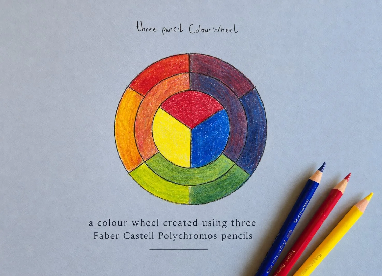
On the wheel, reds, oranges and yellows are warm. Blues, blue-greens and violets are cool. The dividing line runs roughly from yellow-green to red-violet, though it is not exact, and the wheel guide, the colour wheel explained, shows where it falls.
The most important thing about temperature is that it is relative. A green is warm next to a blue and cool next to a yellow. A red is cool next to an orange. So the useful question is never “is this warm or cool?” but “is this warmer or cooler than what is next to it?”
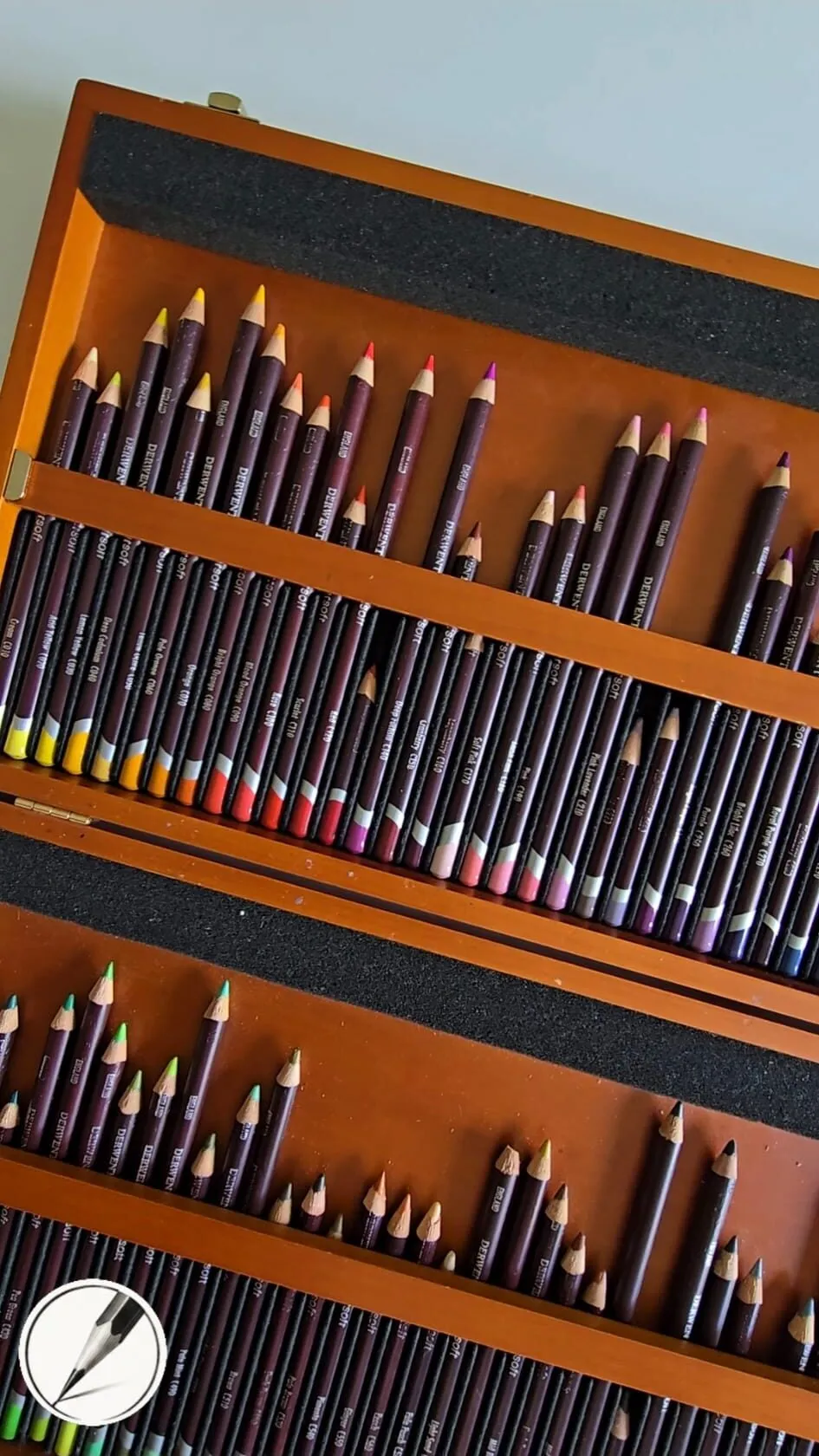
An open wooden box of coloured pencils arranged in tiered trays.
Warm advances, cool recedes
Because warm colours tend to feel closer and cool ones further away, you can build depth without perspective lines. It is the reason distant mountains turn blue-grey in landscapes, and the reason a warm accent in the foreground jumps forward.
To use it:
- Push the background cool and the subject warm to lift the subject forward.
- Push the background warm and the subject cool for a moody, enclosed feel.
- Cool distant objects slightly as they recede. Lower their saturation too.
- Warm the focal point. A small warm area in a mostly cool drawing draws the eye immediately.
Temperature works with value and saturation. A cool colour that is also pale and muted recedes strongly, and a warm colour that is dark and saturated advances strongly. Combine them deliberately, and check your values with the value study tool.
Temperature shifts within one colour family
Every colour family contains warm and cool versions.
| Family | Warm version leans toward | Cool version leans toward |
|---|---|---|
| Red | Orange (scarlet, vermilion feel) | Violet or pink (crimson feel) |
| Yellow | Orange (golden feel) | Green (lemon feel) |
| Blue | Violet (ultramarine feel) | Green (cyan, turquoise feel) |
| Green | Yellow (olive, leaf feel) | Blue (teal, bottle feel) |
| Grey | Brown or pink (warm grey) | Blue (cool grey) |
This is the reason there is no single red pencil. A red that leans orange makes cleaner oranges and warm skin. A red that leans violet makes cleaner violets. If you draw a red apple in one flat red, it will look flat. If you use a warm red where light falls and a cooler red in the turning shadow, it will look round.
The technique in practice is layering, described in how to layer coloured pencils. Lay the cool version first and warm over it, or the reverse, to shift a colour smoothly.
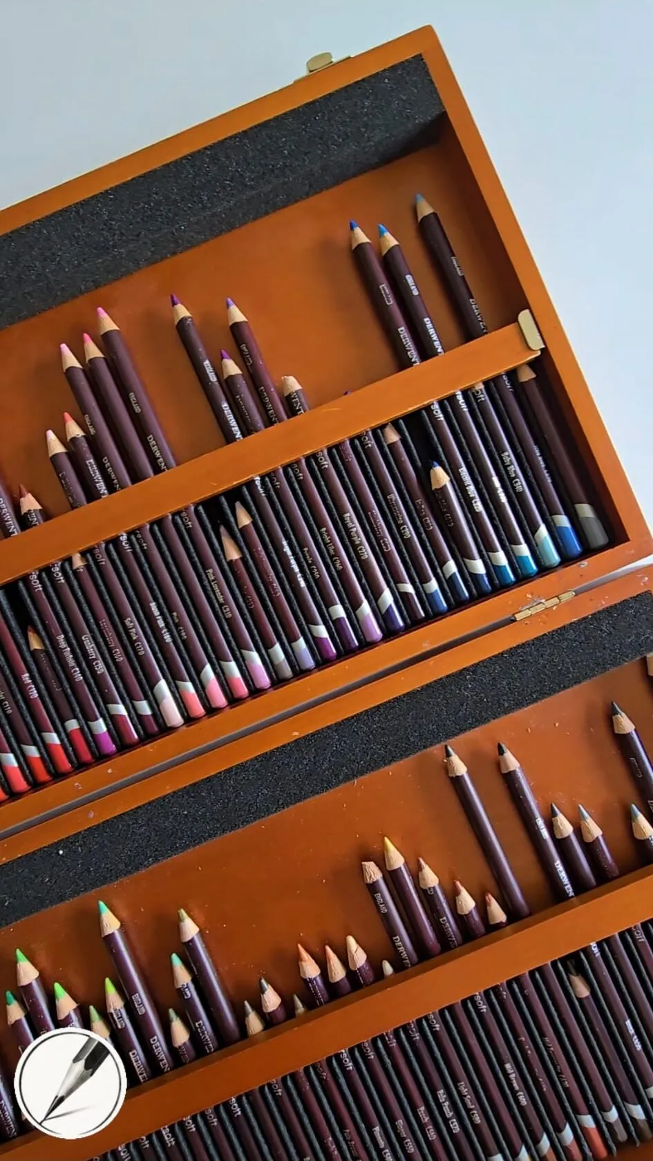
A wooden box of coloured pencils in trays, seen at an angle.
Light and shadow temperature
Light has a colour, and shadow usually carries the opposite. Under warm, low sunlight, the lit side of an object is warm and the shadow reads cooler. Under a cool overcast sky, the light is cool and the shadows can be warmer.
This is a guideline, not a law, but it is the difference between a shadow that feels like real shade and one that is just a darker version of the same colour.
- Decide on the light. Warm sun, cool sky, or mixed.
- Choose the lit colour in the temperature of that light.
- Choose the shadow colour a step cooler or warmer, in the opposite direction.
- Place a bounce light in the shadow. Light reflects from nearby surfaces, so a shadow next to a red cloth may have a warm edge.
- Keep the transition subtle. The shift is usually a quiet lean, not a sudden colour change.
Complements are the strongest temperature partners, and their role in shadows is explained in complementary colours in drawing.
Reading the undertones of your pencils
Undertone is the hidden lean of a colour. Two pencils sold as “blue” may sit on opposite sides of the wheel, and that changes everything when you mix them. A practical way to read undertones:
- Swatch the pencils in a row on your paper, lightly and then firmly.
- Compare each with its neighbours. Which is more orange, which more pink?
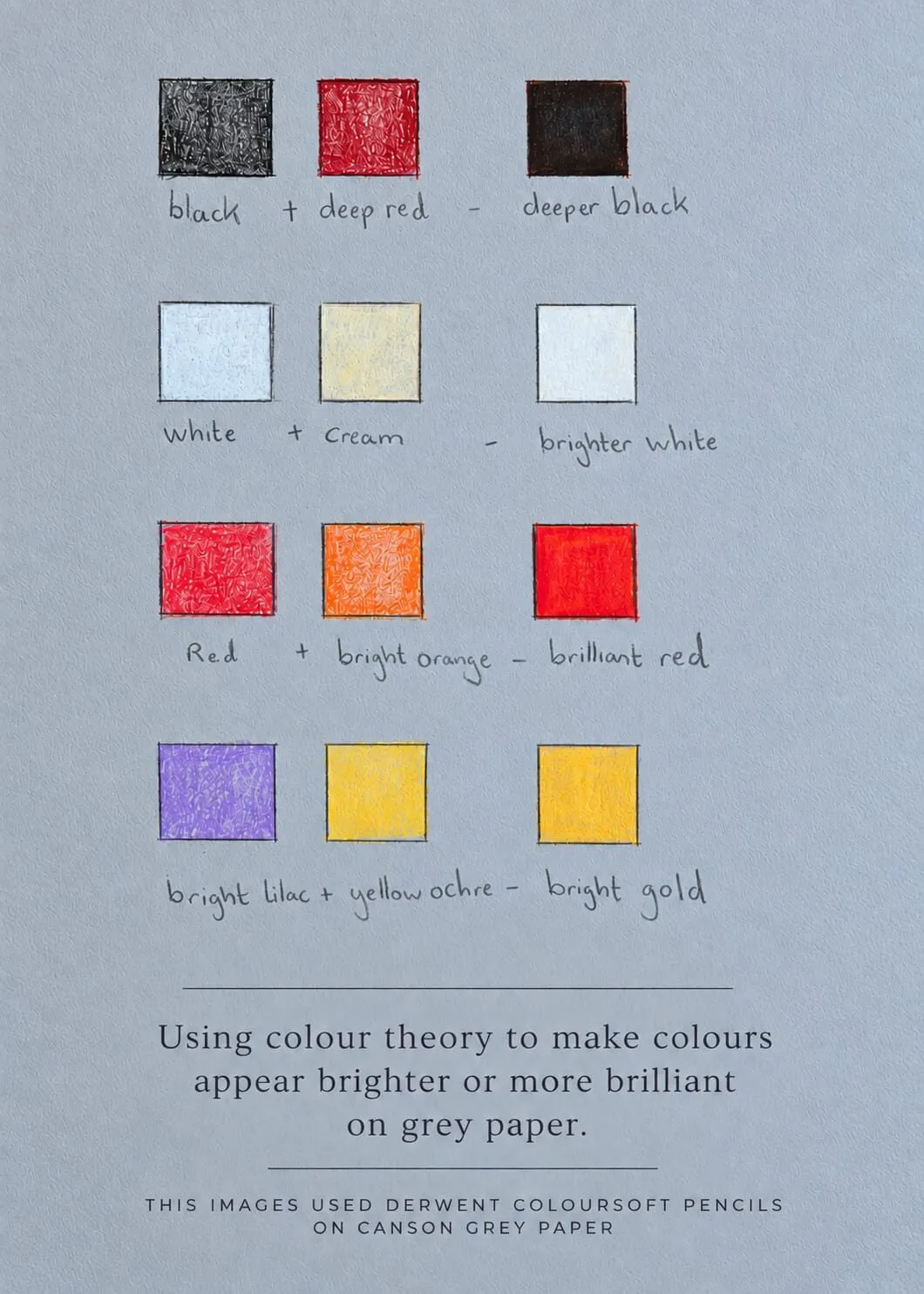
- Layer each over white or cream to see the tint. Undertones show most in pale versions.
- Layer each over a grey to see how it shifts.
- Write the result beside the pencil. A note such as “leans green” saves hours later.
The same exercise is useful when matching colours from a reference. If a mix feels slightly off, the answer is often undertone and not hue. This is at the heart of how to match and mix colours with pencils.
Temperature on toned paper
Grey paper is neutral, so it does not favour warm or cool, but a blue-grey or warm grey paper will tilt everything. The colour beside it always changes how a pencil looks, as colour theory on grey paper explains, so test your pencils on the paper you will use.
Common mistakes
- Treating temperature as absolute. Compare neighbours instead.
- A single temperature everywhere. A drawing that is all warm or all cool feels one-note unless it is deliberate.
- Cold shadows in cold light. Match the shadow to the light source, and make it the opposite, not the same.
- Too big a shift. Temperature changes are usually gentle. Overdoing them creates a patchwork.
- Ignoring value. A warm and a cool of identical value can flatten. Check with greyscale.
Exercises
- Warm and cool pairs. Choose two reds, two yellows and two blues from your set, and blend each pair.
- A sphere in two lights. Draw a sphere lit warm with a cool shadow, then the reverse.
- Distance strip. Draw three bands, near, middle and far, each cooler and paler than the last.
- Undertone chart. Make the swatch row described above for your ten most used pencils.
Temperature and mood
Beyond depth and light, temperature sets the emotional register of a drawing before a viewer notices any detail.
- Mostly warm drawings feel intimate, sunlit, cosy or energetic. They suit food, candlelit interiors and golden-hour scenes.
- Mostly cool drawings feel calm, distant, quiet or cold. They suit winter landscapes, dusk and reflective portraits.
- Warm and cool in tension feels dramatic and alive. A cool room with a single warm lamp is a classic example.
You can shift the mood of a subject without changing a single shape. Try drawing the same small still life twice, once with warm light and cool shadows and once with cool light and warm shadows, and compare how each feels. It is one of the quickest ways to learn how much of a drawing’s feeling comes from temperature rather than subject.
If you want to plan a mood before you draw, enter a warm or cool starting colour into the colour scheme generator and see which partners it suggests, then map them to pencils you own.
The short version
Warm advances, cool recedes, and temperature is always relative to what sits beside it. Use warm and cool versions of each colour, make shadows the opposite temperature to the light, and learn the undertones of your own pencils by swatching. For the companion skill of controlling intensity, continue to saturation and muted colours.
Quick answers
Frequently asked questions
What are warm and cool colours?+
Warm colours are the reds, oranges and yellows, associated with sun and fire. Cool colours are the blues, blue-greens and violets, associated with sky and water. Greens and violets can lean either way depending on how much yellow or red versus blue they contain.
Do warm colours really advance and cool colours recede?+
Generally yes. Warm colours tend to feel closer and cool colours further away, which is why distant hills are drawn cooler and paler. It is a tendency and not a law, since value and saturation also affect depth. Use temperature together with them.
How can I tell if a coloured pencil is warm or cool?+
Swatch it beside similar pencils and compare. A red that looks orange beside another red is the warm one. Look at how it leans. You can also blend it with a neutral, such as a white, and see which direction it shifts.
What temperature should shadows be?+
Usually the opposite of the light. Under warm sunlight, shadows tend to read cooler. Under cool light, shadows tend to look warmer. Layering a small amount of the opposite temperature into a shadow makes it feel alive.