Colour Theory
Complementary Colours in Drawing
How complementary colours create contrast, neutralise shadows and brighten a drawing, with pencil methods, swatch card examples and common mistakes.
Key takeaways
- ◆Complementary colours sit opposite each other on the wheel and create the strongest contrast when placed side by side.
- ◆Mixed together, complements neutralise each other, which makes them the best route to natural greys, browns and shadows.
- ◆A thin layer of the complement over a colour mutes it more elegantly than adding grey or black.
- ◆A complementary underlayer can make the colour on top look richer, especially on toned paper.
- ◆Use complements as accents, not equal partners: one colour should dominate.
Complementary colours are the most dramatic relationship on the colour wheel, and one of the most useful. They sit directly opposite each other, they make each other look stronger when placed side by side, and, less obviously, they cancel each other when mixed. That second property is the one that transforms shadows.
This guide explains what complements are in practical drawing terms, how to use them for contrast, shadows and underlayers, what Michael’s swatch card shows, and the mistakes that make complementary drawings look garish. It builds on the colour wheel explained and belongs to the colour theory hub. The methods are for coloured pencils (colored pencils in the US). Use the palette from photo tool to find complements in a reference, and see how to draw shadows and light for neutral shadows in practice.
What complementary colours are
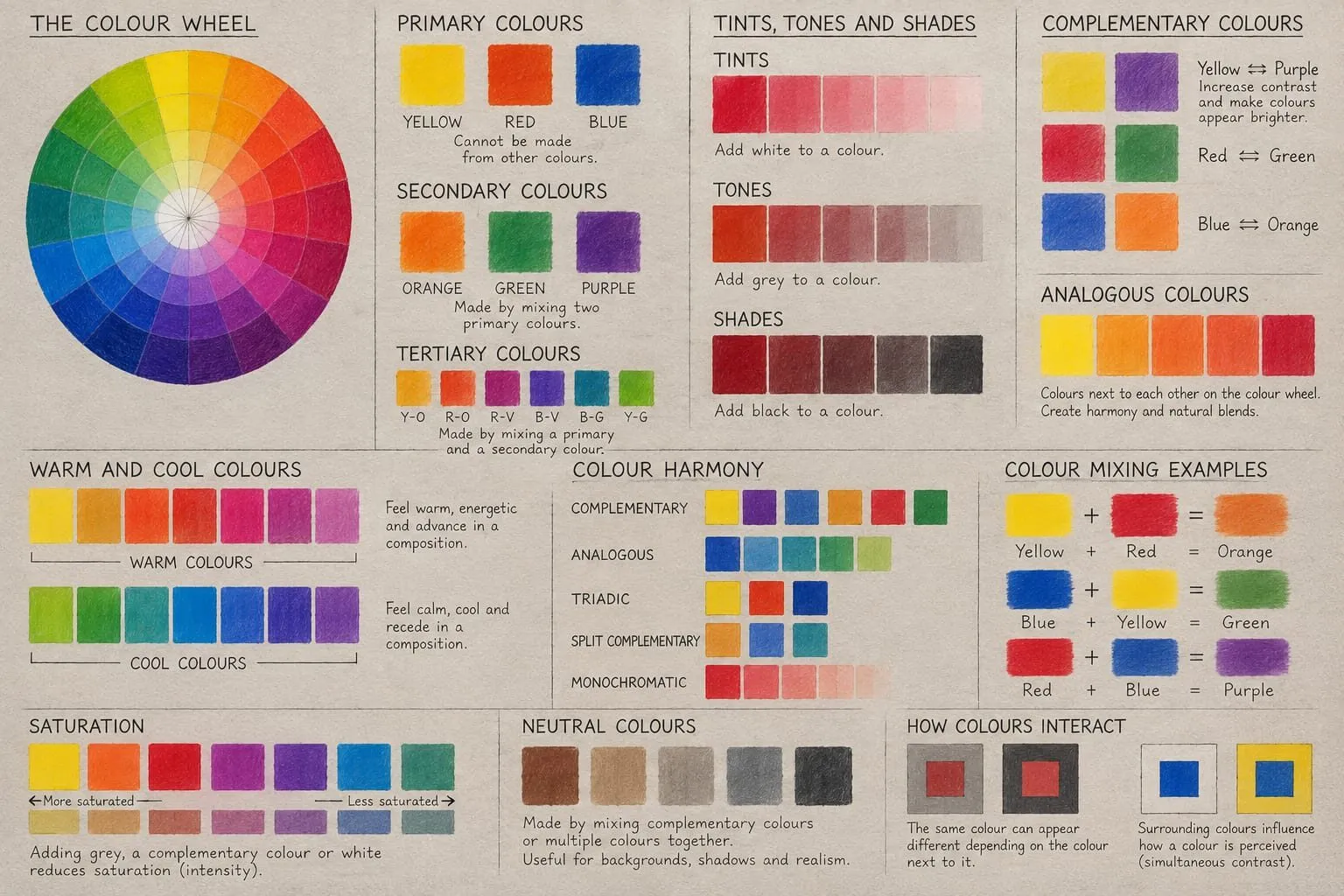
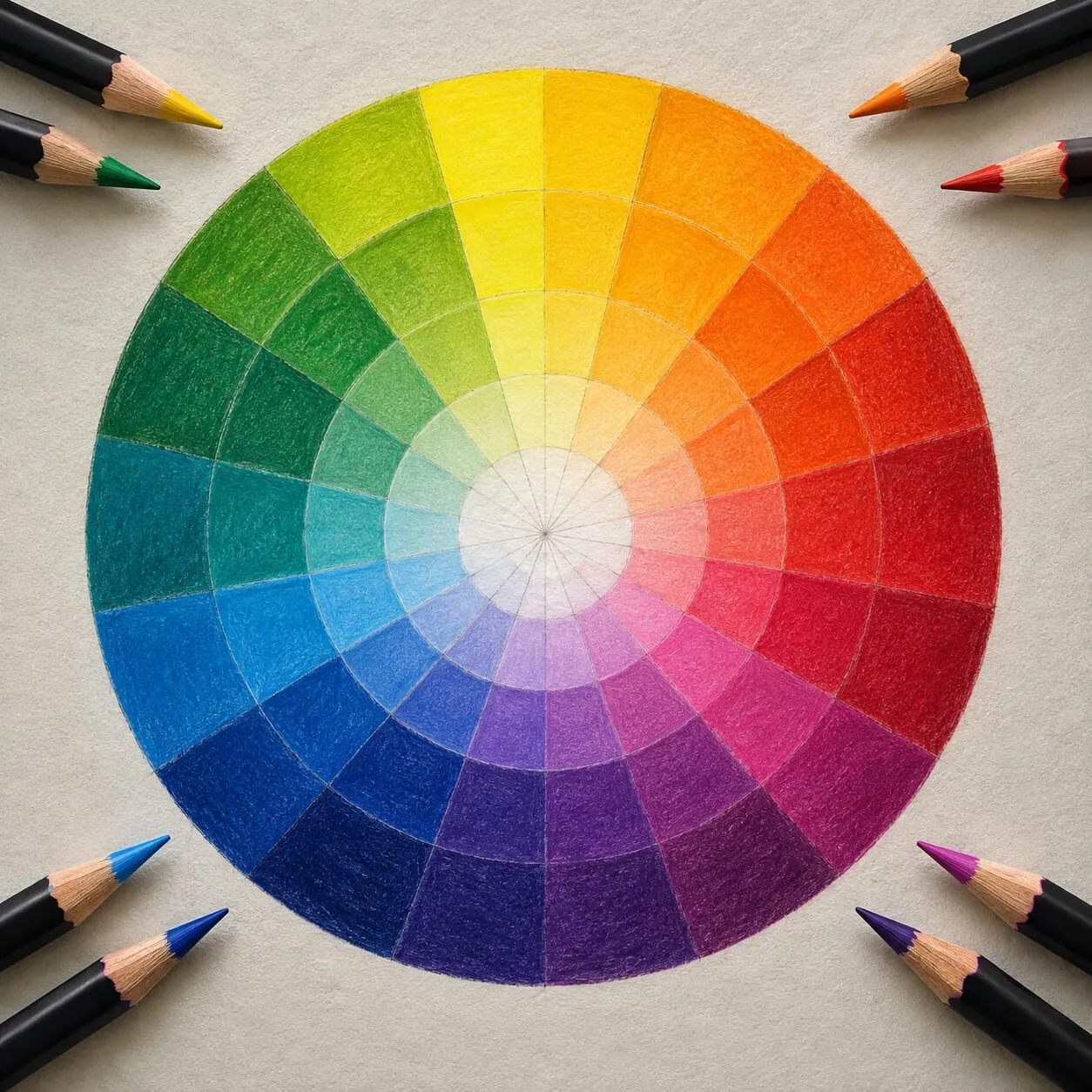
Find any hue on the wheel and go straight across the circle. That is its complement. On the traditional red, yellow and blue wheel the classic pairs are:
| Colour | Complement |
|---|---|
| Red | Green |
| Orange | Blue |
| Yellow | Violet |
| Red-orange | Blue-green |
| Yellow-orange | Blue-violet |
| Yellow-green | Red-violet |
The digital RGB wheel gives slightly different opposites (red and cyan, for instance), because it describes light instead of pigment. For drawing, use the paper-based pairs above, and treat the colour scheme generator as a planning aid rather than the final word. The differences between the two models are explained in the wheel guide.
Each complementary pair contains one warm and one cool colour, which is part of why the contrast is so strong: you get a change of temperature as well as a change of hue.

A wooden drawer of coloured pencils, erasers, brushes and art supplies in separate compartments.
Two jobs complements do
Complements have a dual nature, and understanding both is the whole subject.
Side by side, they intensify. A small patch of orange beside blue looks more orange than the same orange on its own. This is called simultaneous contrast. Your eye exaggerates the difference between neighbours.
Mixed together, they neutralise. Layer blue over orange and you head toward a brown or grey. The two cancel each other’s hue, which is why complements are the best route to natural neutrals.
The rest of the guide is about choosing which job you need at any point in a drawing.
Using complements for contrast
To make a colour pop, put its complement nearby, and keep the amount uneven. A drawing that is mostly warm with a small area of cool is far stronger than one that is half and half.
Practical tips:
- Choose a dominant. Let one colour cover roughly two thirds of the drawing and use its complement as an accent.
- Vary the value. Two saturated complements of the same value can vibrate uncomfortably at their edge. Make one lighter or darker.
- Put the accent at the focal point. The eye goes to the strongest contrast, so place your complementary accent where you want the viewer to look.
- Check with the tool. The colour scheme generator will show the complement of any starting colour so you can pick a matching pencil.
Neutralising shadows with complements
Shadows are where most beginners reach for black, and where complements do their best work. Black flattens colour and tends to look dead. A complement darkens and greys the colour while keeping it alive.
- Identify the local colour. For an orange, that is orange.
- Find its complement. For orange, blue.
- Build the shadow with light layers, first the local colour, then a small amount of the complement, alternating.
- Adjust the ratio. More complement makes the shadow greyer and cooler. Less keeps it richer.
- Add a dark last if needed, but a deep blue or dark brown is usually kinder than black.
This is the principle behind natural-looking shadows on fruit, fabric and skin. It also connects to Michael’s approach to underpainting, in which muted colours establish shadows and temperature before final colour goes on. See underpainting in coloured pencil for the method.
Complementary underlayers
You can place a complement beneath a colour, not just over it. A thin underlayer of the complement adds depth and quietly sits behind the top colour, so the final colour reads richer and less flat than a single flat layer would.
This works especially well when you want to push a colour on toned paper. Michael’s swatch card shows several pairings that use the idea. In one, red is layered with bright orange to give a brilliant red. In another, bright lilac with yellow ochre gives a bright gold, a pairing that leans on the violet and yellow opposition. On the same card, black over deep red makes a deeper black, and white with cream makes a brighter white. All were done with Derwent Coloursoft on Canson grey paper.
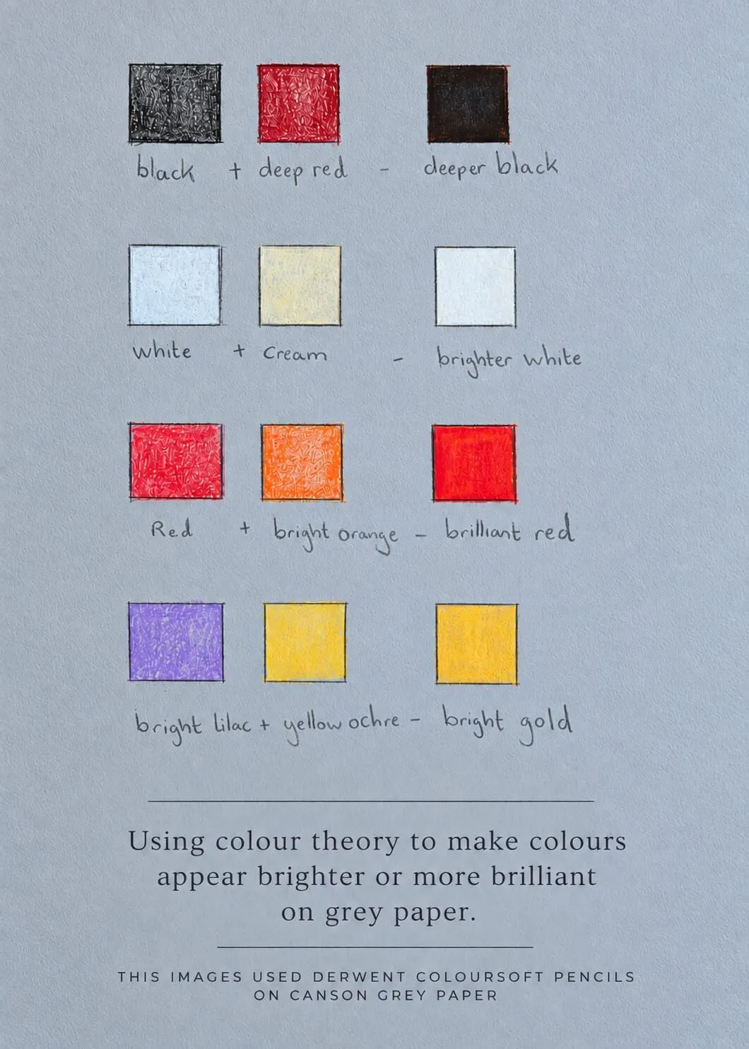
Michael’s swatch card, captioned “Using colour theory to make colours appear brighter or more brilliant on grey paper.”
Not every pairing on the card is a strict complementary pair, and that is the useful lesson: the principle is contrast and relationship, not rigid opposition. For the full reasoning, read colour theory on grey paper.
A worked example
Suppose you are drawing a cloth in a strong violet against a warm ground, in sunlight.
- Block in the shapes in values first, using the value study tool to check the plan reads without colour.
- Lay the violet in light layers, leaving lighter areas where the cloth catches light.
- In the shadow folds, layer a small amount of yellow ochre or a warm yellow into the violet. The shadows grey and warm slightly.
- In the lit areas, layer a paler warm tone rather than pure white, so the highlight relates to the sun.
- Repeat the warm note in a small area of the ground so the two colours talk to each other.
The result has vibrancy from the violet, warmth from the yellow and a unity that comes from the repeated accent.
Common mistakes
- Using too much complement in a shadow. Too much turns a shadow muddy or dull grey-brown. Add it gradually.
- Reaching for black. Black is rarely necessary if the complement does its job.
- Ignoring value. Complements of equal value flatten form. Squint or use greyscale to check.
- Forgetting temperature. A complement pair is also a warm and cool pair. Let one half lead.
- Applying complements everywhere. A whole drawing of complementary contrast is exhausting. Rest the eye with muted areas, as explained in saturation and muted colours.
Where complements sit among the schemes
A single complement pair is the simplest scheme. Splitting the opposite into two neighbours gives a split-complementary scheme, and using two pairs gives a tetradic one. All are compared in colour harmony schemes. For the technique of mixing them with your pencils, see how to match and mix colours with pencils.
Complements beyond the obvious pairs
The textbook pairs are useful, but real subjects rarely arrive as a pure red beside a pure green. Two extensions help.
Complement of a neutral. Even a brownish or greyish colour has a complement, and using it makes the neutral more interesting. A warm brown shadow with a touch of cool blue layered through it looks richer than the same brown alone.
Broken complements. Instead of using an exact opposite, choose a colour a step to one side of it. Blue with a red-orange, instead of blue with a pure orange, gives a livelier and less predictable contrast. This is essentially the idea behind split-complementary schemes.
A quick way to train the eye is to pick a coloured object in the room and, without looking anything up, decide what its complement would be. Then swatch the two together. Over time you will see the opposition automatically, and you will start noticing complementary relationships in reference photos: a warm face against a teal background, a golden field under a violet sky.
The short version
Complements intensify each other side by side and neutralise each other in a mix. Use the first property for focal contrast, with one colour dominant, and the second for shadows and muted tones. A thin complementary layer beats black almost every time, and a complementary underlayer can make the colour above look richer.
Quick answers
Frequently asked questions
What are complementary colours?+
Complementary colours are pairs that sit directly opposite each other on the colour wheel. On the traditional artist's wheel the main pairs are red and green, orange and blue, and yellow and violet. Side by side they create maximum contrast, and mixed they tend to cancel into neutrals.
How do I use complementary colours to make shadows?+
Layer a small amount of the opposite of the local colour into the shadow. A green apple gets a touch of red in its shadow, and a violet cloth gets a touch of yellow. The shadow becomes darker and more neutral without looking flat or dirty, as it can when you add black.
Why do complementary colours vibrate?+
When two strongly saturated complements of similar value sit next to each other, the edge between them can appear to shimmer. It is a real visual effect. Avoid it by varying the value of one colour, or by making one colour clearly dominant.
Do I need to use pure complements?+
No. Slightly off-opposite pairs often look more natural, and your pencils will not match the wheel exactly. Use the wheel or the colour scheme tool as a starting point, then judge by eye.
Are colored pencils and coloured pencils the same?+
Yes. Coloured pencils is the UK spelling and colored pencils is the US spelling, and they are the same product. The complementary methods apply to both.