How to Draw
How to Draw Food Realistically in Coloured Pencil
Draw realistic food in coloured (colored) pencil: glossy glazes, icing, sauces, pastry texture, crumbs and cast shadows, built in four clear stages on grey paper.
This guide contains affiliate links. If you buy through them we may earn a small commission at no cost to you. How this works.
Jump to recommended products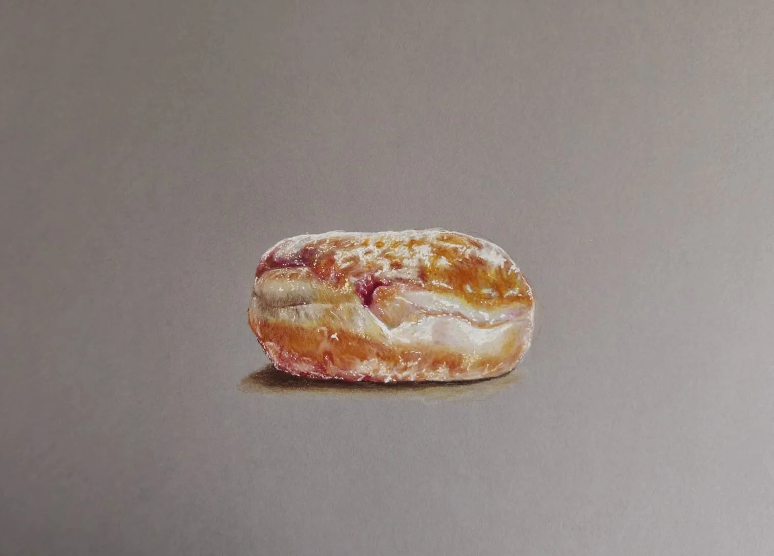
Key takeaways
- ◆Realistic food comes from texture contrast: smooth glossy sauce and icing against crumbly, matte pastry and cake.
- ◆Build in four stages - layout, base colours, depth, then highlights - and add highlights last so they stay sharp.
- ◆Use a few crisp, tinted highlights on glossy areas rather than many white ones.
- ◆A cast shadow and a few crumbs anchor the food to the plate and make it look real.
- ◆Grey paper gives you a mid-tone, so white and light pencil work as bright positive marks.
Food is a rewarding subject because it is colourful, familiar and full of contrasting surfaces. It is also unforgiving. A glossy glaze that looks plastic, a scone that looks like a rock, a brownie with no shadow beneath it: viewers spot the problem instantly because everyone knows what dessert should look like. The good news is that realistic food follows a clear method, and it is the same method every time.
Desserts and glossy treats are Michael’s specialty, and this lesson uses his drawings as examples. It covers the four-stage method (layout, base colours, depth, highlights), how to draw glossy glazes, icing, sauces and pastry texture, and how to finish with crumbs and a cast shadow. It is written for coloured pencils, known as colored pencils in the US, on grey paper.
What you need
- Paper: grey or toned paper with a light tooth. A mid-grey lets you use white for highlights and dark pencils for shadow. Read why use grey paper for coloured pencil for the reasoning.
- Pencils: a mix of creamy and firm pencils. Wax pencils build smooth sauce and icing; oil-based pencils such as Faber-Castell Polychromos give crisp edges for crumbs and highlights. You need warm browns, reds, oranges, yellows, a dark blue or purple for shadows, cream, and a white.
- Reference: a photograph with one clear light source. Side or three-quarter light shows texture and gives a strong cast shadow.
- Tools: a sharpener, a kneaded eraser and a colour plan. The palette from photo tool pulls a set of colours from your reference so you can match them.
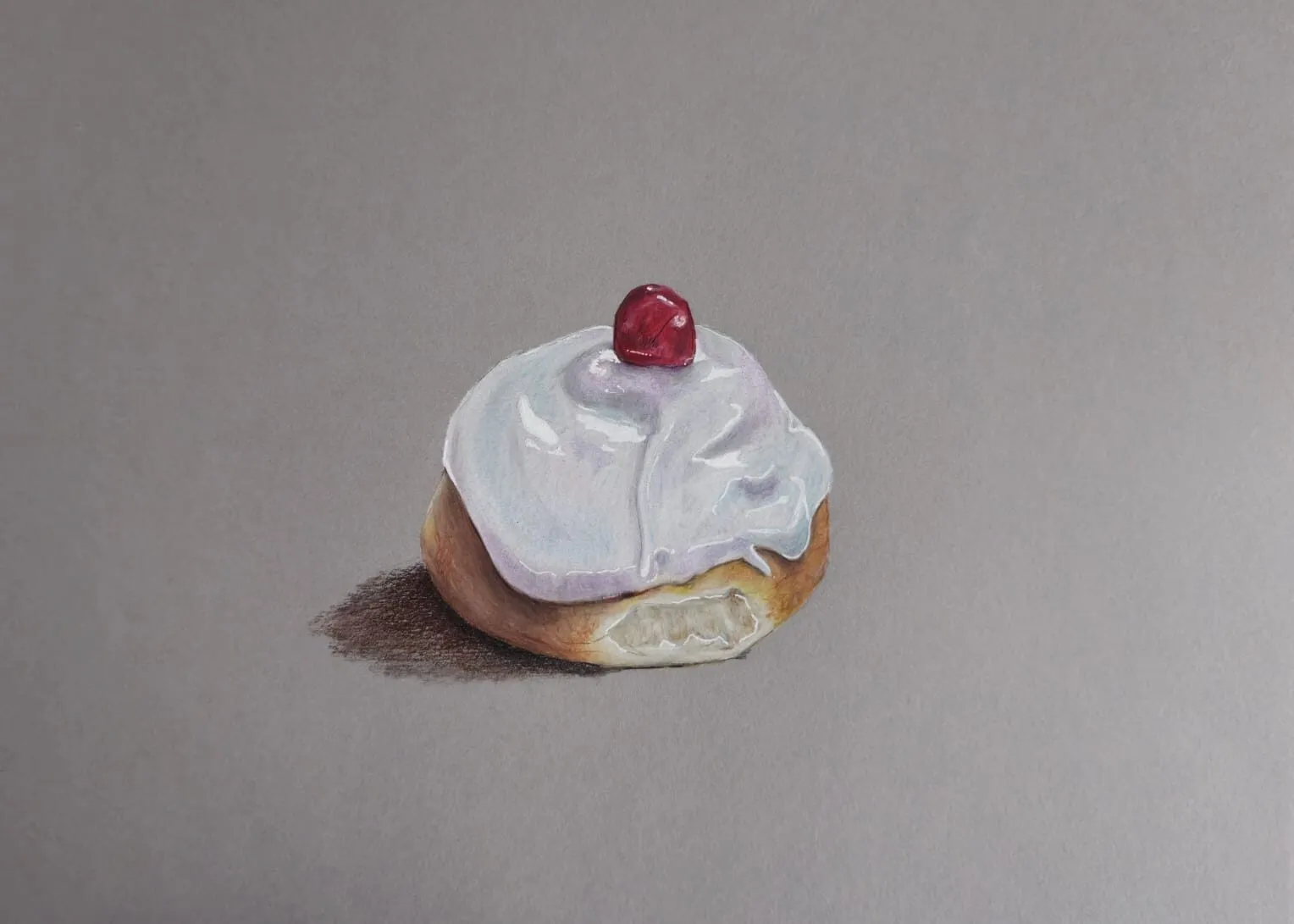
An iced bun topped with a cherry drawn in coloured pencil on grey paper. Drawing by Michael Brace.
Why food looks unreal: texture contrast
Every dessert is a set of surfaces with different behaviour, and your drawing has to show the difference.
| Surface | What it does with light | How to draw it |
|---|---|---|
| Glossy sauce or glaze | Bright, sharp highlights beside deep darks | Smooth mid-tones, few crisp tinted highlights |
| Smooth icing or fondant | Soft highlights, gentle transitions | Even tone with softer highlight edges |
| Pastry, cake, scone | Matte, uneven, crumbly | Broken, textured strokes; irregular edges |
| Ice cream and cream | Soft, slightly waxy | Pale, warm-cool tones with gentle shadow |
| Fruit, cherry, jam | Wet, saturated, small highlights | Rich colour, small sharp highlights |
Once you see food this way, it becomes a study in contrast: shiny against matte, smooth against crumbly, warm against cool.
The four-stage method
This is the same approach used in Michael’s drawings: layout, base colours, depth, then highlights. Working in that order stops you from overworking one area while the rest of the drawing is still pale.
- Layout. Draw the outline and main internal shapes lightly with a sharp pencil. Check proportions and the ellipse of the plate. Mark where the shadows fall and where any highlights will sit. Keep it light so nothing shows through later.
- Base colours. Lay down the local colours with light pressure: golden brown for pastry, deep red-brown for sauce, cream for icing. Don’t chase detail. Cover the shapes evenly and keep the pressure low so the layers can build.
- Depth. Build the shadows and mid-tones. Add darker browns, blues and purples to the recesses, under overhangs and where surfaces meet. This is the stage that gives the food weight, and it is where glossy areas get the dark that makes highlights look bright.
- Highlights and details. Add sharp highlights, crumbs, sugar grains, the cast shadow and any final texture. Do this last so your brightest marks stay clean and are not smeared or overlaid.
Glossy glazes, icing and sauces
Shine is a contrast effect. It comes from a bright highlight sitting beside a deep tone, on a surface that changes smoothly. The glossy surfaces guide covers this in depth, and the essentials for food are:
- Build the mid-tones and darks first, and keep them smooth.
- Use a small number of highlights and make them follow the curve of the sauce or icing.
- Tint highlights. Warm glazes reflect a touch of orange or pink, chocolate sauce a pale warm grey, white icing a pale grey or blue.
- Keep the edges crisp for glassy sauces and softer for icing.
Michael’s progress figure shows this clearly. It presents three stages of a chocolate dessert. In the first stage the sauce already carries bright highlights while the cake and the ice cream are still pale. In the later stages the tones deepen and the contrast strengthens, so the sauce looks even shinier as everything around it gains depth.
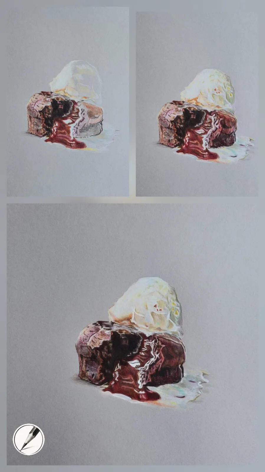
Shine is a relationship. The sauce barely changes, but the darker surroundings make it look brighter.
Pastry, scone and cake texture
Matte, crumbly surfaces need the opposite treatment to sauce. Instead of smooth transitions, use broken, slightly irregular strokes, and let the paper tooth show.
- Lay the base colour in a warm golden-brown, then add darker brown to the cracks and undersides.
- Use short dabbing or scumbling strokes to suggest a rough crust, and keep the pressure light so the texture stays open.
- Add small dark accents in the pits and crevices, then pale highlights on the raised crumbs.
- On sugared surfaces such as a doughnut, scatter tiny cream and white marks last, keeping them uneven in size and spacing.
A scone shows the contrast: the bread has a soft, uneven surface, while the jam and cream beside it are smooth and glossy. The contrast between the two is what makes each look real.
Crumbs, cast shadows and grounding
A dessert floating above a plate looks flat and fake. Two details fix this.
The cast shadow. Place a soft, slightly cool shadow on the plate or surface under and beside the food. Make it darkest and sharpest where the food touches the plate (the contact shadow) and lighter and softer as it moves away. For more on shadows, see how to draw shadows and light.
Crumbs. A few small crumbs scattered near the food, each with a tiny highlight and shadow, add realism. Keep them uneven in size, and avoid a symmetrical sprinkle. Too many crumbs look like noise.
Highlights last
Highlights are the last stage for a reason. If you add a bright white early, you have to draw around it, and layers of colour on top will dull it. Wait until the darks and mid-tones are complete, then add the brightest points with a sharp pencil. Check each one:
- Does it follow the curve of the surface?
- Is it tinted rather than pure white?
- Is there a deep tone next to it to give it contrast?
- Would the drawing improve if you removed it?
On grey paper, the highlight is a positive mark, and you can still adjust it if it lands in the wrong place. This is one reason grey suits food so well.
More examples to study
Michael’s drawings of an iced bun, a jam doughnut and a pastry swirl give you three more studies in the same method. In the iced bun, the icing is smooth and softly lit, with the cherry as a small, saturated accent. In the doughnut, sugar and jam sit side by side, one grainy and one glossy. In the swirl, a warm glaze turns to orange and pink highlights rather than pure white.
Common mistakes
To fix a drawing that feels flat, deepen the darks first and reduce highlights second. Adding more colour and shadow rather than more white almost always helps.
Practice exercises
- Surface swatches: draw a small square each of glossy sauce, matte crust, smooth icing and cream.
- One-highlight study: draw a cherry or a glazed berry using a single sharp highlight.
- Cast shadow drill: draw a simple cupcake with a soft cast shadow on a plate.
- Four-stage bun: choose a single pastry and draw it in the four stages, keeping the stages side by side.
For controlled layering while you practise, read how to layer coloured pencils.
The short version
Draw food in four stages: layout, base colours, depth, highlights. Contrast glossy, smooth surfaces with matte, crumbly ones, use few crisp tinted highlights, anchor everything with a cast shadow and a few crumbs, and work on grey paper if you can. Once you are comfortable, move on to the fundamentals in basic forms and shading, or return to the how to draw hub.
Where to buy
Recommended products
Affiliate links. We may earn a small commission if you buy, at no extra cost to you. Why?
Pencils · Faber-Castell
Faber-Castell Polychromos
Firm, oil-based artist pencils that hold a point - a benchmark for detail and clean layering.
Paper · Canson
Canson Mixed Media Grey Paper
A toothy mid-tone grey paper that grips pigment and makes highlights glow.
Quick answers
Frequently asked questions
How do you draw food realistically?+
Work in stages. Lay out the shapes accurately, add base colours, build the shadows and mid-tones, then finish with highlights, crumbs and a cast shadow. Study the surface of each element: glossy sauce needs sharp highlights and deep darks, while pastry and cake need soft, matte tone and visible texture.
What is the best paper for drawing food in coloured pencil?+
Grey or toned paper with a little tooth works very well, because the mid-tone supplies the shadows and lets white and pale pencil work for highlights. A mixed media grey holds many layers and lets you lift small errors. White paper also works, but you must preserve the lightest lights from the start.
How do you draw icing and glaze so they look shiny?+
Build smooth, simple mid-tones and deep shadows first, then add a small number of crisp, tinted highlights that follow the curve of the surface. Icing usually has softer edges than glassy sauce. Avoid pure white everywhere; a warm glaze picks up a touch of orange or pink.
Are colored pencils and coloured pencils the same?+
Yes. Colored is the American spelling and coloured the British spelling of the same pencils. Both wax-based and oil-based sets work for food. Creamy wax pencils help with smooth sauces, and firmer oil-based pencils hold a sharper point for crumbs, edges and small highlights.