Colour Theory
How to Choose a Colour Palette for a Drawing
Choose a colour palette for a coloured pencil (colored pencil) drawing from your reference, the mood or a harmony scheme, then test swatches on your paper.
This guide contains affiliate links. If you buy through them we may earn a small commission at no cost to you. How this works.
Jump to recommended products
Key takeaways
- ◆Choose value first and colour second: a palette only works if the lights and darks read clearly.
- ◆Start from your reference, then decide how literal to be, pushing or muting colours for mood.
- ◆Harmony schemes such as complementary, analogous and triadic give you a tested structure, and a generator can suggest them.
- ◆A limited palette of four to eight pencils keeps the drawing unified and makes decisions faster.
- ◆Test every palette as swatches on your own paper before you commit, because paper colour and pencil opacity change the result.
The most common palette mistake is choosing colours pencil by pencil, because each one looks nice in the tin. The drawing ends up with a dozen colours that never quite agree. A better approach is to decide the palette before you draw: what the picture needs, how it should feel and which pencils will do the job.
This guide is written for coloured pencils, known as colored pencils in the US. It takes you from reference to final swatches: value first, then colour from the reference, from mood, and from harmony schemes, with limited palettes and swatch testing to finish. It belongs to the colour theory cluster, and two tools will help as you read: the palette from photo tool and the colour scheme generator.
Step one: value before colour
A palette can be beautiful and still fail if the values are wrong. Value is how light or dark a colour is, and it carries the structure of a drawing. Colour sits on top of it.
- Do a quick value study before choosing colours, using a greyscale version of your reference or the value study tool.
- Decide your lightest light, darkest dark and the main midtones. Every colour you pick will sit somewhere on that range.
- Check that your chosen colours cover the range. A palette made only of mid-value pencils will look flat.
If you need the theory, read value in drawing. If your palette is fine in colour but looks wrong, the problem is almost always value.
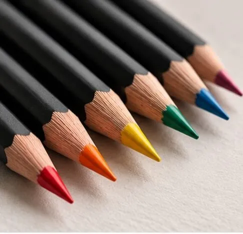
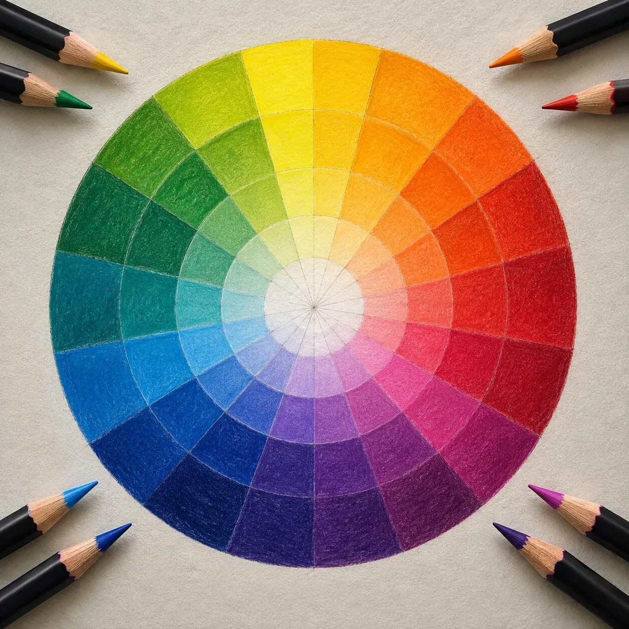
Sharpened coloured pencils lined up on cream paper.
Choosing from your reference
For realistic work, the reference is your best palette source.
- Squint and find the dominant colour family. Is the picture mainly warm, cool, bright or muted?
- Identify four to eight key colours: the main local colours, a dark, a light and the colour of the shadows. The palette from photo tool pulls swatches from a photo to get you started, and it is worth checking against the real thing by eye.
- Notice what is not obvious. Shadows contain reflected colour, whites are rarely white, and skin holds ochre, rose and grey. Match the undertones, not the labels. See how to match and mix colours with pencils.
- Match the mixes, not just single pencils. You will layer several pencils for most colours, so your palette is a set of ingredients.
Choosing from mood
Sometimes the reference is the starting point, not the target. You decide how the picture should feel, and adjust.
| Mood | Palette lean | How to get it |
|---|---|---|
| Calm, quiet | Cool, muted, low contrast | Soft blues and greens, neutral greys, gentle values |
| Energetic, bold | Warm, saturated, high contrast | Reds, oranges and yellows against deep cools |
| Nostalgic, soft | Muted warm, limited | Earthy ochres and dusty tones, lightly layered |
| Dramatic | High contrast, narrow hue range | Deep darks with one bright accent |
You do not have to change the subject to change the mood. Making shadows cooler, dulling the background or raising saturation in a focal area are all decisions you can make at the palette stage. For the temperature side, see colour temperature: warm and cool, and for intensity, saturation and muted colours.
Coloured pencils standing in a speckled ceramic pot.
Choosing from a harmony scheme
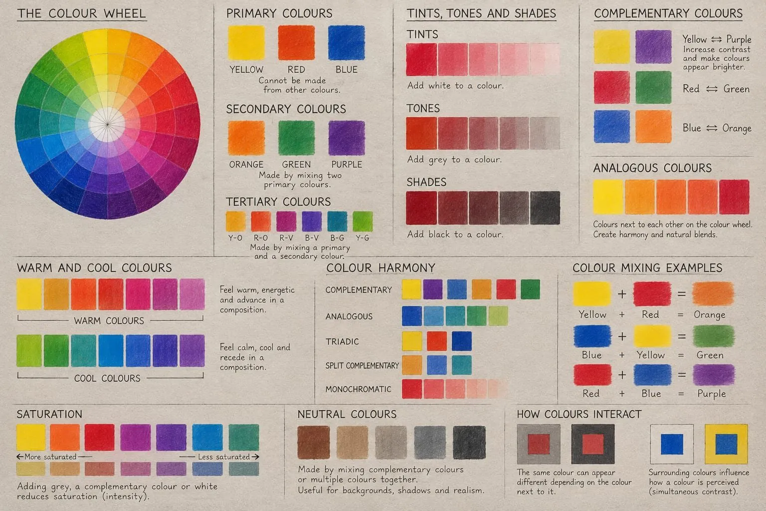
Harmony schemes are tested structures for a palette. The colour harmony schemes guide covers them in full. The short version:
- Complementary. Two colours opposite each other. Strong contrast and energy. Use one as the dominant and the other as an accent. See complementary colours in drawing.
- Analogous. Neighbouring colours. Calm and cohesive, good for landscapes and quiet portraits.
- Triadic. Three evenly spaced colours. Lively but balanced, best with one leading colour.
- Monochrome or near-monochrome. One hue in many values, a strong, simple look.
The colour scheme generator shows these relationships for any starting colour, so you can test a scheme before choosing pencils. Treat schemes as guides rather than laws: a realistic drawing often sits in a scheme loosely, with the reference adding variety.
Keep the palette small
A limited palette is the easiest way to get a unified drawing. Four to eight pencils is enough for most subjects, and the rest you mix.
A useful structure:
- One or two main hues that carry the subject.
- A warm and a cool version of the dominant colour, for light and shadow.
- A dark for accents and depth, ideally a rich deep colour, not just black.
- A light, such as white, cream or a pale tint.
- A neutral or complement for muting and shadows.
The full approach is in limited palette drawing, and a palette cut down in this way also makes your mixing chart quicker to build.
Think about the paper
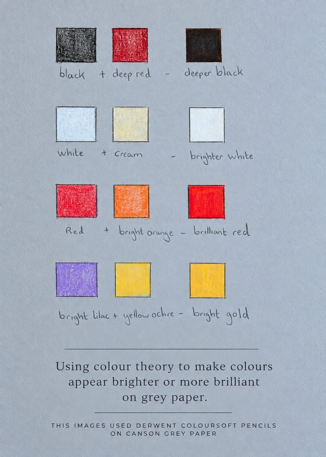
Your paper is a colour in the palette. On white paper, the paper is your lightest light. On grey or toned paper, it acts as a midtone, and white pencil provides the highlights. Pale pencils can disappear on a toned ground, and saturated colours can look brighter against it. Michael works a lot on grey paper, and the ideas are set out in colour theory on grey paper. For paper choices, see the best paper for coloured pencils.
Test swatches on your own paper
This is the step that saves drawings.
- Cut a scrap of your actual drawing paper.
- Swatch each palette pencil alone, light and heavy.
- Swatch the key mixes: your main colour with its shadow colour, your neutrals, and the most difficult colour in the picture.
- Squint and compare to the reference at a distance. A palette can look right close up and wrong from across a room.
- Check values in greyscale. The swatches should cover your planned range.
- Adjust. Swap a pencil, add a layer, or drop a colour.
Pin the swatches next to the drawing. You can then refer to them as you work, and they are a record for the next drawing. Do not assume a pencil will match a colour because of its name or number: what matters is the swatch on your paper.
Common mistakes
- Choosing by the tin. Colours that look good together in a set do not always suit a particular subject.
- Ignoring value. A palette with no dark and no light gives a flat drawing.
- Too many colours. It is harder to keep the picture unified, and each decision takes time.
- Pure saturation everywhere. Keep a neutral area to let the bright colours work. See how to mix grey and neutral colours.
- Skipping the swatch. What looks right on white paper can vanish on grey.
- Matching too literally. Sometimes a slightly cooler shadow or a more muted background makes the drawing stronger than a photographic copy.
A worked example: from reference to palette
Imagine a reference of a figure in a bright coat against a cool, overcast background. Here is how the decisions unfold.
- Value. A quick greyscale check shows the coat is mid to light, the background is mid-dark and the darkest shadows sit in the folds. That gives you a clear light against dark at the focal point.
- Dominant colour. The coat is warm and saturated, and the background is a cool, muted blue-grey. That is close to a complementary relationship, so the coat will pop.
- Mood. You want the coat to lead, so you keep the background quiet. You decide to mute it further with a little orange glazed over the blue, which also ties it to the coat.
- Pencils. Two warm saturated colours for the coat, a warm and a cool shadow colour for the folds, a deep dark, a white for highlights and a blue to mix the background. That is about eight pencils.
- Swatch. You test the mixes on your paper, compare in greyscale and swap one pencil that vanishes against the paper.
The process is the same for a landscape, a still life or a portrait. Only the colours change. If you want a second opinion on the pairings before swatching, the colour scheme generator is a quick check.
Keeping a palette record
Once a palette works, write it down. A small card with the pencils, the paper, the layer order for your key mixes and a photo of the finished swatches takes five minutes and helps next time. Over a few drawings you will see patterns in the colours you favour, and you can build your own default palettes for portraits, food and landscapes. A palette record also helps if you return to a drawing after a break and need to match colours you mixed weeks earlier.
The short version
Decide the values first, then pull colours from your reference or your chosen mood, test them against a harmony scheme and keep the palette to a handful of pencils. Swatch everything on your own paper, in colour and in greyscale, before you start. For more, see the colour theory hub.
Where to buy
Recommended products
Affiliate links. We may earn a small commission if you buy, at no extra cost to you. Why?
Pencils · Derwent
Derwent Coloursoft Pencils
Soft, velvety and richly pigmented - excellent for painterly blending and bold colour.
Pencils · Faber-Castell
Faber-Castell Polychromos
Firm, oil-based artist pencils that hold a point - a benchmark for detail and clean layering.
Quick answers
Frequently asked questions
How do I choose colours for a drawing?+
Start with your reference and identify the main colour families, then decide the mood you want. Check the value structure, choose a harmony scheme that fits, and pick four to eight pencils. Swatch them on your drawing paper to confirm they work together before you start.
How many pencils should be in a palette?+
Four to eight is enough for most drawings. A limited palette keeps colours harmonious and lets you mix greys and browns from the same pencils. Add a pencil only when you can name what is missing. More complex subjects such as a multicoloured coat may need more.
Should I match the reference colours exactly?+
Not always. Matching gives a realistic result, but you can push or mute colours to suit the mood or to unify the picture. Keep the value relationships accurate, and then shift the hues, such as making shadows cooler or a background more muted.
Does paper colour affect my palette?+
Yes. Toned paper shows through light layers and shifts every colour, and a mid-grey ground gives you a built-in midtone. Choose pencils that are opaque enough to cover it where needed, and swatch on the actual paper. White paper will show colours at their brightest.
Are colored pencils and coloured pencils the same?+
Yes. Coloured pencils is the UK spelling and colored pencils is the US spelling, and they are the same product. Choosing a palette works the same way for both.